Your 2026 Kitchen Bathroom Renovation Melbourne Guide
You're probably at the point where the house still works, but only just. The kitchen feels tired, the bathroom is dated, storage is poor, and every workaround you've created over the years now feels permanent. Most Melbourne homeowners in this position ask the same question first: should we do one room now and the other later?
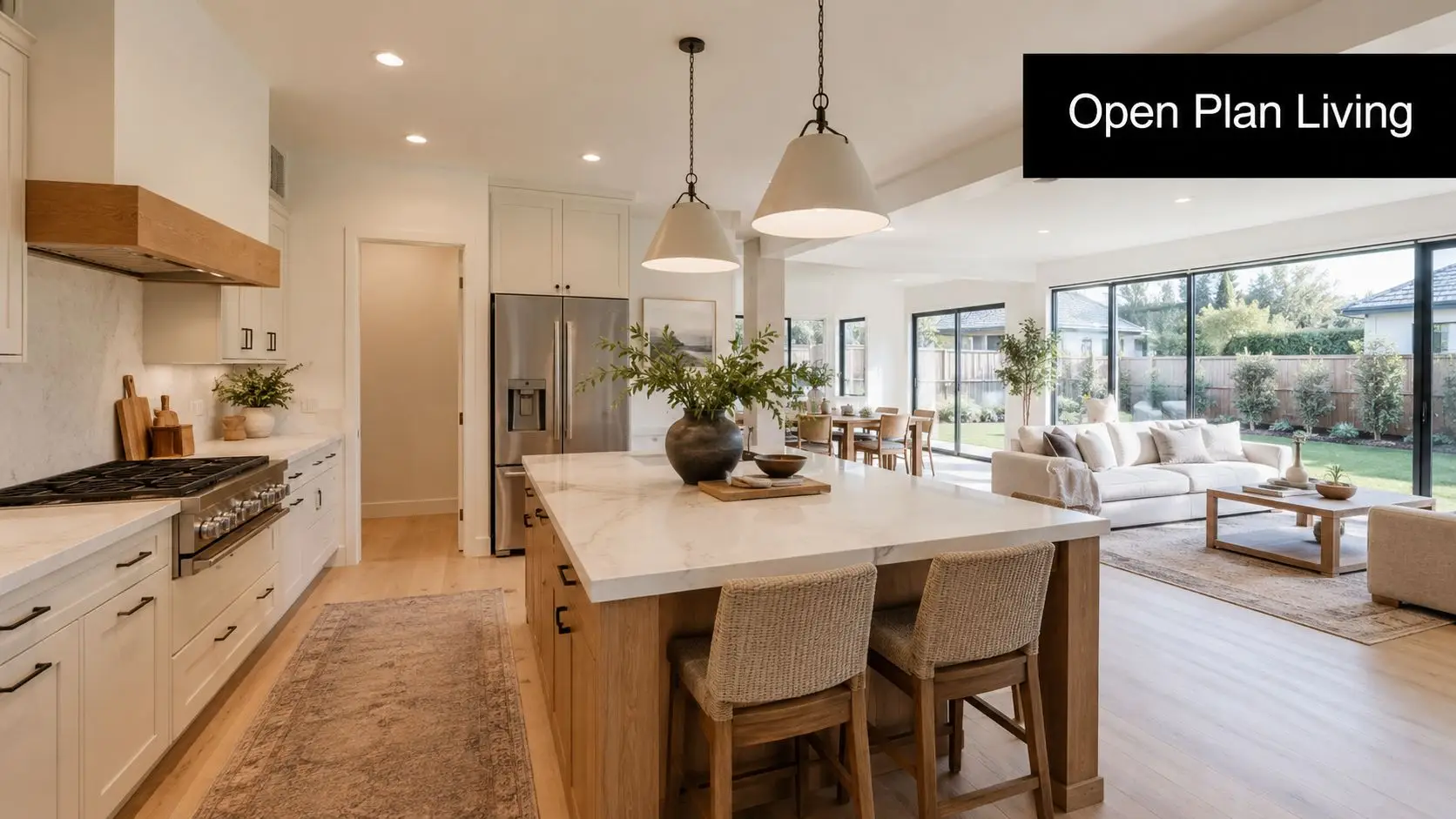
In many homes, the smarter move is to plan both together. A combined kitchen and bathroom renovation isn't just two jobs happening at once. It's one coordinated project with shared decisions around budget, trades, materials, access, disruption, and finish quality. Done properly, it reduces duplicated effort and gives the whole home a more consistent result.
That matters because renovation is no longer a niche spend. A 2025 industry summary of Australian home renovation activity says Australians invested more than A$48 billion in home improvements, a 13% increase from 2024, and estimated that about one in every three households completed a renovation. The same source places the average kitchen renovation at A$27,500 and the average bathroom renovation at A$19,000. In Melbourne, those are usually the two rooms owners target first because they affect daily living most and carry the biggest visual and functional impact.
Your Melbourne Renovation Blueprint Starts Here
If you're considering a kitchen bathroom renovation Melbourne project, start with one question. What's driving it?
For some households, it's lifestyle. You need a kitchen that works for school mornings, dinner prep, and storage that holds what a modern family uses. You need bathroom renovations that solve poor ventilation, awkward layouts, and old finishes that no longer clean up well.
For others, it's value. They want the home to present better, feel newer, and avoid the patchwork look that happens when one room is beautifully renovated and the next still shows its age.

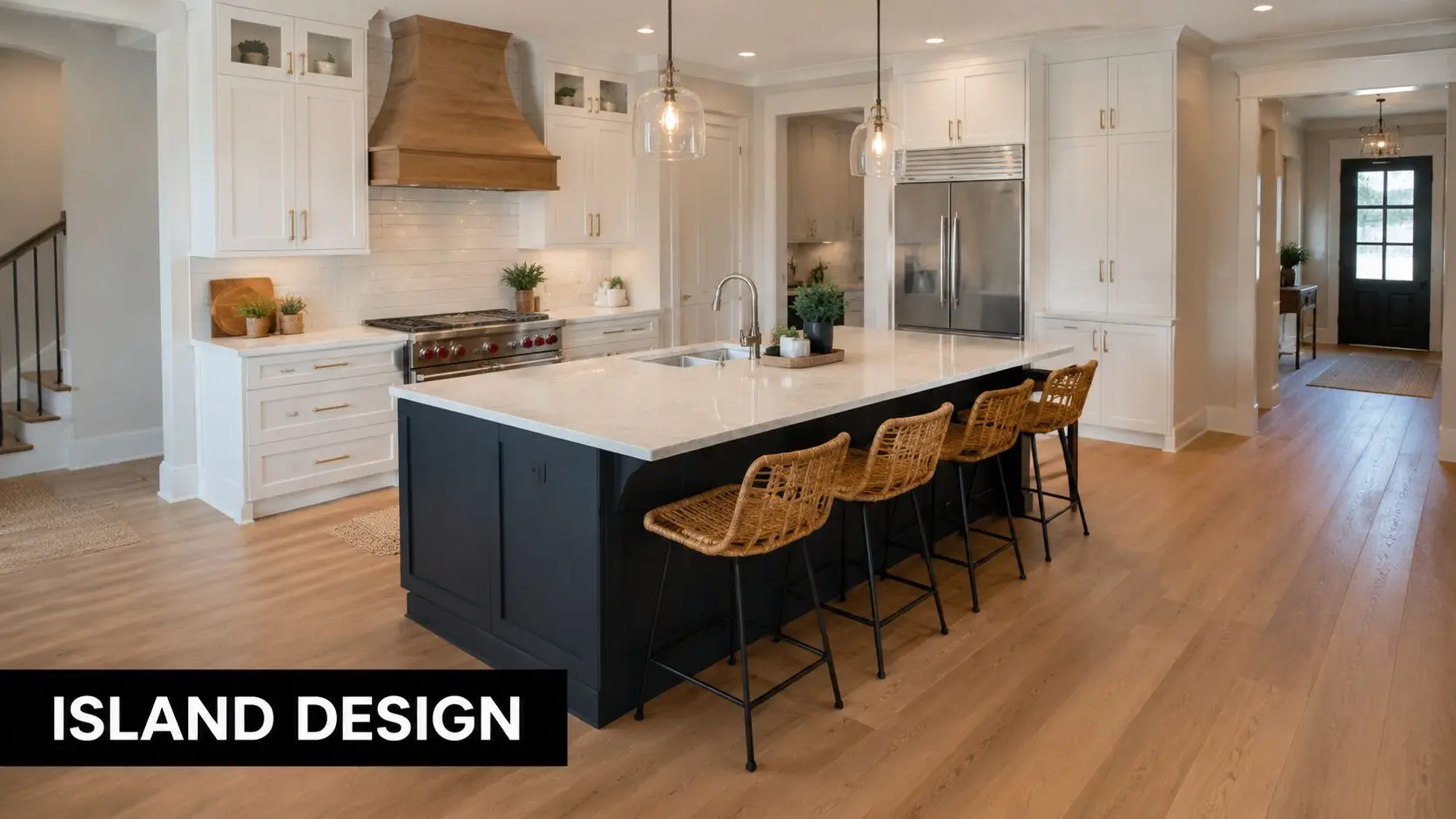
Why combining both rooms can be the better decision
Running kitchen and bathroom works separately often means repeating the painful parts twice. You organise access twice. You manage demolition twice. You coordinate deliveries twice. You lose use of core parts of the home twice.
A combined project gives you better control over:
- Trade sequencing: Plumbers, electricians, tilers, cabinet makers, and painters can be booked as part of one build schedule instead of two disconnected ones.
- Design consistency: Cabinet colours, handles, tile tones, stone selections, and lighting temperature can work together across the home.
- Decision fatigue: You choose once, with one plan, instead of restarting months later.
- Household disruption: One concentrated period of inconvenience is usually easier than dragging renovation over multiple stages.
Practical rule: If both rooms need meaningful work within the same general timeframe, price them together before deciding to split them.
Start with priorities, not finishes
The biggest planning mistake we see is choosing tapware, splashbacks, and vanity styles before the layout has been resolved. A sound brief starts with function.
Ask these first:
- What's not working now? Lack of storage, bad circulation, poor bench space, no exhaust path, inadequate lighting, or a bathroom that never dries properly.
- What must stay where it is? Keeping some plumbing and services in place can make a major difference to budget control.
- Who uses each space every day? A family kitchen and a guest bathroom should not be designed the same way.
- What standard of finish suits the house? There's no point building ultra-luxury rooms into a home where the rest of the property won't support that level.
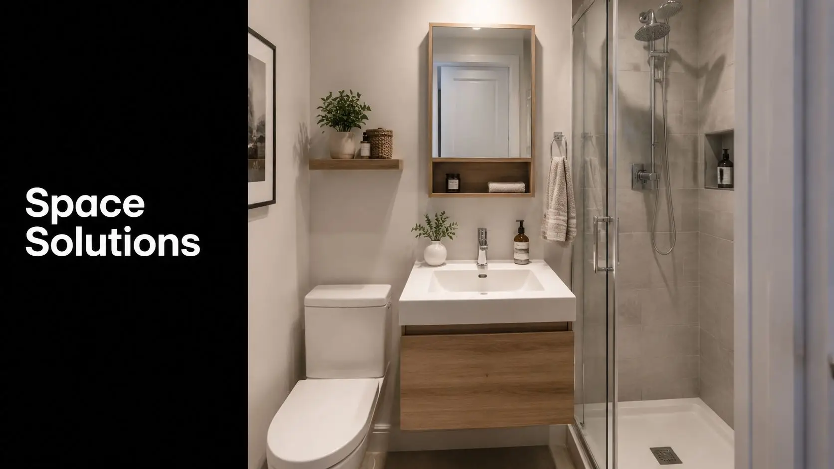
Melbourne homes vary wildly. A compact apartment, a brick veneer family home, and an older weatherboard all require different thinking. Older homes often reward careful retention and upgrade. Apartments demand tighter planning around access, waste removal, body corporate rules, ventilation paths, and moisture risk.
If you're still refining the kitchen side of the brief, our guide to planning a kitchen remodel is a useful starting point before drawings begin.
Decoding Your Melbourne Renovation Budget
Most renovation stress comes from one of two problems. The budget was unrealistic from day one, or the scope changed after work had already started.
The best way to avoid both is to treat your kitchen and bathroom as a single financial plan with separate cost centres inside it. That makes it easier to see where money must go, where you have flexibility, and where “small changes” can trigger larger spend.
What the bathroom numbers tell you
For bathrooms, the strongest benchmark in the current Australian market comes from a 2026 bathroom renovation cost guide citing Housing Industry Association data. It says the average bathroom renovation cost is around A$26,000 nationally. The same guide breaks spending into practical tiers:
- A$8,000 to A$15,000 for a cosmetic refresh
- A$15,000 to A$35,000 for a standard mid-range renovation
- A$35,000+ for premium work
It also notes that labour can account for 40% to 50% of the total spend, and builders often recommend a 10% to 20% contingency for unexpected issues.
Those figures matter because a combined project doesn't magically make complexity disappear. If anything, it makes early budgeting more important. Kitchen works add cabinetry, benchtops, appliances, splashbacks, and often wider electrical scope. Bathroom works add waterproofing, tiling, plumbing fit-off, and moisture-control detail that can't be guessed at.
Where combined-project budgets usually shift
Some costs become more efficient when both rooms run together. Others don't.
Efficiencies often come from shared site setup, coordinated trades, bulk material ordering, and a single project management stream. Costs usually rise when owners change layouts late, move plumbing unnecessarily, upgrade finishes across both rooms at once, or uncover hidden conditions in older homes.
Here's a practical way to think about a combined project.
| Cost Component | Estimated Cost Range (AUD) | Notes |
|---|---|---|
| Bathroom works | A$8,000 to A$35,000+ | Depends on whether the job is cosmetic, mid-range, or premium, based on the national bathroom budget bands in the cited guide. |
| Kitchen works | Qualitative only | Scope varies widely based on cabinetry, benchtops, appliances, and whether layout changes are involved. |
| Labour | 40% to 50% of bathroom spend | Trade labour is a major budget driver, especially where multiple trades need tight sequencing. |
| Contingency | 10% to 20% | Useful for hidden issues such as outdated services, substrate repair, or demolition surprises. |
| Premium finish upgrades | A$35,000+ bathroom tier indicator | Designer bathrooms typically move into this territory once high-end materials and custom details are selected. |
Cheap quotes often leave out the awkward parts. Waste removal, substrate repair, electrical upgrades, and compliance work are where budgets get tested.
The hidden items that deserve attention early
In Melbourne homes, especially older ones, these are the items that regularly reshape the budget:
- Asbestos-related work: This has to be handled carefully and priced before assumptions are locked in.
- Electrical upgrades: New appliances, better lighting, and compliance improvements can expand the electrical scope quickly.
- Waterproofing preparation: The membrane itself is only part of the story. The surfaces beneath it matter just as much.
- Service relocation: Moving wastes, water lines, or major fixtures usually costs more than owners expect.
If you want a more focused breakdown before requesting quotes, our page on bathroom renovation cost in Melbourne explains how scope and finish level change the final number.
Designing Your Dream Kitchen and Bathroom
Good design isn't about making two rooms look expensive. It's about making them easier to live with.
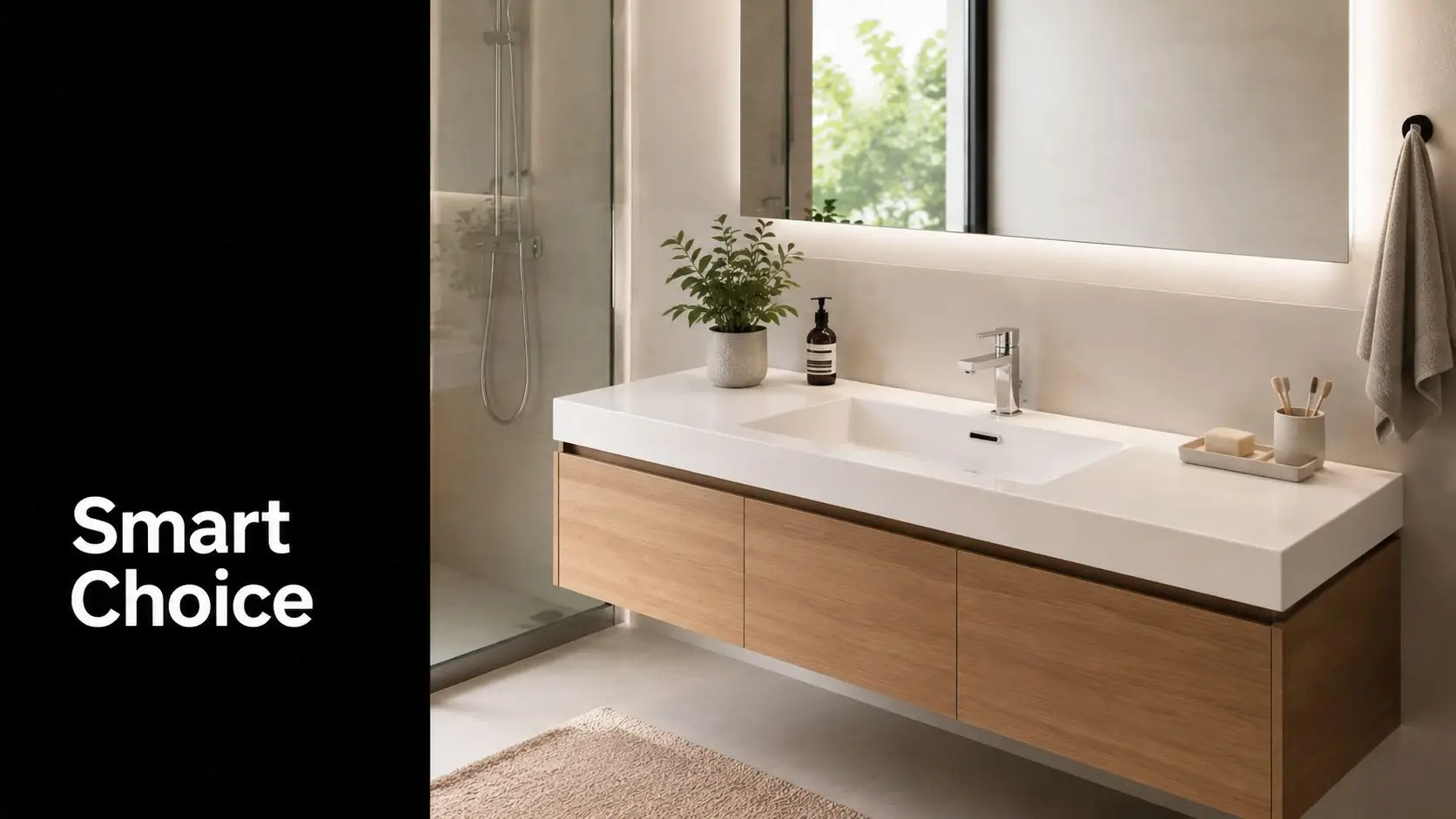
That matters most in Melbourne because many homes have tight footprints, older wall lines, uneven floors, or previous alterations that already compromised the layout. New bathroom ideas and modern bathrooms only work when they fit the building you own, not the showroom image you saved on your phone.
What works in real homes
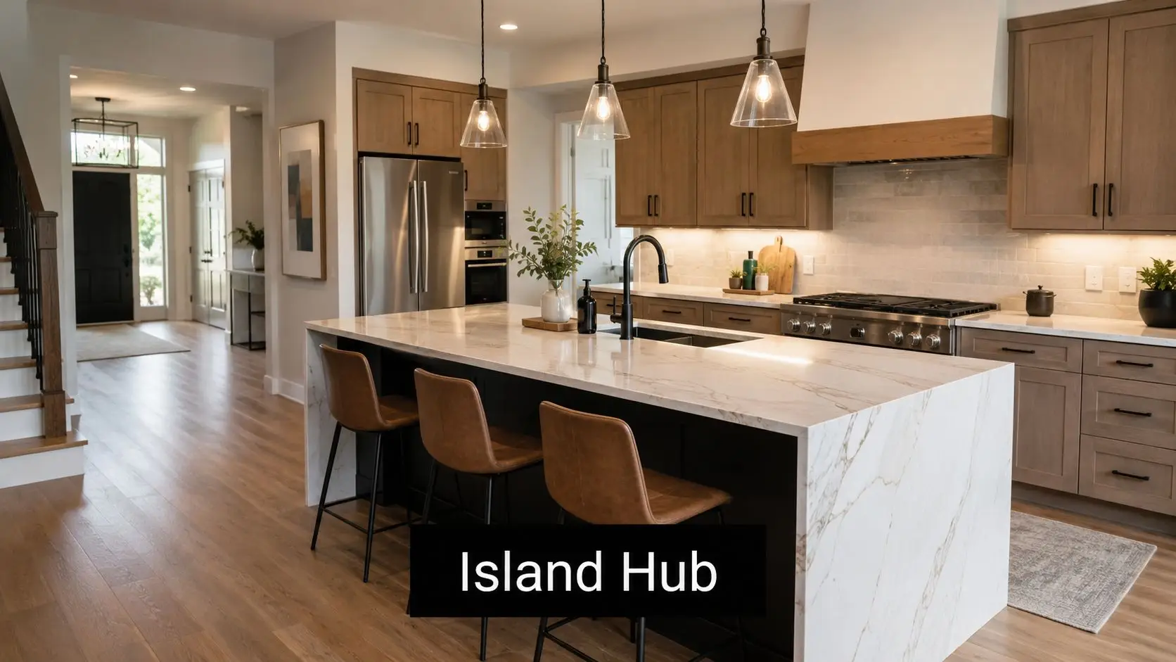
The strongest combined renovations usually share a design language without becoming repetitive. That might mean similar joinery tones, matching metal finishes, or a common approach to lighting and storage. It doesn't mean the kitchen and bathroom need to look identical.
A practical design brief usually prioritises:
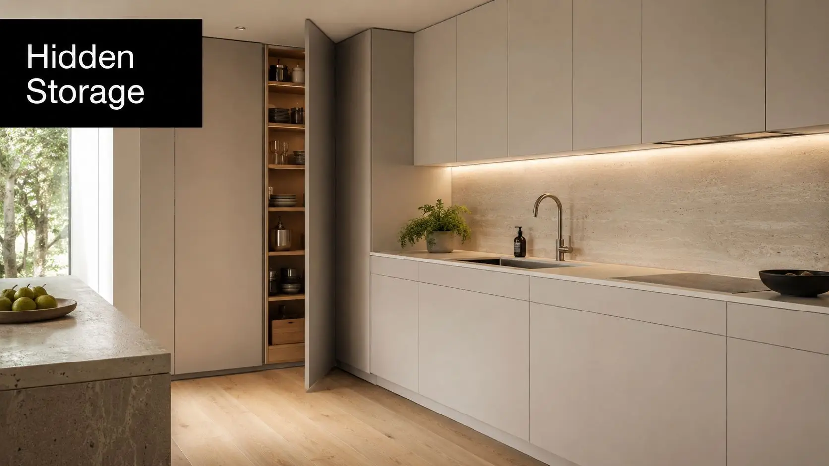
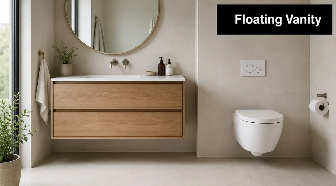
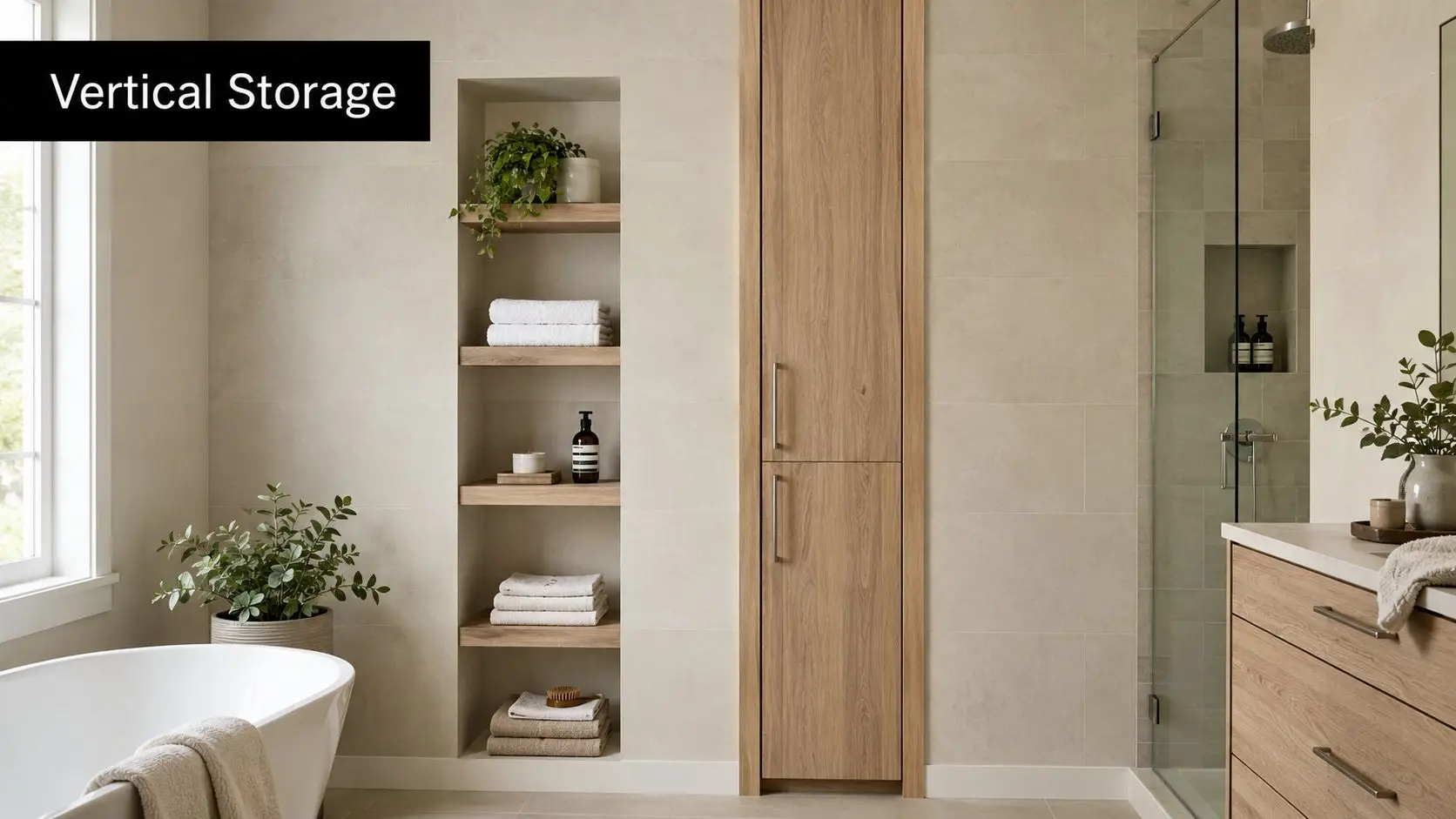
- Storage that matches use: Deep drawers in kitchens, sensible vanity storage in bathrooms, and less dead space.
- Materials that are easy to maintain: Particularly around splash zones, cooking areas, and high-use surfaces.
- Lighting layers: Task lighting where work happens, softer ambient lighting where comfort matters.
- Clear movement: Doors, drawers, appliances, and shower screens should all open without conflict.
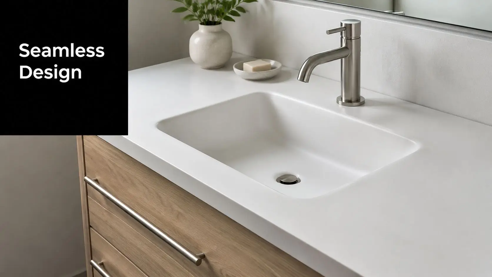
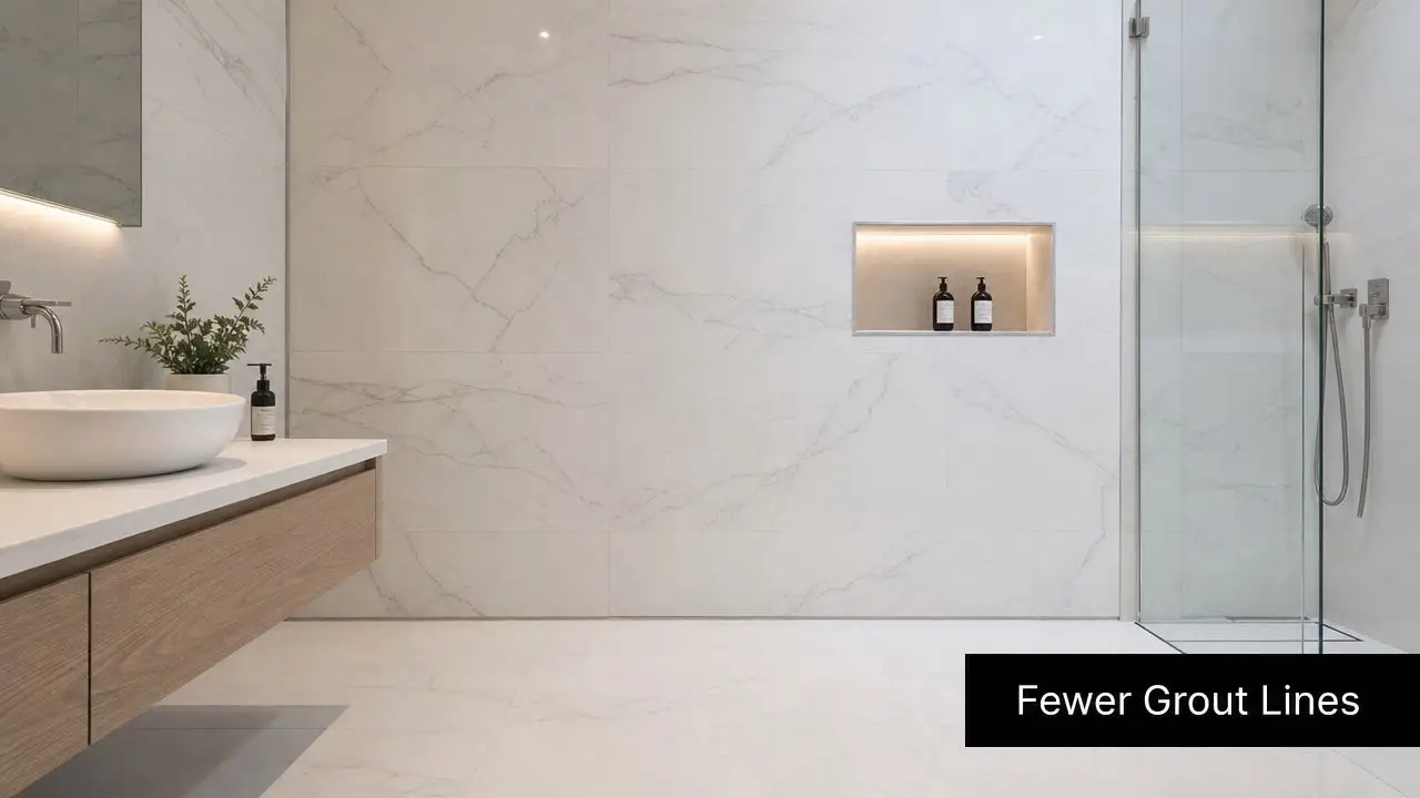
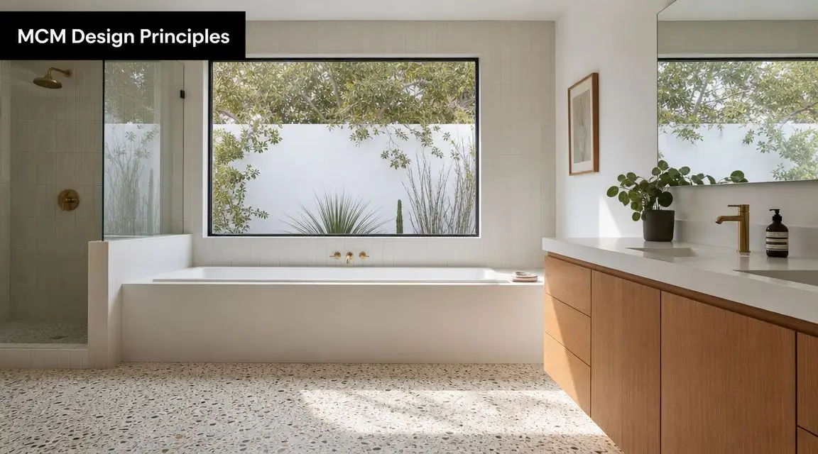
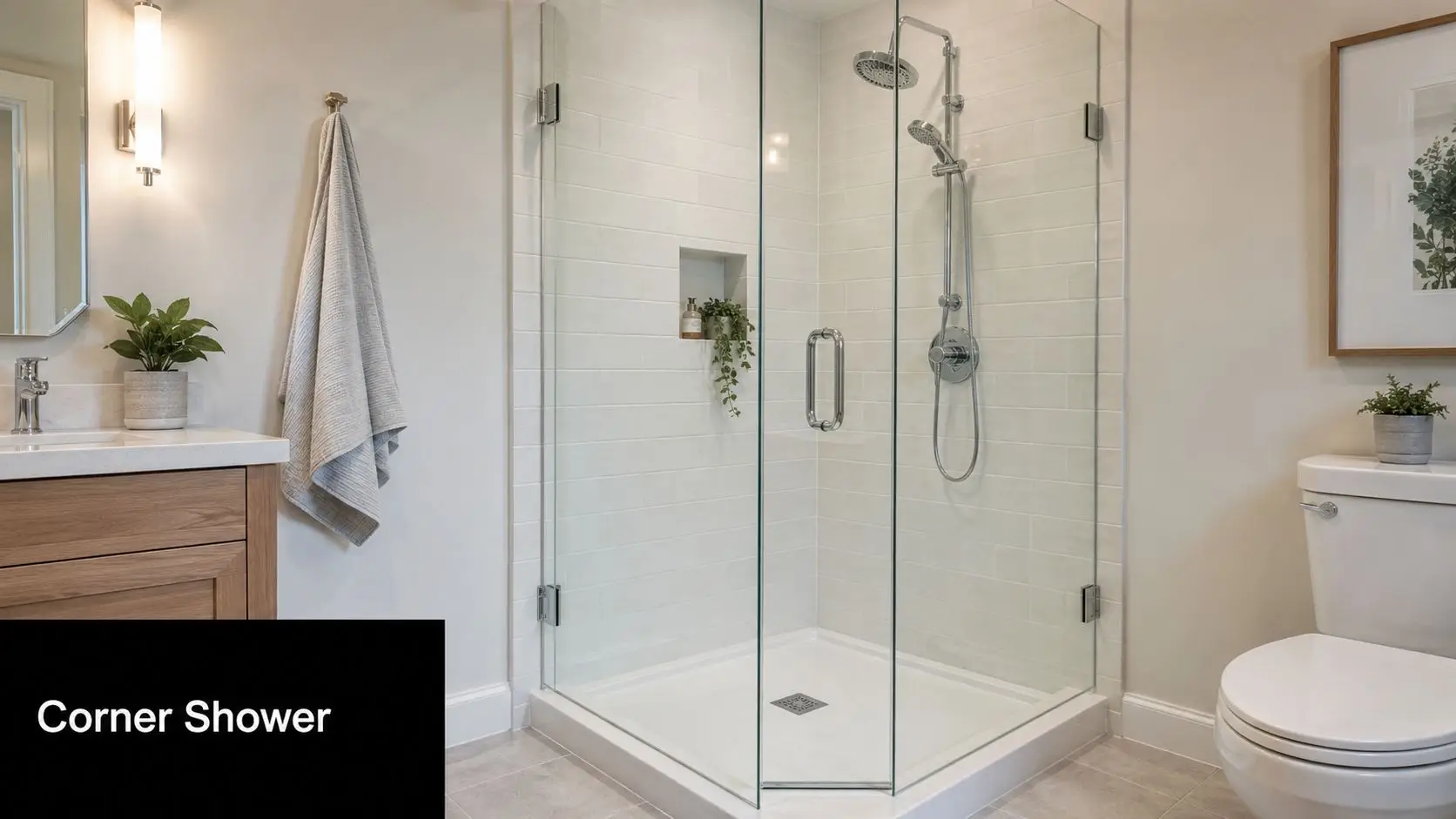
In bathrooms, modern bathrooms tend to work best when they stay visually simple. Cleaner tile lines, restrained colour palettes, and well-sized vanities usually age better than novelty features. In kitchens, simplicity often means better cabinet planning rather than more visible features.

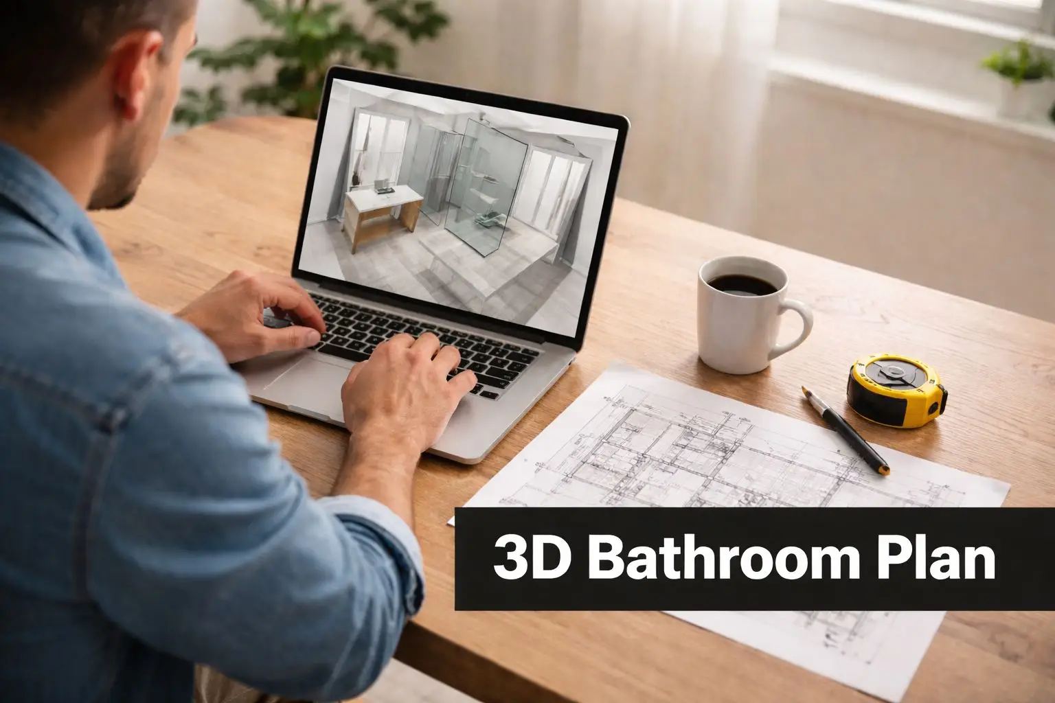
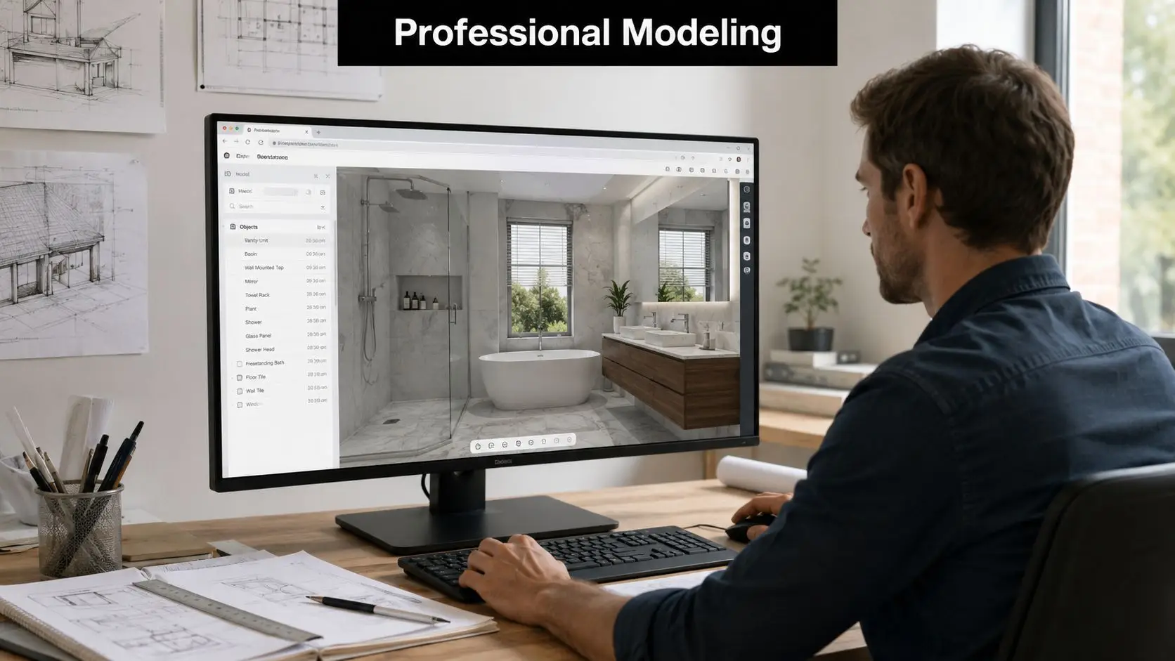
Why 3D design prevents expensive regret
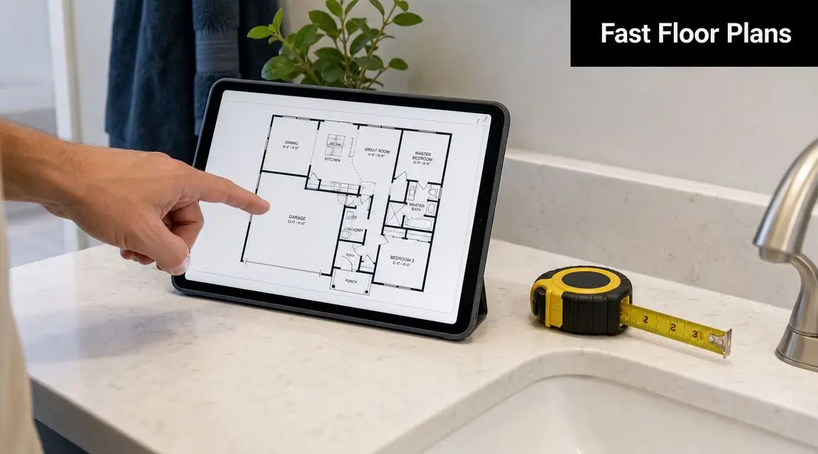
Most layout mistakes don't happen because people have bad taste. They happen because plans are hard to visualise at full scale. A vanity looks fine on paper until the door swing is wrong. A kitchen island seems generous until the walkway tightens. A niche sits neatly on elevation, then clashes with the actual tile setout.
That's why 3D design is so useful before demolition starts. It allows owners to test proportions, sightlines, finishes, and circulation before anyone removes a wall tile or disconnects a service.
You should be able to “walk” the room before you build it. If you can't picture how the space works, the design isn't resolved yet.
One option for that process is SitePro Bathrooms, which provides bathroom and kitchen renovation services in Melbourne and includes 3D design as part of project planning.
Designer bathrooms need discipline
Designer bathrooms aren't defined by price alone. They're defined by control. The tile layout aligns. The vanity depth suits the room. The lighting flatters without creating shadows. The storage is deliberate. The tapware placement makes sense.
What doesn't work is forcing high-end finishes into a poor layout. A premium basin won't fix a cramped entry. Statement tiles won't compensate for inadequate ventilation. If the room still traps moisture or feels awkward to move through, the design hasn't done its job.
Navigating the Renovation Process and Timelines
The construction phase feels chaotic when you only see the mess. It feels much more manageable when you understand the sequence.
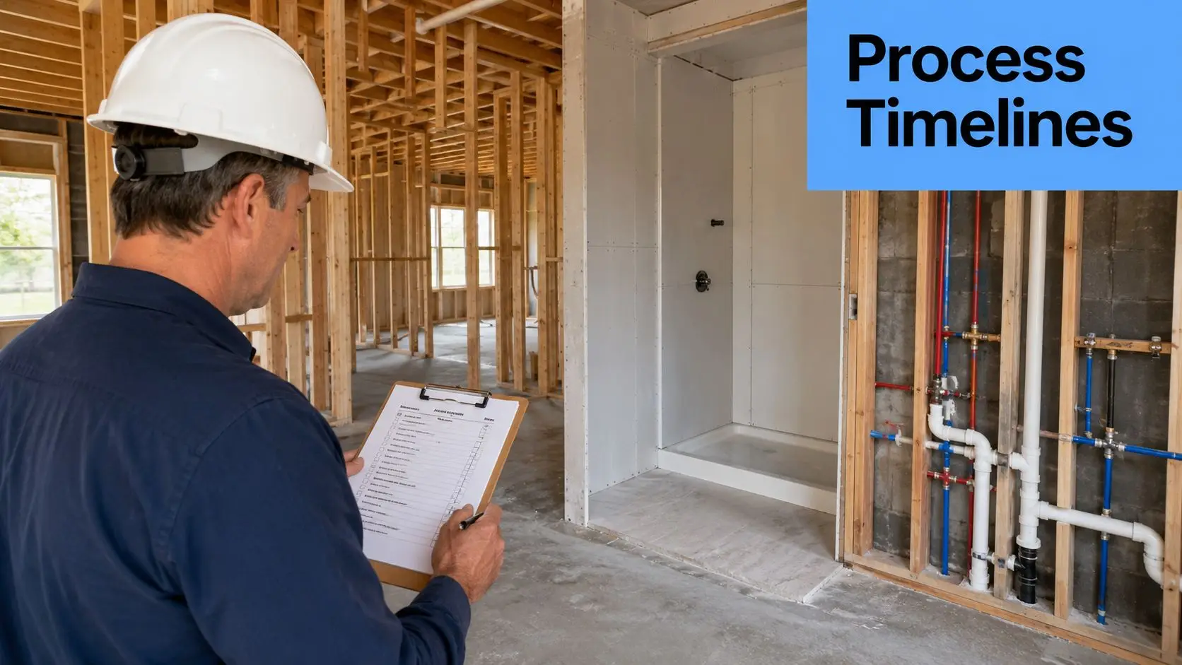
For a Melbourne bathroom renovation, the most defensible workflow comes from Australian renovation guidance on the bathroom renovation process. The sequence is clear: define the brief and budget, confirm the layout against the NCC and Australian Standards, complete demolition, then rough-in plumbing and electrical before waterproofing, tiling, fixture fit-off, and final inspection. That same guidance stresses that avoiding unnecessary plumbing relocation helps reduce cost blowouts, and that hidden items such as waterproofing, electrical upgrades, and asbestos removal should be budgeted early.
The order matters more in a combined project
When a kitchen and bathroom are renovated together, sequencing becomes tighter because the same trades often move between both spaces. That's where project management matters.
A well-run sequence usually follows this pattern:
-
Site protection and strip-out
Floors, access paths, and retained areas are protected before demolition begins. This is especially important in occupied homes and apartment buildings. -
Demolition and inspection of the opened-up structure
Once walls, tiles, cabinets, and fixtures are removed, the room's underlying condition becomes visible. Hidden damage, poor previous work, or service issues are often discovered during this phase. -
First-fix services
Plumbing and electrical rough-in happen before surfaces are closed up. In combined projects, this stage has to be coordinated carefully so kitchen and bathroom works don't obstruct each other. -
Waterproofing and substrate preparation
In wet areas, this is an essential stage. It has to be done correctly and in the right order. -
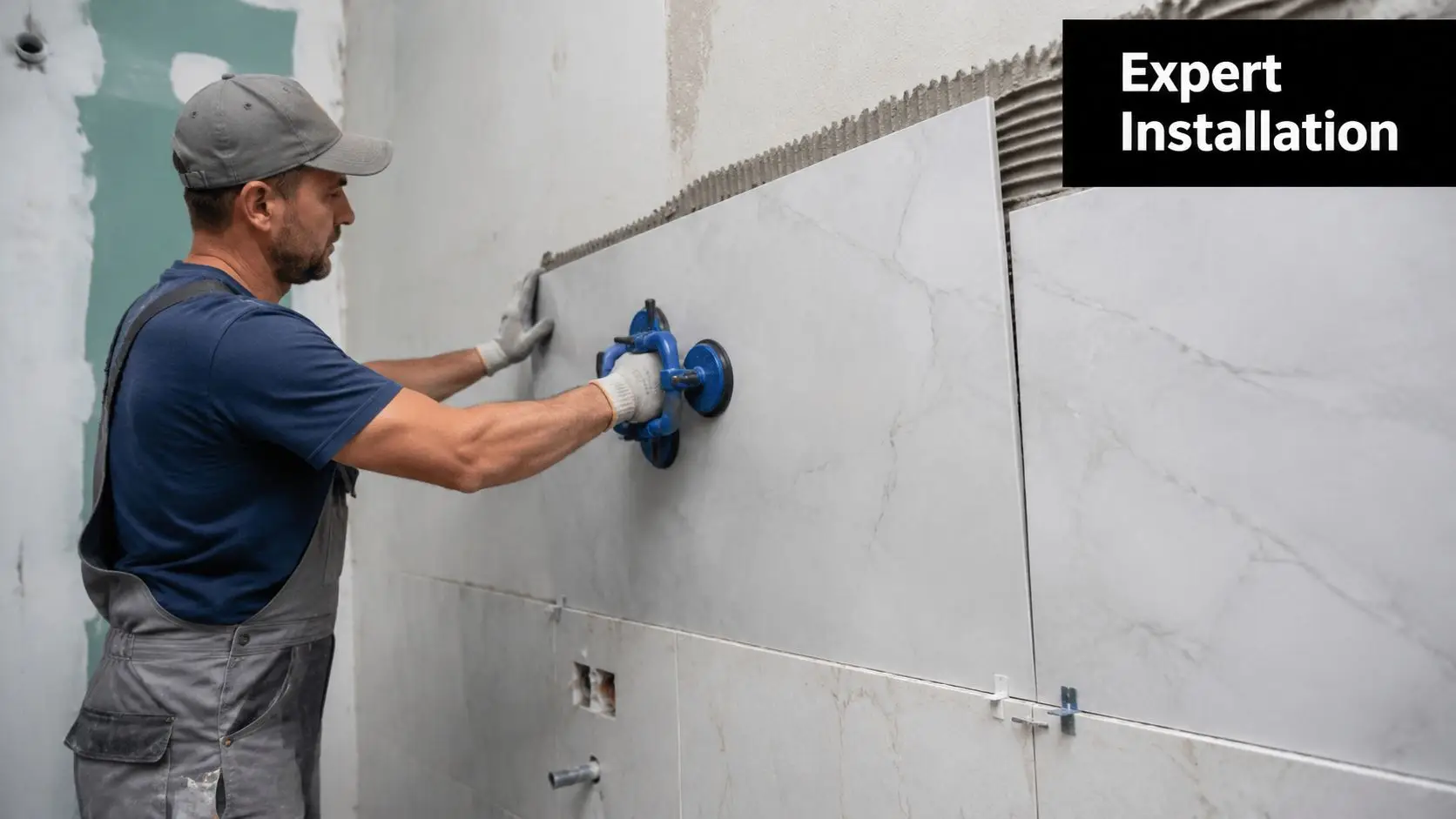
Tiling, cabinetry, and surface installation
Once base preparation is complete, the visible build starts to take shape quickly. -
Fit-off and final inspection
Tapware, basins, appliances, lighting, mirrors, and accessories are installed, checked, and adjusted.
What usually slows jobs down
Not every delay is avoidable, but most preventable delays come from poor decisions early.
Common causes include:
- Late selections: Tiles, appliances, and fittings that haven't been finalised before demolition.
- Unnecessary layout changes: Moving plumbing after plans were supposedly settled.
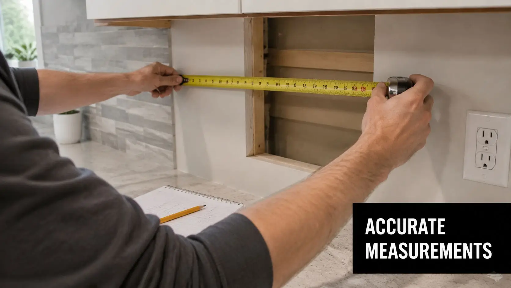
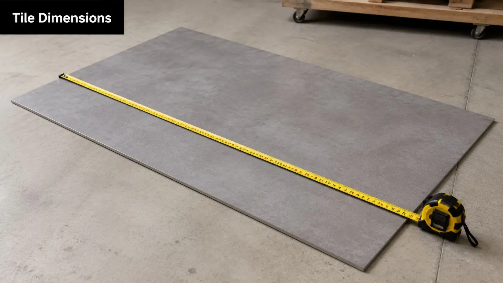
- Measurement errors: Vanity depth, appliance clearances, tile setout, and shower screen height must all be checked properly.
- Trade overlap issues: One unfinished stage holding up the next.
A renovation schedule only works when the design, selections, and service locations are resolved before trades arrive.
If you're trying to set realistic expectations around disruption, our guide on how long a bathroom remodel should take gives a useful framework for planning around access and downtime.
Choosing Your Team Trades and Permits Explained
Homeowners often focus heavily on design and budget, then leave the builder decision too late. That's backwards. The team you appoint determines how well the design is interpreted, how clearly the scope is priced, and how much risk gets managed before work begins.
A combined kitchen and bathroom renovation usually involves more than one trade working in close sequence. That means the quality of coordination matters almost as much as the quality of installation.

Why builder capability matters
If structural work, major reconfiguration, or broader compliance issues are involved, homeowners should understand what registered builders unlimited means in practical terms. It refers to a level of registration relevant to larger and more complex domestic building work. For projects with structural implications or substantial scope, that level of builder capability matters because the work needs to be managed within the right legal and technical framework.
Even where the job seems straightforward, kitchens and bathrooms carry concentrated risk. Water, power, ventilation, cabinetry, tiling, and finish tolerances all come together in a tight footprint. Poor supervision shows up fast in these rooms.
How to assess a quote properly
A quote should do more than name a price. It should help you see the scope.
Look for these signs of a usable proposal:
- Clear inclusions: Demolition, waste, preparation, waterproofing, fit-off, and finishing should be visible in the scope.
- Defined exclusions: If an item is not included, it should be stated.
- Trade responsibility: You should know who is handling plumbing, electrical, cabinetry, tiling, and final coordination.
- Allowance clarity: Prime cost items and selection-dependent items should not be buried.
Benchmark guidance from an Australian bathroom renovation breakdown indicates full bathroom renovations commonly take about three to six weeks and often fall in the $10,000 to $25,000 range, with complexity and layout changes pushing costs higher. That same example reported trade costs of about $8,860.76 inside a roughly $12,000 bathroom project, which is a useful reminder that labour can consume the majority of the budget when sequencing and specialist trades are involved.
Permits and approvals in Melbourne
Not every renovation needs the same approval path, but no owner should assume permits are irrelevant just because the project is internal.
Ask early about:
- Building permit requirements: Particularly where structural changes are proposed.
- Apartment or strata approvals: Access, waste handling, waterproofing obligations, and working hours can all be controlled.
- Compliance documentation: Waterproofing, plumbing, and electrical work need proper sign-off where required.
The safest projects are the ones where legal compliance and construction planning are treated as the same conversation, not separate admin tasks.
Frequently Asked Questions About Melbourne Renovations
Is it really better to renovate the kitchen and bathroom at the same time
Usually, yes, if both rooms already need work and you can fund the project properly. The main advantage isn't that every line item becomes cheaper. It's that the planning becomes more coherent.
You make one set of design decisions, run one site setup, and coordinate one trade schedule. For busy households, that often feels far more manageable than repeating disruption later.
Can we live in the home during the works
Sometimes. It depends on the layout, your tolerance for disruption, and whether you have another usable bathroom or a temporary kitchen setup.
Families often underestimate how tiring it is to live around demolition dust, trade access, shutoffs, and limited cooking facilities. If the property is compact, an apartment, or heavily used by children or shift workers, temporary relocation can be the simpler option even for a shorter project.
What's the advantage of using a builder with unlimited registration for a more complex renovation
The advantage is risk control. Where structural changes, significant reconfiguration, or larger domestic building scope are involved, that level of registration is relevant because it aligns with more complex project delivery.
It doesn't replace the need for good planning, clear documentation, or skilled trades. It does mean the job is being led within a framework suited to broader renovation responsibility.
How do I design a bathroom renovation to reduce mould, condensation, and waterproofing defects in Melbourne's older homes and apartments
This is one of the most important questions Melbourne homeowners can ask, and it's still under-discussed.
An Australian-facing review of Melbourne renovation needs points to waterproofing, ventilation, and moisture-risk management as a major gap in existing renovation content. It also notes that the 2021 Census shows Victoria had 9.3% of occupied private dwellings in apartments, flats or units in Greater Melbourne, which makes shared-wall and bathroom moisture issues a practical planning constraint.
What works in real projects is a prevention mindset:
- Prioritise ventilation early: Don't leave fan choice and exhaust path until the end.
- Design for drying: Reduce unnecessary moisture traps and make surfaces easier to ventilate and clean.
- Treat waterproofing as a system: The membrane matters, but so do substrate condition, junctions, penetrations, and sequencing.
- Respect the building type: Older homes may have movement, uneven walls, and previous patch repairs. Apartments may impose stricter constraints on penetrations, noise, access, and waste.
Better moisture control often adds more long-term value than simply upgrading visible finishes.
Are new bathroom ideas always worth following
Only if they improve how the room functions. Some trends translate well into everyday use. Others look good in photos and become annoying in practice.
The best new bathroom ideas usually solve a real problem. Better storage. Cleaner lines. Easier maintenance. Improved movement. More light. If a feature doesn't help the room work better, it's worth questioning before you pay for it.
What should we lock in before demolition starts
These decisions should be settled as early as possible:
- Layout and fixture locations
- Tile selections and setout direction
- Vanity and cabinetry dimensions
- Appliance and service requirements
- Lighting positions
- Access and protection plan for the rest of the house
The more complete those decisions are before strip-out, the smoother the build tends to run.
A combined kitchen and bathroom renovation in Melbourne can be one of the most rewarding upgrades you make to your home. It can also become expensive and frustrating if the project starts with vague scope, unrealistic allowances, or unresolved layout decisions. The households that get the best result usually do the same few things well. They plan early, price transparently, choose a capable team, and treat design, compliance, and construction as one connected job.
If you're weighing up bathroom renovations, a kitchen rework, or a coordinated full update, start with the rooms you use hardest and the problems you're most tired of living with. The right renovation plan fixes both.