8 Small Bathroom Renovation Ideas for 2026
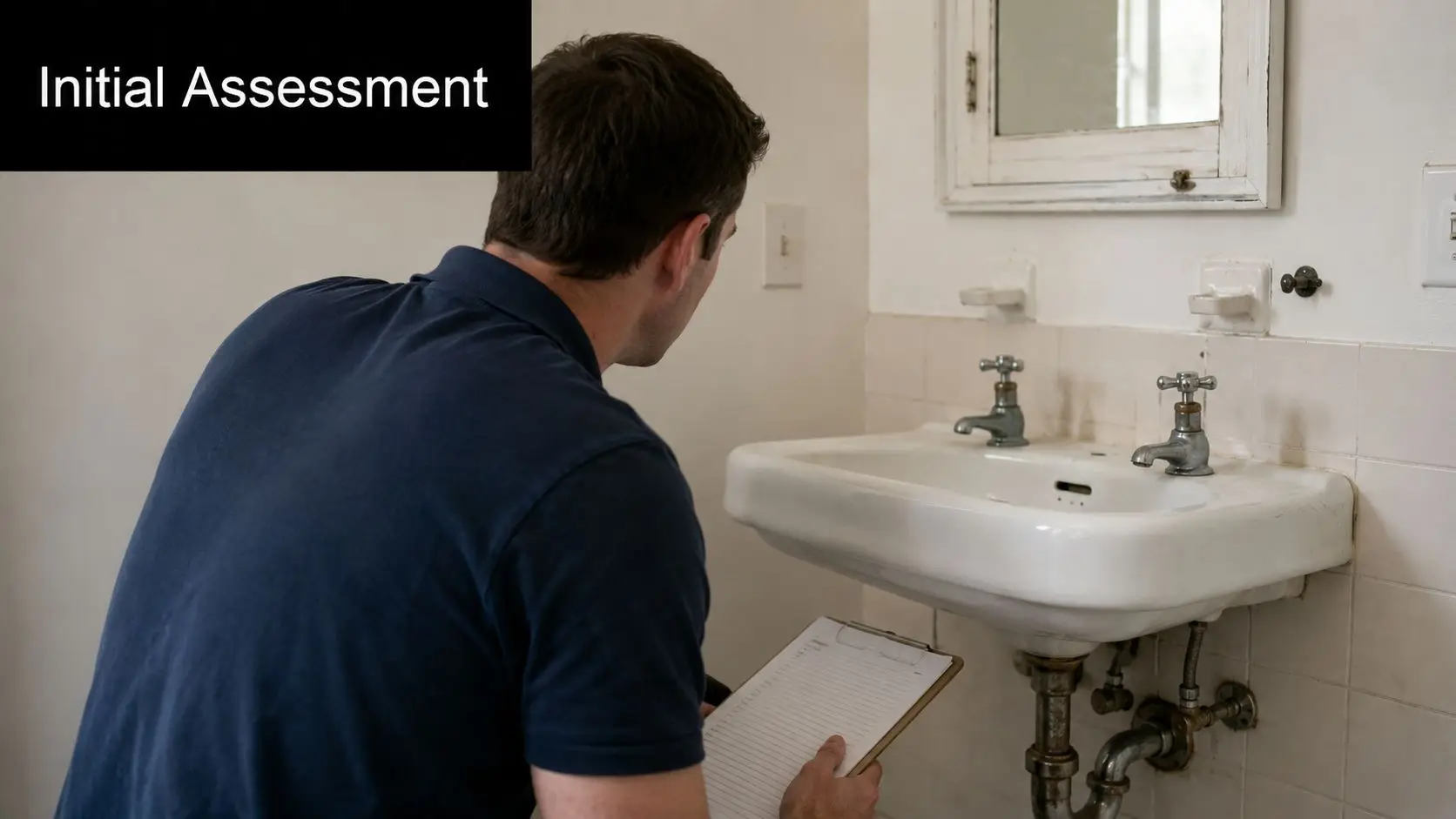
Struggling with a cramped, outdated bathroom right now? You're not alone, especially in a market like Australia where compact bathrooms often have to do more work in less space. The 2021 Census recorded about 10.85 million private dwellings nationally, and the ABS reported that around 70% were separate houses (ABS data discussed in renovation guidance), which is exactly why so many bathroom renovation conversations start with ensuites, powder rooms, and secondary bathrooms that need sharper planning rather than bigger footprints. In places like Highett, Victoria, that usually means making every fixture, tile choice, and storage decision count.
The best small bathroom renovation ideas are rarely about adding more stuff. They're about choosing pieces that free up floor area, improve circulation, and make the room easier to use every day. In compact Australian bathrooms, that also means balancing style with moisture control, waterproofing, and compliance, because the National Construction Code keeps evolving and Victorian waterproofing rules treat some bathroom work as regulated building work (NCC and VBA context). Good design in a small room isn't decorative first, it's practical first, then beautiful.
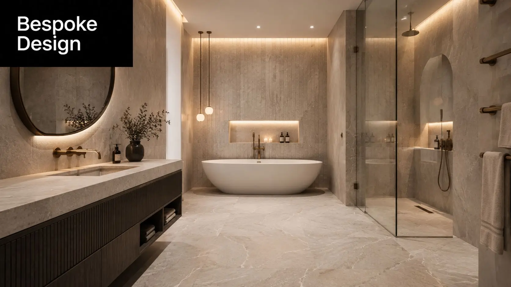
1. Wall-Mounted Fixtures and Floating Vanities
Wall-mounted fixtures change the feel of a small bathroom fast. A floating vanity, wall-hung toilet, and wall-mounted basin lift visual weight off the floor, so the room feels cleaner and less crowded. In compact bathrooms, that open floor line also makes cleaning simpler, which matters more than people expect once the space is in daily use.
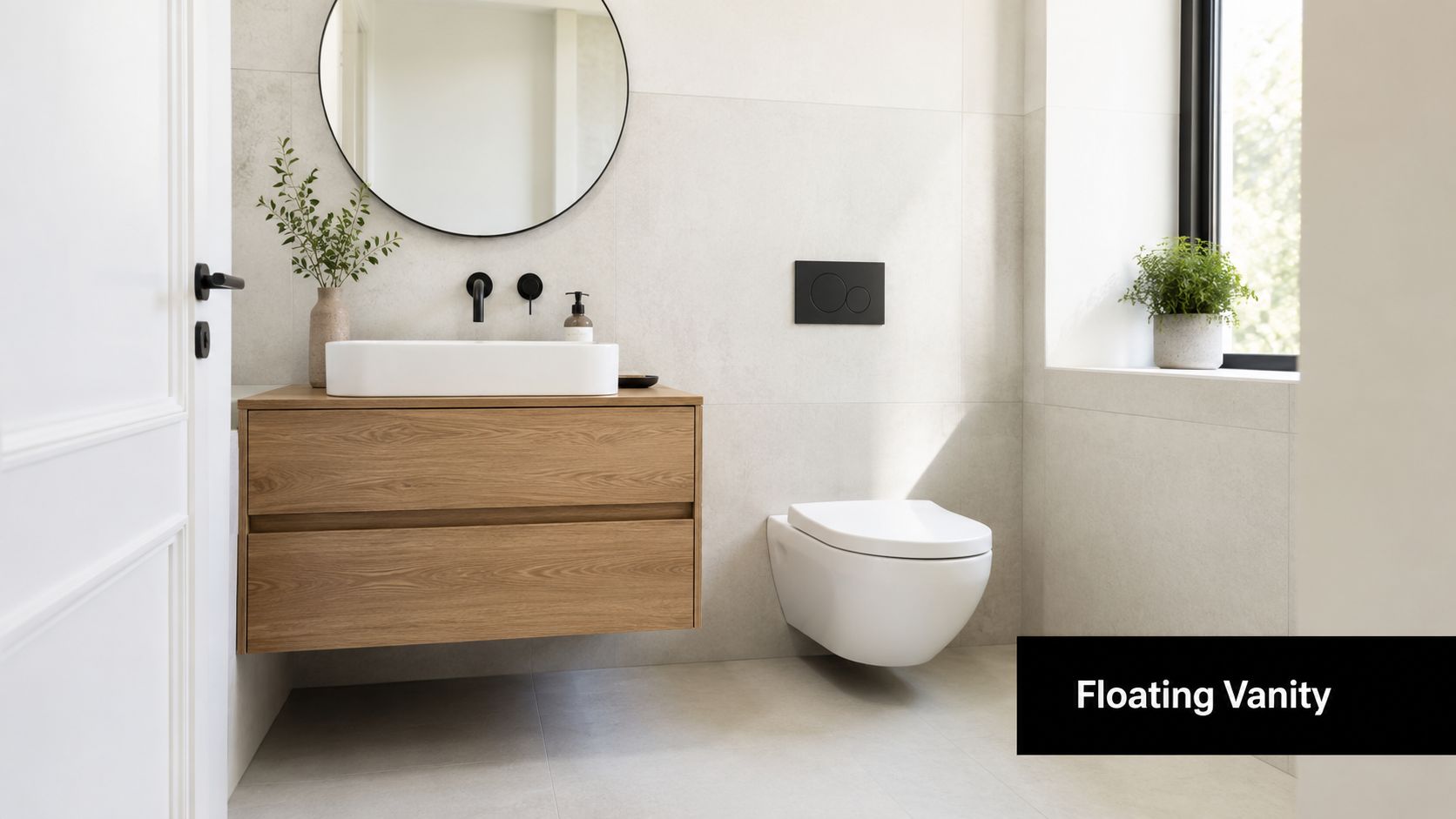
The best versions don't just look light, they work hard. I've seen Victorian homes in and around Melbourne transformed with natural oak floating vanities, while newer Highett bathrooms often suit white lacquered units with integrated lighting. If the vanity is too shallow or has wasted internal space, the room still feels cramped even if it looks modern.
Practical rule: don't choose a wall-hung unit just for the style. It needs proper framing support, planned plumbing routes, and a vanity design that gives back usable storage.
A good renovation team will check the wall structure before installation, because the fixture weight and plumbing position matter. For small bathrooms, I prefer vanities with drawers over open cavities, since drawers keep daily items organised without forcing you to bend into dark under-sink space. Moisture-resistant finishes, like engineered wood or stone, also hold up better in compact rooms where steam hangs around longer.
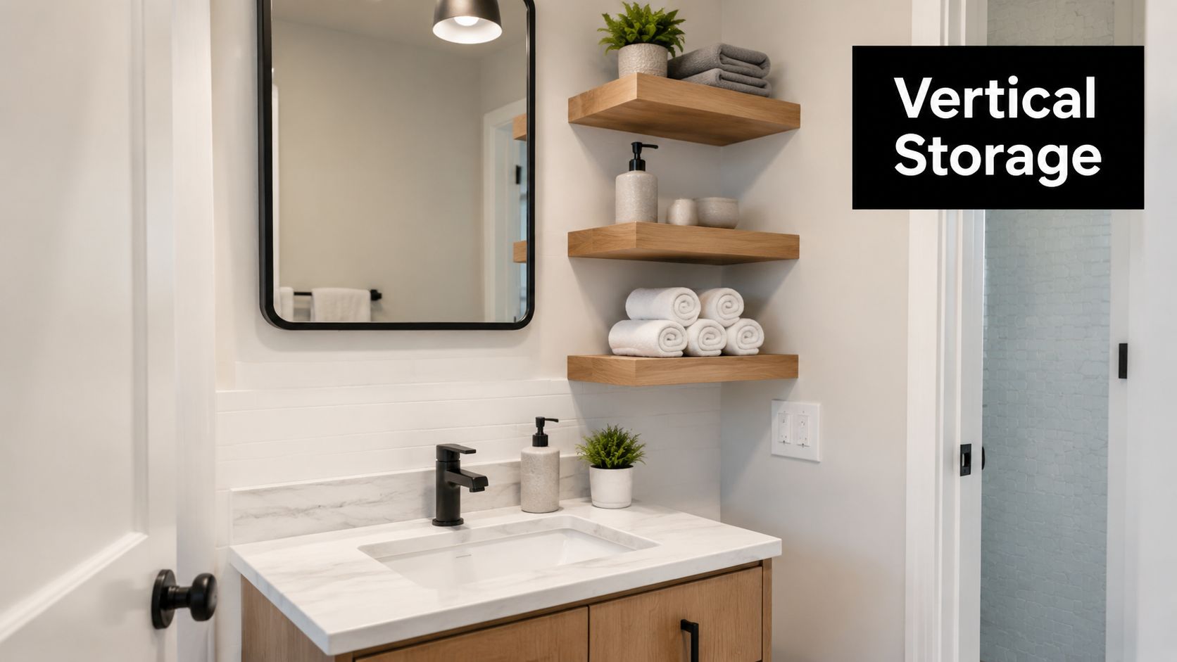
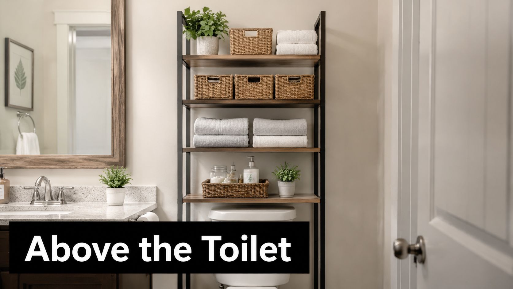
2. Smart Storage Solutions and Vertical Organisation
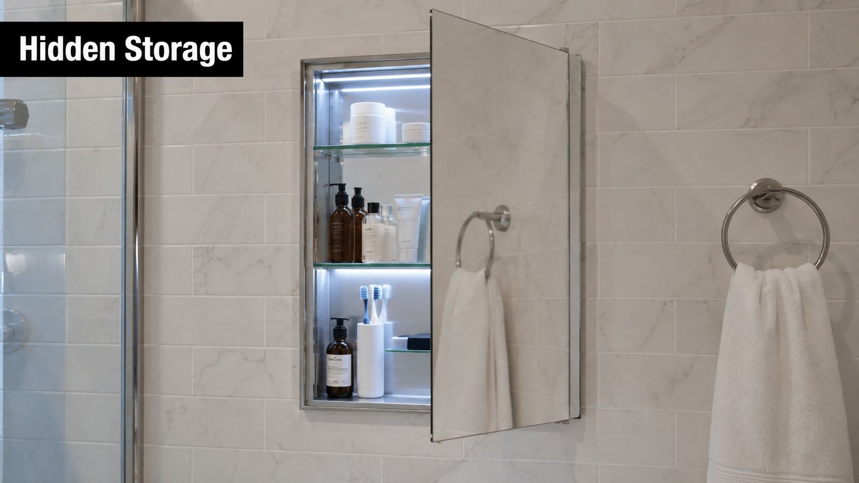
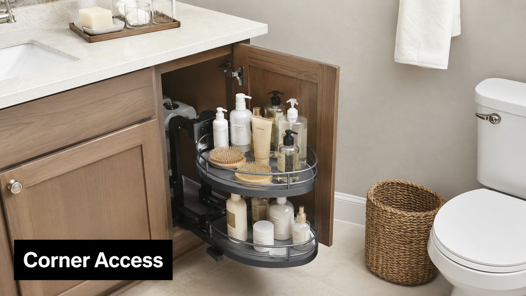
Storage is where many small bathrooms go wrong. People add a vanity, maybe a mirrored cabinet, and then wonder why the bench still looks cluttered. The answer is usually vertical planning, because the walls in a small bathroom are often the only spare real estate left.
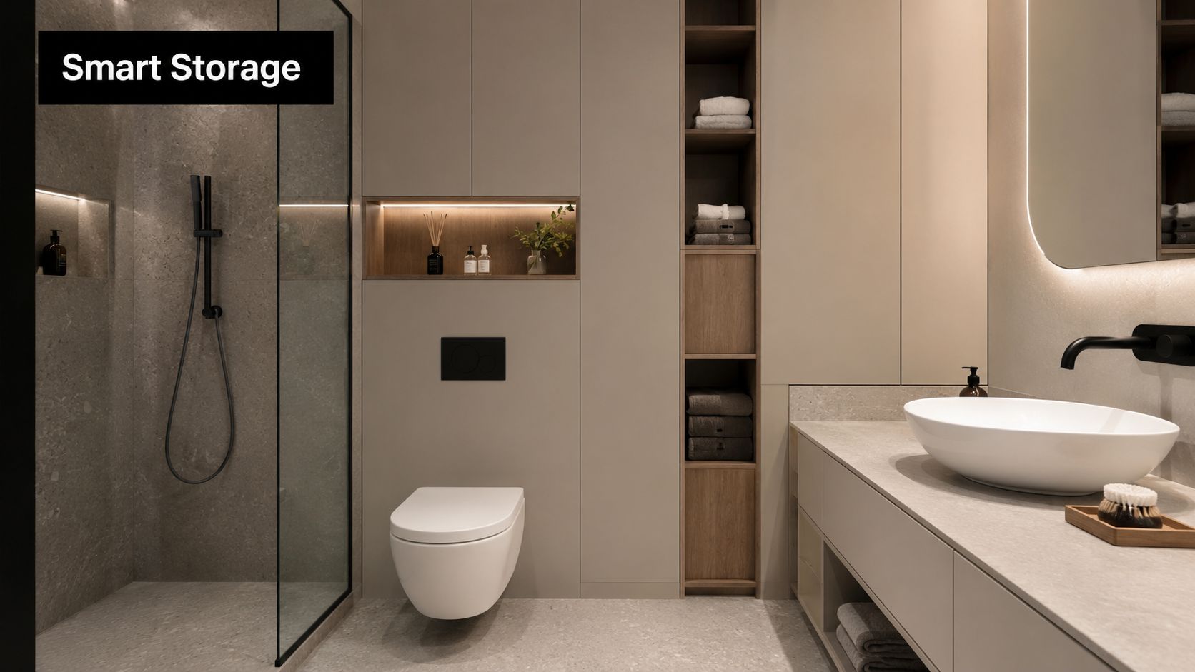
Tall cabinetry, recessed niches, and mirrored shaving cabinets all help, but only if they're placed with circulation in mind. In compact Highett ensuites, floor-to-ceiling cabinets in matte grey can work well when the room has one clear storage wall, while family bathrooms often suit integrated corner niches for toiletries. The trick is not to store everything, it's to store the right things where they're easy to reach.
SitePro Bathrooms' small bathroom storage ideas is a useful reference point if you're weighing recessed cabinetry against freestanding options.
A few choices tend to work best in real projects:
- Recessed medicine cabinets: These preserve wall depth, so you gain storage without stealing passage space.
- Pull-out organisers: They make deep cupboards usable instead of turning them into black holes.
- Open shelving in moderation: Good for towels or display, poor for clutter if the room already feels busy.
- Moisture-resistant finishes: Non-negotiable in wet areas, because cheap boards swell and age badly.
A 3D design preview helps here because storage mistakes are hard to undo after tiling. If a cabinet door clips the shower screen or blocks towel movement, the whole room feels tighter than it should.
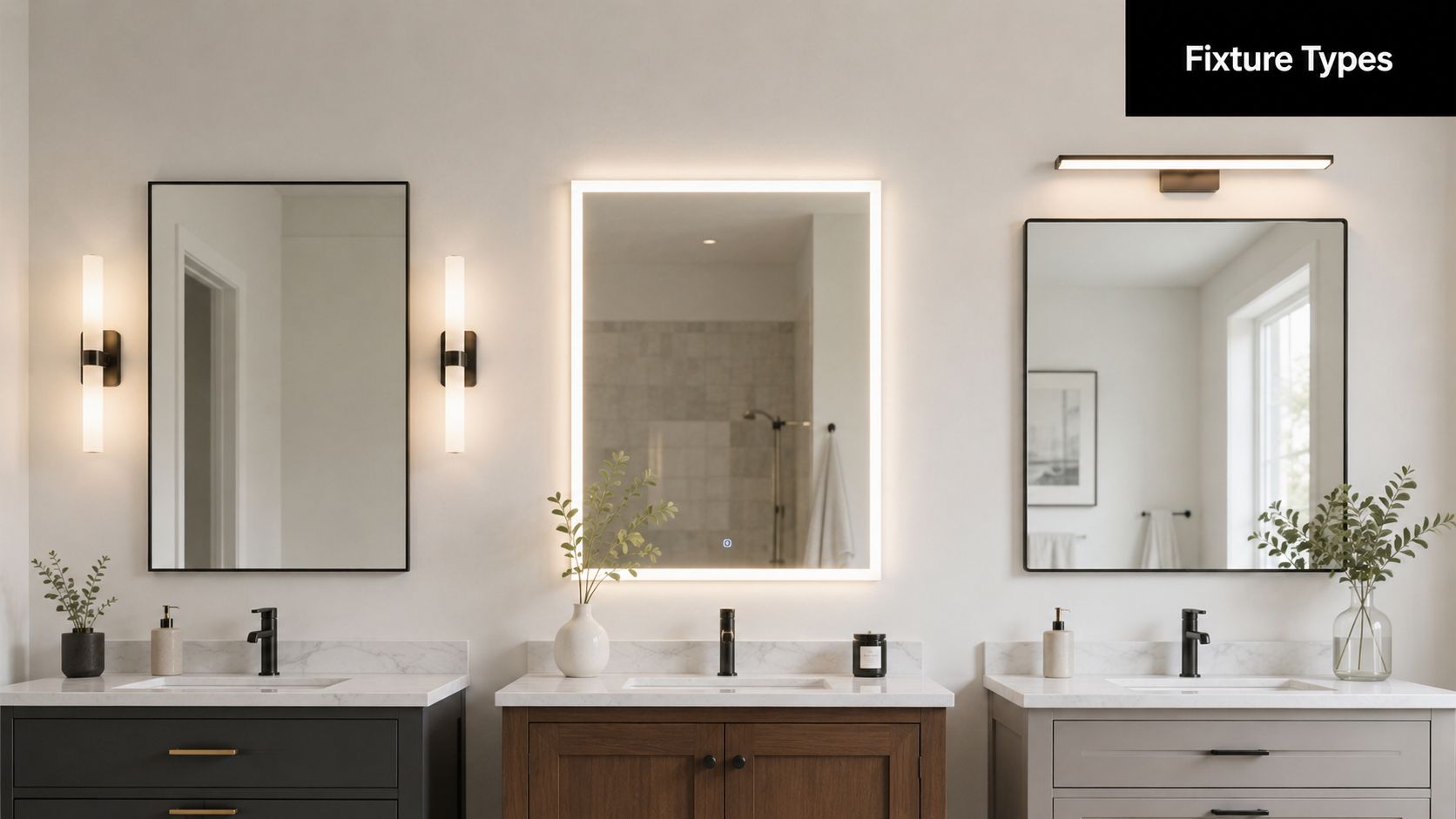
3. Light and Mirror Strategies for Space Enhancement
A small bathroom can feel bright and open, or cramped and uneven, depending on how the light is planned. Natural light helps, but most compact bathrooms in Australian homes still need layered artificial lighting to carry the room through daily use. Overhead light, task lighting, and accent light should be planned together from the start, because each one affects how the space reads and how easy it is to use.
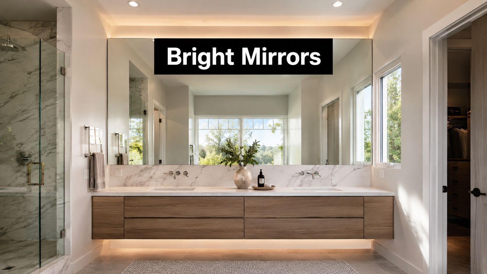
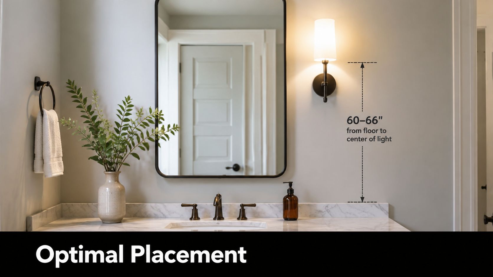
Mirrors are the quickest way to make a room feel larger, but the result depends on where they sit. A large mirror placed opposite a window can pull daylight deeper into the room, while a backlit mirror adds practical task lighting without crowding the wall. For homeowners weighing designer bathrooms against purely functional layouts, this combination often gives the best visual return because it widens the vanity zone without changing the floor plan.
If you want a more detailed look at mirror options, our LED-backlit bathroom mirrors guide covers the kinds of setups that suit compact spaces and everyday use.
Large mirrors work best when they're paired with even lighting. A bright mirror over a dim vanity still feels underdone.
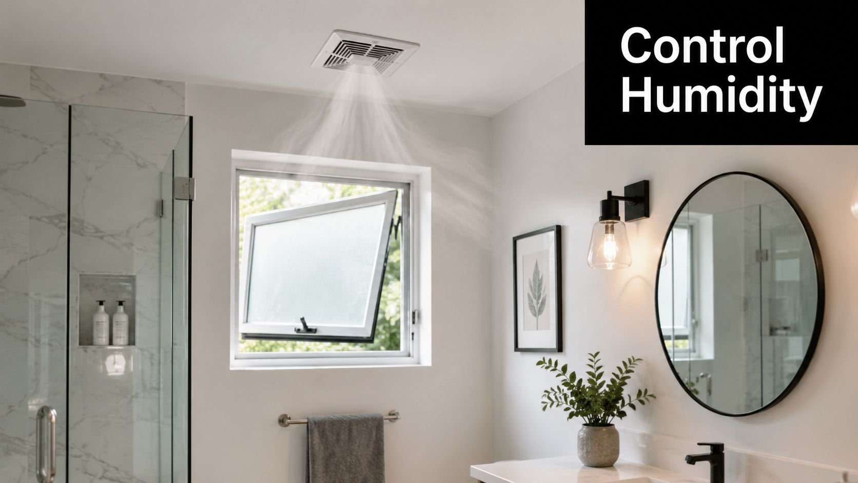
Dimmers are worth including in small bathrooms because morning grooming and evening bathing need different light levels. Frosted or matte mirror finishes can reduce glare, which matters when reflective surfaces are already doing a lot of visual work. In Highett and across Victoria, exhaust and lighting should be planned together, because moisture builds up quickly in compact rooms and can affect both clarity and comfort.
A clean palette helps the lighting do more work. White ceilings, light wall colours, and reflective tile finishes bounce light well, but they need balance so the room does not feel flat. The strongest modern bathrooms usually combine brightness with some texture, so the space feels open without losing depth.
4. Compact and Corner-Integrated Fixtures
A small bathroom often feels larger once the fixtures stop fighting the layout. Compact basins, corner showers, and reduced-projection toilets can return circulation space that standard fittings take away, which helps in tight ensuites, apartment bathrooms, and older homes with awkward dimensions.
The layout still has to be measured with care. A toilet that sits closer to the wall can improve movement through the room, but if the basin is too small, everyday use becomes frustrating because water splashes further and bench space disappears. In Highett ensuite renovations, I've seen corner basins make good use of dead space, while sliding glass shower screens keep family bathrooms easier to move through where a hinged door would get in the way.
If a fixture saves space but makes cleaning or access harder, it is usually the wrong choice.
Brand selection still matters, but the name on the box should never drive the plan. Homeowners often prefer established Australian plumbing brands because they want parts availability, service support, and fittings that are familiar to local installers. Wall-mounted basin taps can also free up bench space, provided the wall cavity and plumbing layout are decided early enough for the builder and plumber to coordinate properly.
This is one of the places where professional 3D design pays off. A compact room can look fine on a sketch and still feel awkward once the vanity door swings into the shower line or the toilet clearance feels tight. SitePro Bathrooms uses that planning stage to test fixture sizes, corner placement, and access before work starts, which helps avoid costly changes once the build is underway.
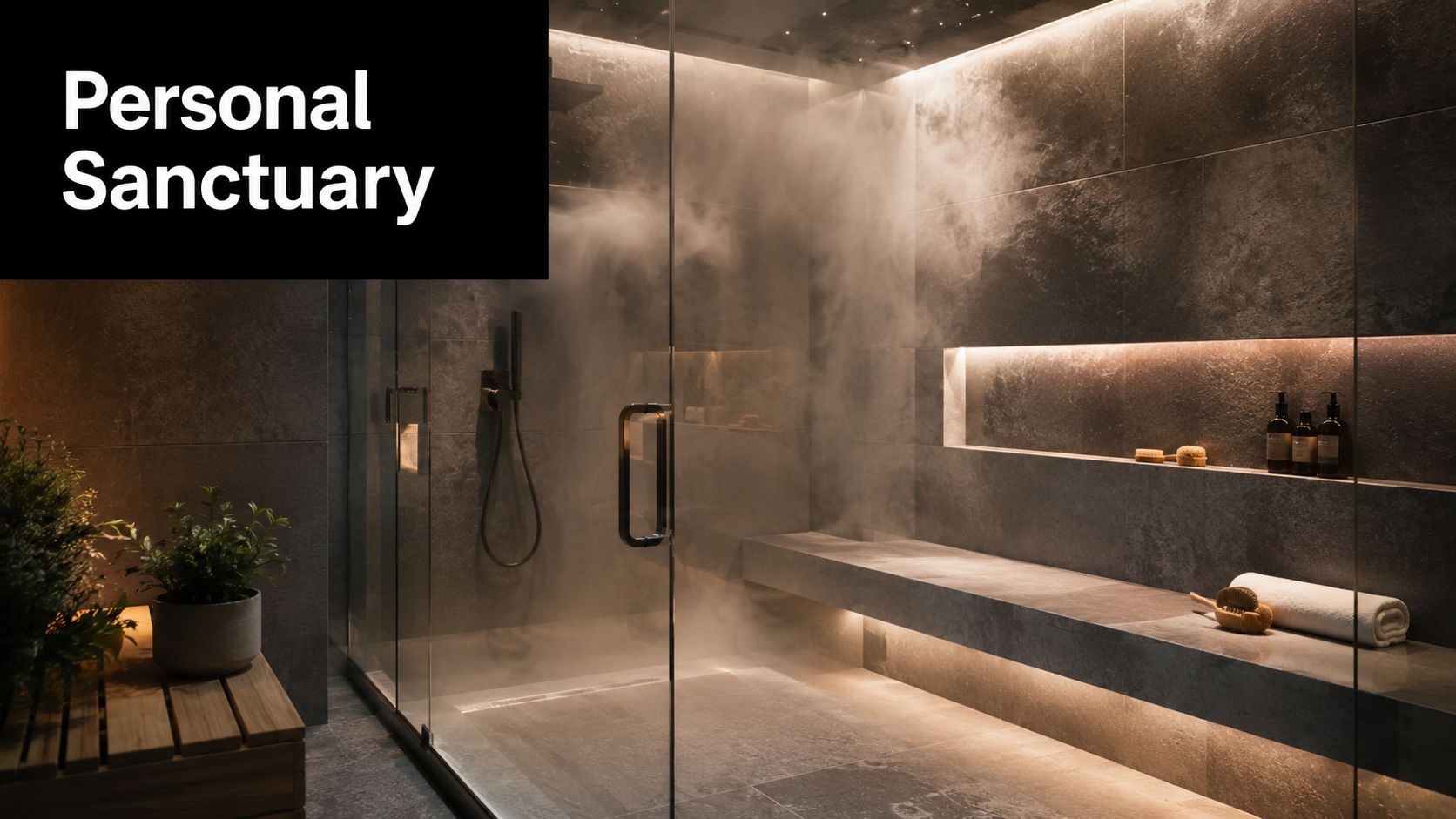
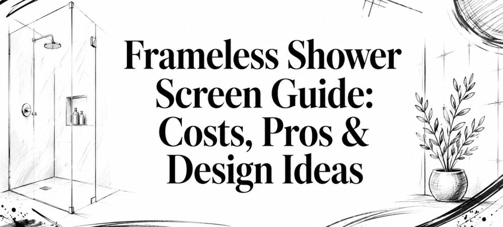
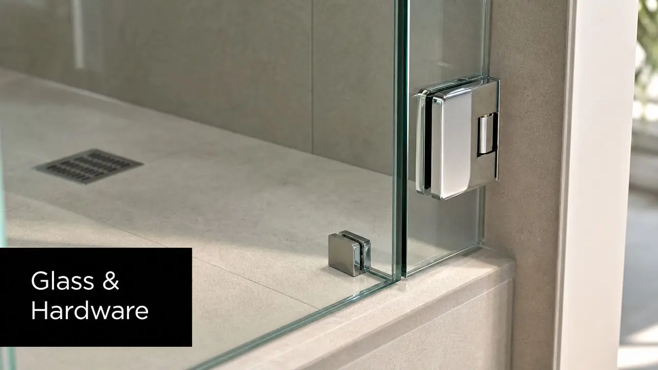
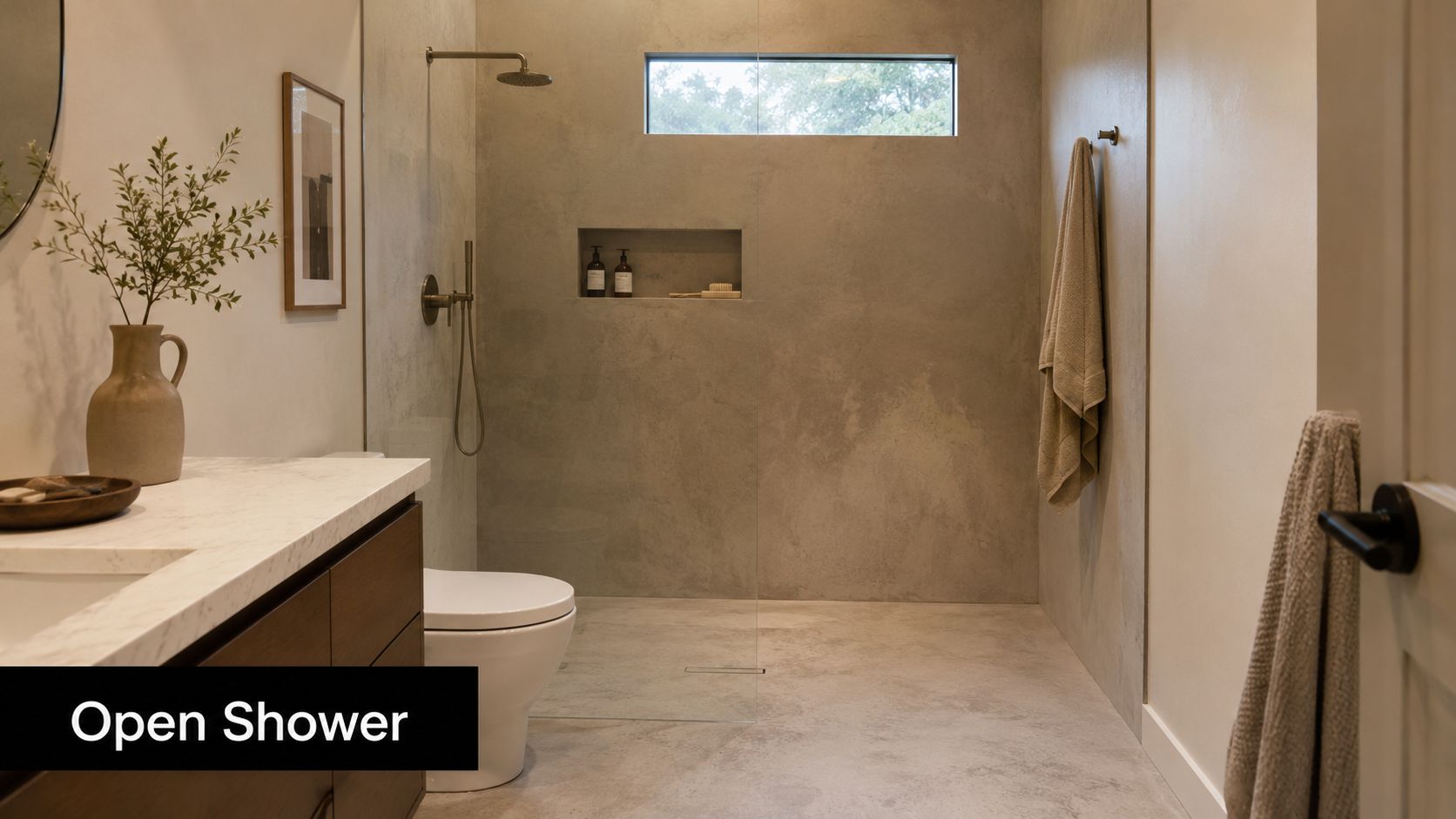
5. Open Shower Designs and Frameless Enclosures
A tight bathroom can feel larger straight away when the shower stops breaking up the room. Open showers reduce visual clutter, and frameless glass keeps sightlines clear so the space reads as one continuous area. In a compact layout, that effect matters as much as the actual footprint, because every hard edge can make the room feel more boxed in.
SitePro Bathrooms' frameless shower screen guide is a useful starting point if you are choosing a screen for a small bathroom and want to weigh the practical differences before you commit.
The construction still has to be planned properly. Water needs a controlled path to the drain, so floor fall, waterproofing, and sealing must be coordinated from the start. The Victorian Building Authority and NCC context is important here, because waterproofing requirements and bathroom access rules mean this is a build sequence, not a styling decision (Victorian Building Authority and NCC context).
For a compact wet area, these details shape the result:
- Proper floor fall: Water moves to the drain instead of sitting in low spots.
- Quality waterproofing membrane: Protects the structure over the long term.
- Thicker frameless glass: Gives better stability in daily use.
- Non-slip flooring: Helps reduce slip risk in a wet zone.
- Ventilation planning: Limits condensation and the mould issues that follow.
I've found open showers suit homeowners who want a clean, contemporary finish and less visual division in the room. They also make cleaning easier because there is less hardware to collect soap residue and grime. If you are planning a wet-room style bathroom in Highett, a registered builder should be involved early so the drainage, waterproofing, and tiling sequence is set before work starts, not guessed at on site.
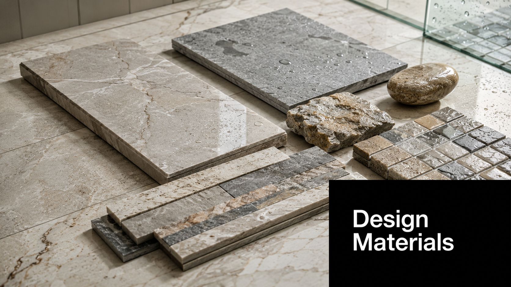
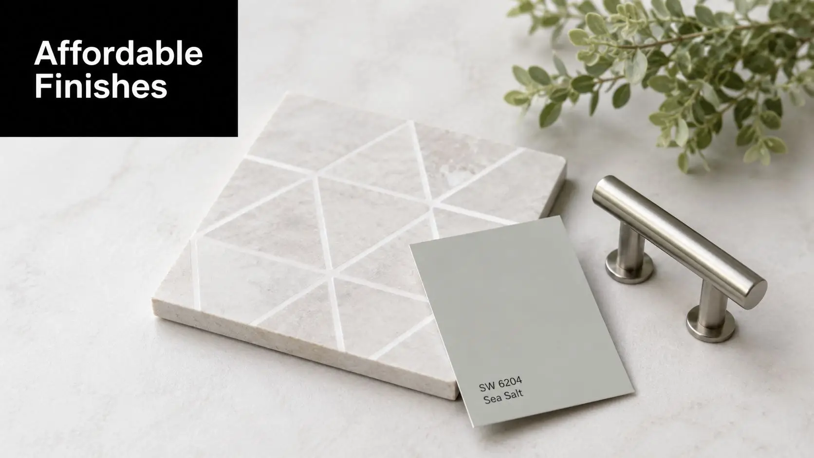
6. Neutral Color Palettes and Visual Continuity
Neutral palettes work because they let the eye move without interruption. In a small bathroom, every hard contrast can make the room feel chopped up, while a coordinated palette ties the walls, floor, vanity, and fixtures together. That visual continuity is one of the simplest ways to make a compact room feel calmer and larger.
The best results usually use whites, warm greys, greige, taupe, or soft ivory tones rather than harsh, cold shades. A Highett bathroom with white subway tiles, a timber vanity, and soft grey walls can feel modern without looking sterile. Similarly, pale cabinetry paired with large-format porcelain tiles creates fewer grout lines, which helps reduce visual noise.
Texture still matters. A room built entirely from plain surfaces can feel flat, so add variation through stone, textured tile, brushed metal, or timber accents. I prefer warm neutrals over icy ones in most Australian homes because they usually sit better with natural light and make the room feel more liveable.
A few design moves usually help:
- Large-format tiles: Fewer grout lines, cleaner visual flow.
- Matched undertones: Keep paint, cabinetry, and tile tones compatible.
- Subtle contrast: Use one darker accent, not many competing ones.
- Textured finishes: Bring depth without breaking the palette.
You'll get the cleanest result when the palette is decided before construction starts. That's where detailed 3D design helps, because colour combinations that seem fine in a store can look quite different once they're sharing a small room with mirrors, light, and moisture.
7. Multifunctional Fixtures and Space-Saving Innovations
Multifunctional fixtures make sense in small bathrooms because they reduce the number of separate items competing for space. A combined bidet-toilet unit, a shower-bath hybrid, or a smart mirror with integrated storage can all pull double duty. In a compact room, that can be the difference between a layout that feels efficient and one that feels overcrowded.
The trade-off is complexity. The more functions a fixture combines, the more important warranty support, servicing access, and installation quality become. That's why I'd only specify a system like this when the owner is comfortable with the controls and the bathroom can support the electrical and plumbing requirements from the start.
Choose multifunctional pieces for function first. If they're clever but hard to service, they stop being clever very quickly.
For a practical renovation, think about how the room is used every day. A compact vanity with concealed storage may matter more than a high-tech mirror. A heated towel rail with a storage-friendly placement can be more useful than another decorative feature, especially in a small room where damp fabrics are a constant annoyance.
If you're considering these ideas in a renovation, document what each fixture does and how it will be maintained. That helps future servicing and avoids confusion if you ever need parts, repairs, or upgrades later. In small bathrooms, the best innovations are usually the ones that simplify life, not complicate it.
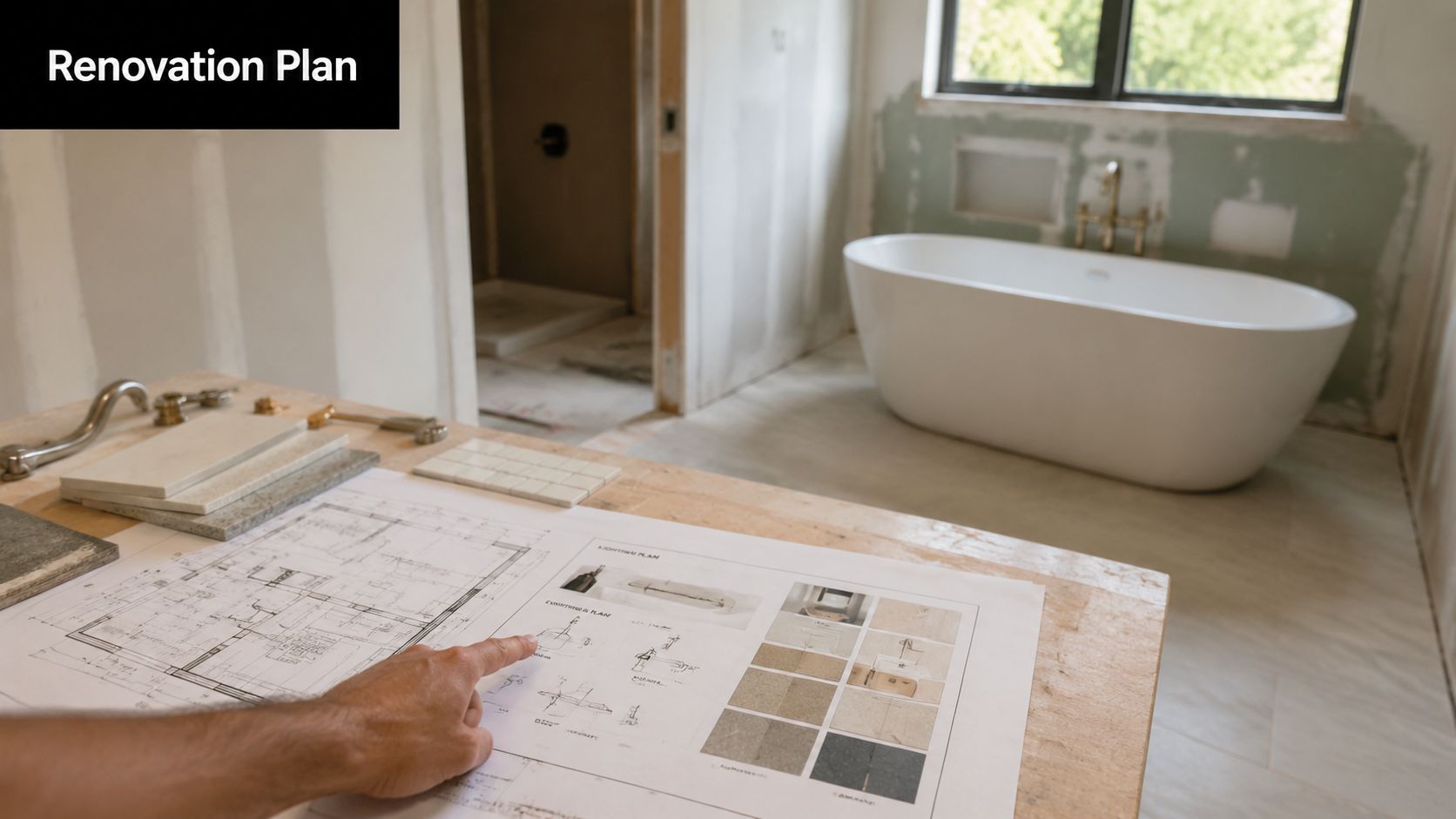
8. Professional Design and Planning Services for Optimal Space Utilisation
Professional planning is the difference between a bathroom that merely fits and one that works. In small bathrooms, there's very little room for error, so fixture placement, waterproofing, electrical points, and storage all need to be mapped before construction begins. That's especially true in Highett, Victoria, where homeowners often want the finish quality of designer bathrooms without wasting money on avoidable rework.
A detailed 3D design is one of the best tools available because it shows circulation, line of sight, and storage conflicts before a single tile is laid. It also helps homeowners compare layout options when they're deciding whether to keep plumbing in place or justify a change. For many compact projects, layout preservation is the smartest budget decision because the biggest costs are tied to labour, waterproofing, tiling, plumbing, and electrical work rather than the materials alone.
That's why working with registered builders unlimited matters. Small bathrooms are regulated spaces, and the wrong sequence can create compliance issues, leaks, or costly do-overs. A good builder coordinates the first fix, second fix, and finishing stages so the shower height, vanity position, and tile line all land where they should.
A well-run planning process usually includes:
- Clear scope definition: Decide what matters most before work starts.
- 3D renderings: Test the room visually and practically.
- Budget alignment: Keep scope realistic for the space.
- Builder coordination: Make sure trades don't clash.
- Approval checkpoints: Confirm key choices before installation.
SitePro Bathrooms fits naturally. The company is based in Highett and focuses on bathroom renovations with end-to-end project coordination, which suits homeowners who want a structured process rather than piecemeal decision-making. For a small bathroom, that kind of planning support can save time, reduce stress, and deliver a better result.
8-Point Small Bathroom Renovation Comparison
| Design solution | Implementation complexity | Resource requirements | Expected outcomes | Ideal use cases | Key advantages |
|---|---|---|---|---|---|
| Wall-Mounted Fixtures & Floating Vanities | Medium–High (structural reinforcement, plumbing reroute) | Carpenter/framer, plumber, electrician, moisture‑resistant materials, higher‑cost fixtures | More visible floor space, easier cleaning, modern look, improved accessibility | Small bathrooms, accessibility upgrades, contemporary remodels | Frees floor area, visual openness, flexible under‑vanity storage |
| Smart Storage & Vertical Organization | Low–Medium (planning, some in‑wall work for recessed units) | Joiner/cabinet maker, shelving, integrated lighting, design planning (3D helpful) | Significantly increased storage, decluttered surfaces, better organization | Family bathrooms, renters, spaces with limited floor area | Maximizes vertical space, customizable organization, keeps counters clear |
| Light & Mirror Strategies | Low–Medium (electrical work, mirror installation) | Electrician, quality mirrors/LED fixtures, ventilation upgrades | Perceived larger space, improved task lighting, energy savings | Any small bathroom needing visual expansion or low‑cost upgrade | Optical enlargement without structural changes; energy‑efficient lighting |
| Compact & Corner‑Integrated Fixtures | Low–Medium (fixture selection, standard plumbing) | Plumber, compact fixture suppliers, standard installation materials | Full functionality in tight layouts, clearer circulation, space saved | Very small bathrooms, corner dead‑space, secondary ensuites | Space‑efficient solutions, often more affordable than custom builds |
| Open Shower Designs & Frameless Enclosures | High (waterproofing, precise drainage, skilled trades) | Waterproofing systems, premium glass, tilers, experienced installers | Seamless wet/dry transition, enhanced openness, luxury aesthetic, better accessibility | Contemporary renovations, wet‑room conversions, accessibility upgrades | Maximizes light/space, easier cleaning, premium modern look |
| Neutral Color Palettes & Visual Continuity | Low (material/paint selection, coordination) | Tiles/paint, coordinated finishes, design visualization recommended | Cohesive timeless look, perceived spaciousness, higher resale appeal | Any small bathroom seeking timeless, calm aesthetic | Brightens space, flexible accents, broad market appeal |
| Multifunctional Fixtures & Space‑Saving Innovations | Medium–High (integrated units, electrical/plumbing integration) | Specialized fixtures (bidet‑toilet, hybrids), plumber, electrician, higher unit cost | Greater functionality in minimal footprint, fewer separate fixtures | Tight footprints, tech‑forward designs, multi‑use spaces | Combines functions to save space, often water/energy efficient |
| Professional Design & Planning Services | High (comprehensive planning and coordination) | Designers, registered builders, 3D visualization software, upfront design fees | Optimized layout, reduced costly mistakes, clear budget/timeline, code compliance | Full renovations, complex structural/plumbing constraints, investors | Reduces risk, visualizes outcomes, coordinates trades and compliance |
Your Next Steps to a Beautifully Renovated Bathroom
A small bathroom renovation can change how your home feels every single day. The room stops being a bottleneck and starts working like a properly designed part of the house, with better storage, easier cleaning, and a layout that makes sense. The strongest results usually come from a mix of practical decisions and good finish choices, not from chasing trends alone.
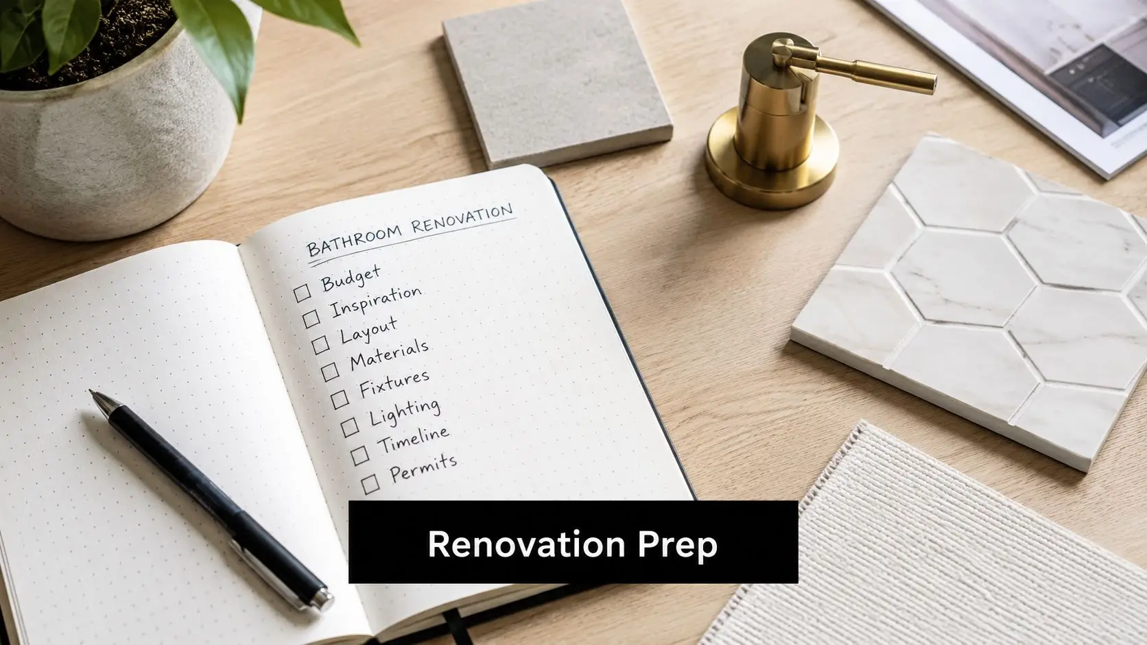
If you're renovating in Australia, the most valuable first step is a clear plan. Keep the layout simple where you can, because preserving plumbing locations often protects budget and reduces complexity. If you do want to reconfigure the room, make sure the design justifies the extra work with better circulation, better storage, or a clearer visual result.
This is also where compliance and workmanship matter. The National Construction Code, the Victorian Building Authority's waterproofing requirements, and the realities of tight bathroom sequencing all point in the same direction, small bathrooms need careful planning from the start (NCC and VBA context). That's why so many successful bathroom renovations begin with a detailed 3D model, a realistic budget, and a builder who knows how to coordinate the trade sequence properly.
SitePro Bathrooms works from Highett, Victoria, and offers bathroom renovations with concept development, 3D design, construction, and finishing under one coordinated service. If you're ready to turn a cramped ensuite or family bathroom into a room that works better every day, book a consultation and bring your measurements, photos, and priorities. The clearest next move is to get the layout assessed properly, then build the room around how you live.