

You're probably doing what most homeowners do at the start of a bathroom update. Saving screenshots, collecting tile samples, comparing paint cards under the vanity light, then wondering why every option looks either too cold, too beige, or too risky.
That confusion usually isn't about colour alone. It's about not yet seeing how colour affects the whole renovation. In bathroom renovations, the palette influences how large the room feels, how easy surfaces are to keep looking clean, whether your fittings feel cohesive, and how long the space will still look current after the trend cycle moves on. The right scheme can make modern bathrooms feel calm and expensive. The wrong one can make even good joinery and quality tiles feel disconnected.
A lot of homeowners I speak with start by asking for “new bathroom ideas” and mean colour, but what they really need is a decision framework. A bathroom doesn't behave like a lounge room. It has steam, hard finishes, strong task lighting, reflective surfaces, and usually less natural light. In older Victorian homes, that challenge gets sharper because layouts are tighter and windows are often smaller.
Good bathroom design color schemes aren't picked in isolation. They're built around light, tile size, finish sheen, budget, and resale logic. That matters whether you're planning a compact ensuite, a family bathroom, or one of the more refined designer bathrooms people want to get right the first time.
Beyond the Paint Swatch
A homeowner in Highett recently brought in a folder full of samples. Soft sage paint. Warm white wall tile. Charcoal floor tile. Timber-look vanity. Brushed brass tapware. On their own, every piece looked good. Together, they were fighting each other.
That's the part many people don't expect. Bathrooms punish random choices.
A colour scheme isn't just decoration. It's the structure that tells every other finish where to sit. If the dominant tone is too cool, the timber can suddenly look yellow. If the floor is too dark for the room's light level, the bathroom can feel smaller than it is. If the feature tile is too assertive, the vanity and mirror become background noise. A successful palette makes the room feel settled.
What homeowners usually get stuck on
It is common to fall into one of these traps:
- They choose from trends first: A colour looked great in a display or online, but it doesn't suit the actual room size or light.
- They make every element a statement: Patterned floor, coloured wall tile, bold vanity, black fixtures. The room ends up crowded.
- They play too safe: Everything goes white and grey, then the bathroom feels flat, clinical, and forgettable.
Practical rule: If every surface is asking for attention, none of them will look premium.
That's why the best bathroom design color schemes start with a clear question. Do you want the room to feel warm, airy, grounded, dramatic, or timeless? Once that's settled, the product choices become easier.
For homeowners planning bathroom renovations with future value in mind, colour deserves more attention than it usually gets. It affects buyer appeal, how expensive the room feels, and whether the design still makes sense in a few years. In practical terms, colour is one of the easiest ways to steer a bathroom toward long-term appeal without changing the layout.
The Foundations of Bathroom Colour Theory
A bathroom colour scheme works best when it has hierarchy. Much like getting dressed for a formal event, the suit does most of the work. The shirt supports it. The tie or pocket square adds character. If every piece competes, the outfit feels messy.
Bathrooms work the same way.
Use the 60 30 10 rule properly
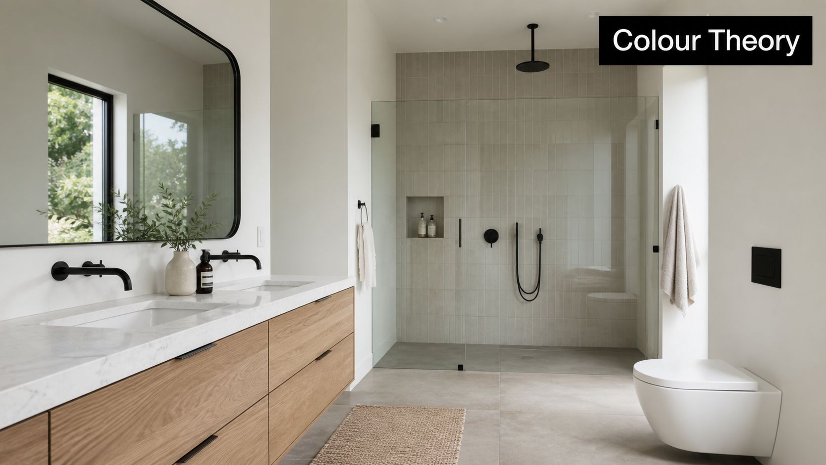
The most reliable framework is the 60-30-10 rule. In Australian renovations, 60% of the space typically carries a dominant neutral such as sage green or warm grey, 30% is a supporting tone used on elements like the vanity or floor tiles, and 10% is the accent colour introduced through tapware, grout, or feature tiles according to Australian bathroom colour scheme guidance on the 60-30-10 rule.
That split works because bathrooms have a lot of hard surfaces. Without a clear ratio, finishes can feel chopped up. You want one visual leader, one support act, and one restrained accent.
A practical version looks like this:
| Colour role | Typical bathroom elements | What it does |
|---|---|---|
| Dominant 60% | Wall tiles, paint, large wall areas | Sets the room's mood |
| Secondary 30% | Floor tile, vanity, joinery finish | Adds structure and depth |
| Accent 10% | Tapware, mirror frame, niche tile, grout | Brings contrast and personality |
If you reverse that ratio by accident, the room usually feels busy. I see this when homeowners fall in love with a feature tile and try to use it everywhere. What looked refined on a sample board becomes tiring once it wraps a full bathroom.
Warm colours and cool colours do different jobs
Colour temperature changes how a bathroom feels before you even notice the individual products.
Warm tones, such as clay, beige, soft taupe and earthy greens, create comfort. They're useful when a bathroom feels stark or overly hard-edged. These shades also pair well with timber vanities, brushed gold finishes, and stone-look surfaces.
Cool tones, such as muted blue, soft green-grey and off-white, create calm. They're often the right move when you want a spa-style room or need visual freshness in a bathroom that gets heavy use.
A calming palette usually has lower contrast than people expect. The quieter the shift between wall, floor and vanity, the more settled the room feels.
That doesn't mean every bathroom should be low contrast. Contrast is useful. It defines shapes and gives the room a focal point. The mistake is using high contrast on every surface. Black vanity, white wall, patterned floor, brass tapware and a coloured niche can all work separately. Combined, they often look over-designed.
What works and what doesn't
A strong colour scheme usually includes tonal variation. That means staying within a family of colours, but changing depth and texture.
What tends to work well:
- Layered neutrals: Warm white walls, mushroom floor tile, oak vanity.
- Soft earthy balance: Sage wall tile, beige stone-look floor, terracotta accent.
- Controlled contrast: Pale wall tile, mid-tone vanity, darker floor.
What often misses the mark:
- Too much matching: Same grey on walls, floor, vanity and bench.
- Accent overload: Coloured tile plus coloured vanity plus dramatic stone.
- Trend without context: A bold shade chosen because it's current, not because it suits the architecture or light.
If you're browsing new bathroom ideas, start by reducing the palette before expanding it. Most modern bathrooms look better when they're edited. That's especially true if the room is compact or shared by a family.
How Light Size and Finishes Shape Your Choices
The same tile can look refined in one bathroom and dull in another. Light is usually the reason.
Bathrooms in Victorian homes often have awkward natural light. Frosted windows reduce glare but also mute colour. Narrow room proportions can create shadows along one wall. Ceiling height might help, but if the surfaces absorb too much light, the room still feels closed in.
Why reflective schemes matter in Victorian homes
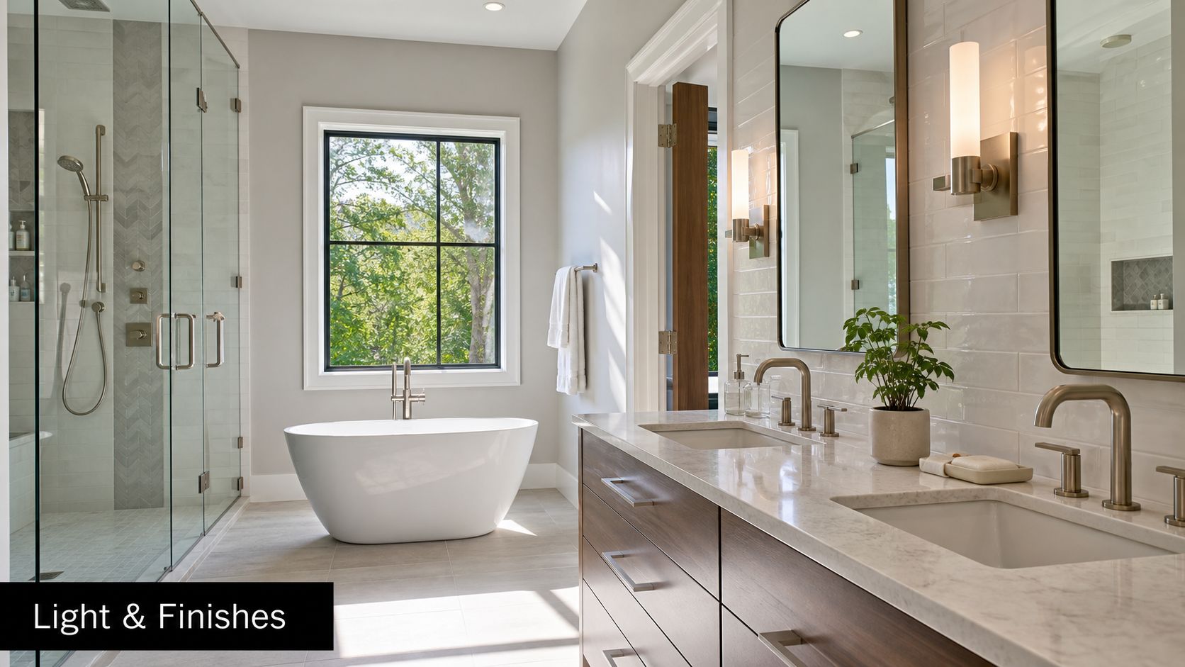
In Australian bathroom design, light-reflective colour schemes such as crisp white walls with warm beige stone accents can reflect up to 80% more visible light than darker palettes, helping compact Victorian bathrooms feel larger and reducing the need for artificial lighting during daylight hours, as explained in this guide to bathroom ideas in Australia.
That doesn't mean you must choose plain white. It means you need to understand what the room can support.
In older homes around Highett and greater Victoria, I'd rather use a warm white, pale green, or soft blue with the right finish than force a dark trend into a bathroom that can't carry it. Lighter schemes blur visual boundaries. That's what makes a small room feel less boxed in.
Finish changes colour more than people expect
A matte surface softens colour. A gloss surface bounces it around the room. Neither is always better.
Here's the trade-off:
- Matte finishes feel contemporary and understated. They hide glare well, but they can flatten a dim room if the palette is already dark.
- Gloss finishes increase reflection and energy. They help small bathrooms feel brighter, but they also show uneven walls and poor tile alignment more clearly.
- Textured finishes add depth and warmth, though they need restraint. Too much texture can make a small room feel visually crowded.
A good selection process is to compare your main samples in morning light, late afternoon light, and with the vanity light switched on. Bathrooms don't get used under one lighting condition. A tile that looks creamy and elegant at midday can look yellow at night.
A quick filter for choosing confidently
Before locking in your scheme, test it against these questions:
- How much daylight does the room get: If it's limited, lighter and warmer tones usually perform better.
- What finish dominates the space: A matte room needs enough tonal variation so it doesn't fall flat.
- Where do you want the eye to go first: Vanity wall, shower niche, floor, or freestanding bath.
- Will the tile size help or hurt the colour choice: Large-format tiles usually make quieter palettes feel more premium.
If you're working through surfaces as well as colour, this guide on how to choose bathroom tiles is a useful companion because tile format and finish can change the whole reading of a palette.
Dark colours aren't wrong in a small bathroom. They just need a room with enough shape, light, and confidence to carry them.
Powder rooms can often take bolder colour than full family bathrooms. That's because they're used differently and don't need the same sense of brightness for day-to-day function.
Curated Palettes for Modern Australian Bathrooms
The best palettes tell a complete story. They don't just name a wall colour. They connect tile, vanity, hardware, mirror, stone, and lighting into one clear mood.
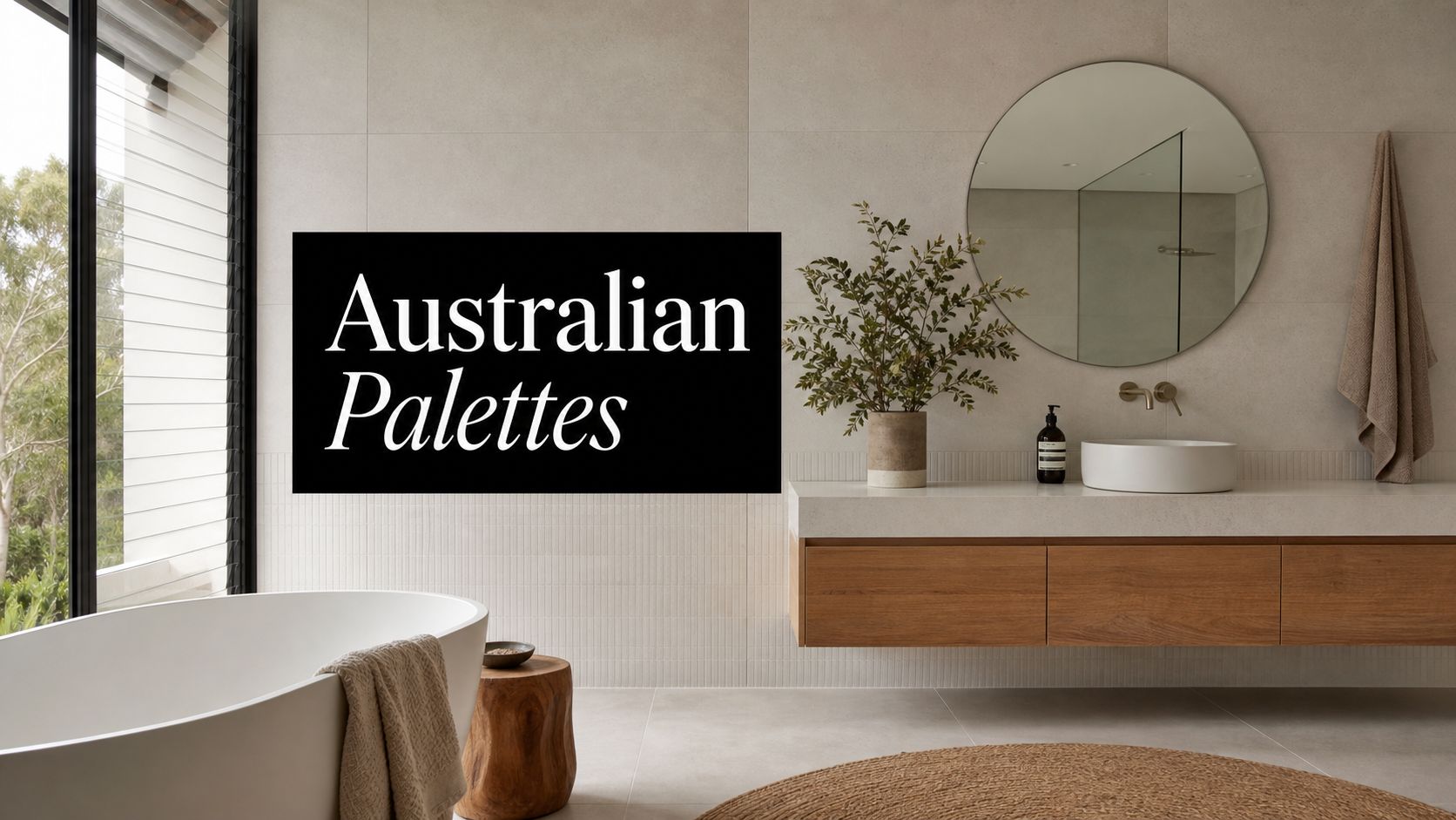
Australian bathrooms have shifted noticeably away from all-white schemes. Warm, nature-inspired tones like terracotta, muted greens, and soft beiges have replaced stark white palettes as the dominant direction in Australia's 2025 bathroom design trends, reflecting a move toward wellness-focused, spa-like environments, according to current Australian bathroom trend reporting.
The Earthy Retreat
This is the palette many homeowners are drawn to right now, and with good reason. It feels calm without becoming bland.
The base might be soft beige or warm off-white wall tiles. Add a sage or muted green vanity, then bring in terracotta through a niche, handmade-look feature tile, or accessories. Timber fits naturally here, especially lighter oak or walnut-toned cabinetry.
This scheme suits:
- period homes that need softness
- family bathrooms where warmth matters
- anyone who wants modern bathrooms to feel less clinical
Best fittings:
- brushed gold for warmth
- warm brushed nickel if you want a quieter finish
- matte stone-look surfaces rather than shiny white tops
What usually doesn't work is overcommitting to terracotta. It's strongest as a supporting voice, not the whole room.
The Timeless Neutral
If your priority is longevity, this is still the safest and most versatile direction. That doesn't mean cold grey and plain white. A timeless neutral bathroom today is warmer and more layered than older minimalist schemes.
Use warm white or mushroom wall tiles, a greige or oak vanity, and a floor tile with subtle movement rather than obvious pattern. The room should feel tonal, not monotone.
A good neutral palette often depends on texture more than colour variation. Ribbed vanity fronts, honed-look tile, softly veined benchtops, and framed mirrors can all create interest without locking you into a trend-heavy look.
| Palette | Main colours | Best for | Risk to avoid |
|---|---|---|---|
| Earthy Retreat | Beige, sage, terracotta | Relaxed family bathrooms | Too much clay tone |
| Timeless Neutral | Warm white, greige, timber | Broad resale appeal | Flat, one-note beige |
| Contemporary Bold | Deep blue or green with stone neutrals | Powder rooms, larger ensuites | Using bold colour on every surface |
This is usually the best answer for homeowners balancing personal taste with resale. It gives enough warmth for current tastes and enough restraint for broad appeal.
The Contemporary Bold
Some bathrooms benefit from a stronger point of view. A deep blue or forest green can look excellent when it's controlled.
This approach works best in a powder room, a larger ensuite, or a bathroom with strong architecture. Keep the bold shade to a vanity, feature wall, or shower recess. Pair it with lighter stone-look tiles, restrained flooring, and simple mirror lines. Let one bold move carry the room.
The danger here is trying to make every item “designer”. A dark vanity, heavily veined tile, dramatic pendant and mixed metals can quickly turn visual confidence into clutter.
In designer bathrooms, restraint is what makes the bold element look expensive.
For hardware, brushed nickel usually pairs more cleanly with blue-based palettes. Brushed gold can work with deep green, but it needs the right undertone in the tile to avoid a muddy mix.
The Soft Spa Blend
This is one of the most reliable schemes for homeowners who want serenity without the earthier, rustic side of current trends.
Think pale grey-green, muted blue, warm white, and a soft stone floor. The palette feels fresh, but not cold. It's especially effective in ensuites and bathrooms where people want a slower, more retreat-like atmosphere.
Use this if you want:
- a calmer alternative to plain white
- a gentle update for a smaller room
- new bathroom ideas that still feel durable over time
For more visual inspiration around styling these tones with materials and accessories, explore this collection of bathroom decor ideas for Australian homes.
The common thread across all four schemes is editing. Good bathroom design color schemes don't need many colours. They need the right colours, in the right proportions, with enough tonal depth to feel deliberate.
From Vision to Reality with 3D Visualisation
Colour decisions become expensive when they stay abstract too long.
A sample tile in your hand doesn't show grout scale, reflection, shadow lines, or how the vanity colour will sit against the floor once everything is installed. That's why 3D visualisation matters so much in bathrooms. It closes the gap between liking a material and knowing it will work in your actual room.
Why renders prevent costly colour mistakes
The main benefit isn't presentation. It's risk reduction.
A realistic render lets you test whether your bathroom design color schemes have enough contrast, whether the room feels too dark, whether the feature tile is overdone, and whether your chosen metals suit the rest of the palette. You're no longer guessing from disconnected samples.
This is especially useful in Victorian homes, where the room's proportions can be deceptive. Narrow rooms often need more visual quiet than the sample board suggests. A render shows that quickly.
What to test before construction starts
The most useful visualisation process checks several variables at once:
- Wall and floor interaction: The floor might be beautiful on its own but too heavy once paired with the wall tile.
- Vanity impact: Timber, painted joinery, or laminate all shift the warmth of the palette.
- Tapware finish: Brass, chrome, or black can completely change the room's tone.
- Mirror and lighting reflection: These affect whether the scheme feels soft or high contrast.
A render also helps households make decisions faster. Instead of debating individual samples, everyone can react to the whole room. That usually leads to better alignment and fewer late changes.
“If you can't see the whole palette in the actual layout, you're still designing in fragments.”
That matters because bathroom construction is unforgiving. Once waterproofing, tiling and fitting installation begin, changing direction is costly and disruptive. It's far better to reject a colour scheme on screen than after the feature wall is already installed.
Design still needs skilled delivery
Even the best render is only a plan. The final result still depends on precise set-out, careful tile selection, accurate lighting placement, and trades who understand how details read in a finished bathroom. That's where execution separates average results from polished ones.
For projects with moving parts, homeowners should also look closely at who is building the work. Complex renovations need qualified professionals, including registered builders unlimited where the scope requires that level of oversight, so the detail shown in design documentation is carried through on site.
If you want to see how a room can be tested before selections are final, a 3D bathroom planner is one of the most practical tools in the planning stage.
Budgeting for Colour The Renovation Cost Factor
Colour choices affect cost more than many homeowners expect. Not because paint itself is expensive, but because colour usually arrives through materials. Feature tiles, specialty glazes, coloured joinery, premium stone looks, and higher-end tapware finishes can all move the budget.
That's why good budgeting starts with knowing where colour should come from. If the statement is in the tile, keep the vanity simpler. If the joinery colour is the hero, the wall tile can do less. You don't need every line item to carry design weight.
What the numbers mean in Victoria
In Victoria, a standard full bathroom renovation typically costs between $15,000 and $22,000, while high-end luxury ensuite projects can exceed $60,000 according to Victorian bathroom renovation cost guidance. The same source notes that a quality renovation in Southeast Melbourne can add $1.50 to $2.00 in property value for every $1 spent.
That's why palette decisions should be tied to value, not just taste.
A bathroom aimed at broad resale usually benefits from timeless, adaptable colours. A highly personalised scheme can still work, but it needs discipline. If buyers walk in and immediately notice the colour rather than the quality of the room, the scheme may be too dominant.
Where to spend and where to pull back
A smart colour budget often looks like this:
- Spend on the permanent surfaces: Wall and floor tiles need long-term appeal because they're hardest to replace.
- Save on trend expression: Use smaller feature areas, paint, or styling-led colour moments where possible.
- Keep tapware in perspective: A premium finish can enhance the room, but it shouldn't force compromises in layout or waterproofing quality.
For many homeowners, the strongest value move is building a mostly timeless base, then adding personality through one controlled element. That might be a coloured vanity, a niche tile, or a warmer metal finish. This approach suits both owner-occupiers and investors because it protects flexibility.
The best new bathroom ideas don't come from spending on everything. They come from knowing what the room will still need to do in five or ten years. That's the balance point between trend and longevity, and it's usually where the best designer bathrooms land.
Choosing bathroom design color schemes gets easier once you stop treating colour as an isolated decision. It's part mood, part light management, part material strategy, and part budget control. The most successful bathrooms don't chase every trend and they don't hide in safe but lifeless palettes either. They make a few deliberate choices and carry them through with discipline.
If you're planning bathroom renovations in Highett or greater Victoria and want help turning ideas into a buildable, cost-aware design, SitePro Bathrooms can help with concept planning, 3D design, and complete renovation delivery.