• siteprobathrooms

8 Small Bathroom Layout Ideas to Maximise Space

Transform Your Compact Space: A Builder's Guide

Struggling with a small, awkward bathroom? You're not alone. Many older Highett homes have compact bathrooms that feel harder to use than they should. The room is small, the door swings into the wrong spot, the vanity is too deep, and every decision seems to affect three others.

That doesn't mean you're stuck with a bathroom that feels cramped. With the right layout, a compact room can work well, look clean, and still deliver the finish people want from modern bathrooms. Good planning matters more in a small room because every millimetre counts, especially once waterproofing, drainage, and fixture depths are locked in.

At SitePro Bathrooms, we handle bathroom renovations across Victoria and we see the same pattern often. People start with tile colours and tapware, but true success of the room comes from the plan underneath. A good layout improves movement, storage, cleaning, sightlines, and how spacious the room feels when you walk in.

Australian small bathrooms are often tighter than people expect. A typical small bathroom sits between 2.5 and 5 square metres, and the NCC 2022 and ABCB Housing Provisions place the minimum compact footprint at about 1,500mm × 1,800mm, which is why layout discipline matters from the start (Australian small bathroom design guidance).

1. The Galley Layout
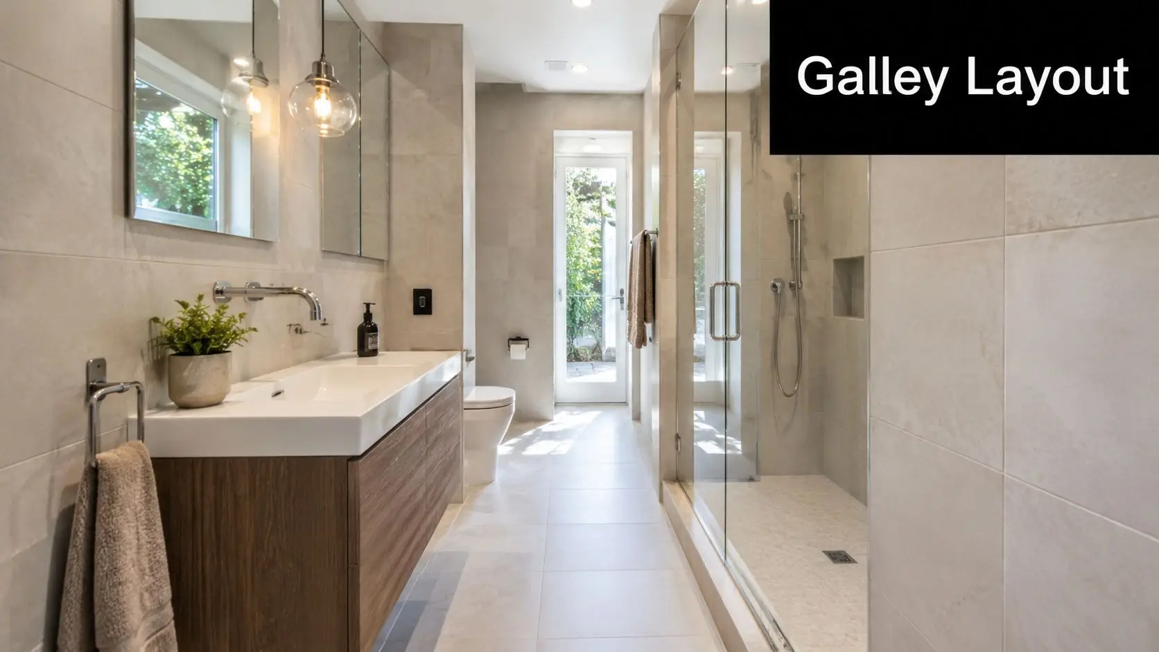
A modern, minimalist bathroom with a wood vanity, tiled walls, glass shower, and a galley-style floor plan.

You open the door and step straight into a narrow run of fixtures, with no spare corner to hide bad planning. That is where a galley layout either works brilliantly or feels frustrating every day.

In long, tight bathrooms, this is often the clearest layout to test first. Fixtures run along two opposing walls, creating a direct path from the entry to the shower or toilet. We use it often in Melbourne apartments, compact ensuites, and older Victorian terraces where the room is rectangular and every fixture depth affects circulation.

The strength of this layout is discipline. Keep both sides slim and the room feels ordered. Oversize one element, especially the vanity, and the centre aisle starts to feel cramped fast.

What makes it work

A galley layout usually performs best when one side carries the vanity and the other takes the shower, with the toilet positioned toward the end of the room where it is less dominant on entry. That arrangement gives a cleaner sightline and a more practical walking path. In renovations across Victoria, it is often the most buildable option when the existing room shape is narrow and relocating plumbing needs to stay controlled.

Fixture depth matters more here than in almost any other small bathroom layout. A wall-hung vanity helps because it keeps more floor visible and makes cleaning easier around the base. A frameless or lightly framed shower screen also reduces visual weight, which helps the room read as one space instead of a series of obstacles.

Door planning can make or break the result. If the existing swing cuts across the vanity or toilet clearance, a cavity slider or out-swing door is often worth pricing early. I have seen otherwise solid galley plans fall apart because the door was treated as an afterthought.

Practical rule: In a galley bathroom, protect the walkway first. Finishes can improve the look later, but poor circulation is hard to hide.

A few choices usually improve this layout:

  • Use a wall-hung vanity: It frees up the floor line and makes the room easier to clean.
  • Keep storage vertical or recessed: Mirror cabinets, niches, and shallow shelving work better than full-depth tall units.
  • Place the toilet carefully: Tucking it further down the room usually improves privacy from the doorway.
  • Use clear glazing where possible: It keeps the full length of the room visible.

For narrow ensuites, our guide to ensuite bathroom design planning shows how to adapt this kind of layout without wasting width. For more planning examples, our guide to small bathroom ideas in Australia shows how these compact layouts can be adapted without wasting space.

The trade-off is straightforward. Galley bathrooms are efficient and easy to read, but they leave little tolerance for bulky fixtures, thick nib walls, or poor door placement. Get those details right and the room feels calm and functional. Get them wrong and the bathroom will always feel tighter than the floor plan suggests.

2. The Corner Layout
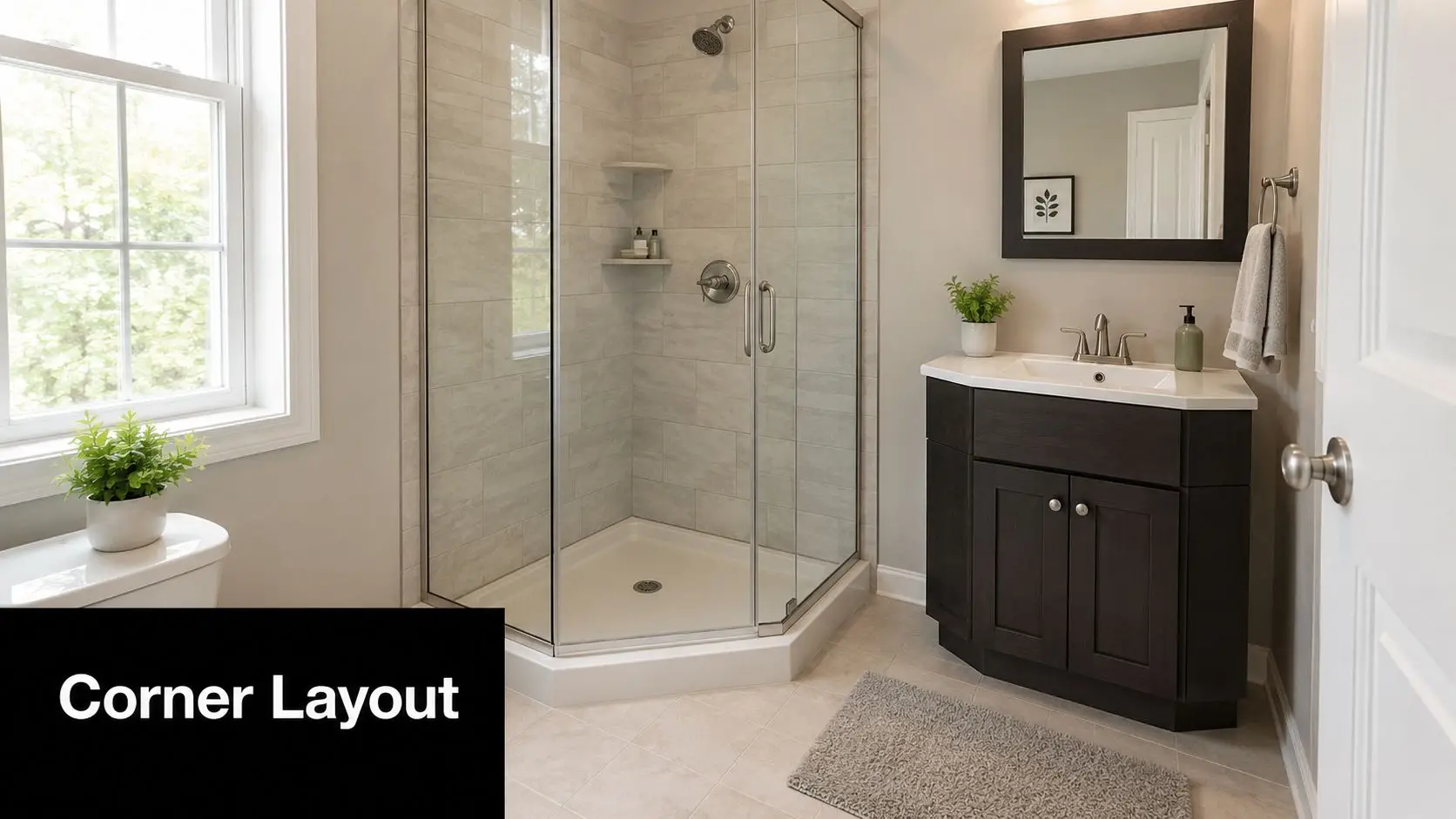
A bright, compact bathroom featuring a space-saving corner shower stall and a dark wood vanity sink cabinet.

A corner layout suits small bathrooms that are closer to square than rectangular. The main advantage is visual. By pushing the shower, vanity, and toilet into corners, you leave the centre of the room clearer, and the room feels less congested the moment you open the door.

This is a strong option for compact ensuites in newer Highett builds and for older bathrooms where the existing plumbing limits how far fixtures can move. It also works well when you want the bathroom to feel open without committing to a full wet room.

Best use cases and trade-offs

Corner showers are often suggested for tiny rooms, but the layout still needs to be buildable. In very small ensuites and older Victorian homes, the problem isn't the 3D view. It's whether the clearances comply once wall thicknesses, plumbing walls, and fixture projections are accounted for. That gap between attractive design and workable construction is a common reason small bathroom plans need redesign before build starts (small bathroom layout compliance discussion).

That's why we don't treat corners as leftover space. They need proper waterproofing, ventilation, and access around fixtures.

A corner layout usually works best when you:

  • Anchor the shower first: The shower takes the most visual space, so set that position before choosing the vanity.
  • Use corner storage deliberately: Built-in shelves or a compact corner vanity can stop the room from feeling patched together.
  • Protect the middle of the room: Clear floor space improves flow more than adding one extra cabinet ever will.

If you're working on an ensuite, our article on designing an ensuite goes into the planning decisions that matter before waterproofing and tiling begin.

What doesn't work here is forcing all three fixtures into corners without checking how each one projects into the room. A corner layout should feel balanced, not shoved outward just for the sake of keeping the centre open.

3. The L-Shaped Layout

The L-shaped layout is one of the most forgiving options in small bathroom layout ideas because it suits rooms that aren't perfectly narrow or perfectly square. It places the main fixtures along two adjoining walls, which naturally creates a more open zone in the remaining part of the room.

In family bathroom renovations across Victoria, this often gives the cleanest separation between grooming and bathing. A vanity can sit on one wall, while the shower or bath runs along the perpendicular wall. That keeps the room organised without making it feel too segmented.
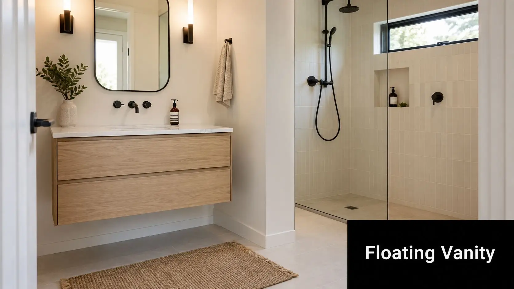
A modern bathroom features a light wood floating vanity with black fixtures and a minimalist walk-in shower.

Where this layout earns its keep

This layout helps when the doorway arrives at an awkward point or when one wall is better suited to plumbing than the other. In renovated period homes, that's common. You don't always get symmetry, but you can still get a room that feels intentional.

It's also a good fit for people collecting new bathroom ideas who want a bit more design flexibility. The corner where the two walls meet can hold a mirror return, a niche, open shelving, or a feature light. That gives the room some personality without interrupting movement.

Good L-shaped bathrooms feel calm because they direct use naturally. You walk in, turn once, and the room makes sense.

A few practical choices improve the result:

  • Keep the vanity on the more visible wall: That gives you a cleaner first impression from the doorway.
  • Use the junction well: A dead corner is wasted space in a small bathroom.
  • Light both sides properly: If one wall is bright and the other falls into shadow, the room can feel uneven.

The downside is that poorly planned L-shaped rooms can create one tight pinch point, usually near the shower entry or toilet approach. When that happens, the bathroom looks fine on paper but feels awkward every day. The fix is usually simpler fixture selection, not more joinery.

4. The Open Plan Floating Vanity Layout

This is one of the most effective layouts for clients who want designer bathrooms without crowding a small footprint. The floating vanity does two jobs at once. It gives you storage, and it leaves the floor line visible underneath, which immediately makes the room feel less boxed in.

Wall-hung vanities are a recognised design solution for small bathrooms because they free floor area and improve the sense of space while still fitting modern minimalist styling (bathroom ideas for Australian homes). In practice, that matters most in ensuites and compact family bathrooms where a full-height vanity can feel heavy.

What to get right before installation

The visual effect is simple. The construction behind it isn't. The wall has to be framed properly to support the vanity and plumbing needs to be coordinated early, especially if you want drawers rather than a basic shelf arrangement. Consequently, working with registered builders unlimited in scope on renovation delivery matters, because the clean look depends on what's hidden in the wall.

The best versions of this layout usually pair the vanity with an open or lightly screened shower zone, simple mirrors, and restrained finishes. If you overload the room with too many feature materials, the floating vanity loses the clean effect that made it useful in the first place.

A practical approach is to focus on these details:

  • Keep the vanity proportionate: Slimmer joinery often looks better than trying to force extra width into a small room.
  • Use integrated storage: Drawer organisers and mirrored cabinetry reduce clutter on the benchtop.
  • Light the underside carefully: Soft under-vanity lighting helps the room feel layered instead of stark.

This layout is ideal for modern bathrooms, but it isn't the best choice if the household needs maximum enclosed storage at all costs. Open visual space and bulky storage don't usually coexist well in a tight bathroom. One has to lead.

5. The Wet Room Layout

A wet room strips the bathroom back to its simplest form. Instead of treating the shower as a separate object inside the room, the whole room becomes the waterproofed environment. In a compact bathroom, that can be a smart way to remove visual barriers and open the floor area.

This layout suits clients chasing cleaner lines and a more contemporary feel. It also works well where accessibility, easier movement, or long-term usability matter as much as aesthetics.

Why it can feel bigger than it is

Large-format tiles and porcelain panels are widely used in Australian small bathroom renovations because fewer grout lines reduce visual clutter and create better surface continuity. In particular, 1200mm x 600mm tiles help the room read as more expansive, especially when paired with light-coloured glossy or satin finishes that reflect natural light well (small bathroom ideas and layouts in Australia).

That's one reason wet rooms often photograph so well. The floor and walls read as one connected envelope instead of a collection of pieces.

Builder's note: A wet room only feels effortless when the falls, drainage, screen placement, and waterproofing have been resolved before tiling starts.

For homeowners exploring wet room bathroom ideas, the layout can be excellent in small spaces, but it isn't a shortcut option. It requires discipline in set-out and a builder who understands how all the elements interact.

A strong wet room usually includes:

  • A controlled splash zone: Even in open layouts, a fixed glass panel often improves usability.
  • Reliable drainage planning: The floor has to fall properly to the waste without creating awkward tile cuts.
  • Slip-resistant flooring: The room must be safe when fully wet.

What doesn't work is treating a wet room as just a standard bathroom with the shower screen removed. Without proper planning, water tracks further than expected, storage gets wet, and the room becomes harder to live with, not easier.

6. The Separate Toilet Alcove Layout

This layout changes how the room functions rather than just how it looks. By tucking the toilet into its own alcove, you free the main bathroom to focus on the vanity, mirror, and shower or bath. In family homes, that can make a compact bathroom feel far more usable because more than one person can use the broader space without conflict.

It's a practical option in older Victorian homes where separate WC arrangements already existed in some form, and it also suits modern bathroom renovations where privacy matters. The trick is to make the toilet alcove feel intentional, not like a leftover cavity created after everything else was squeezed in.

When separation helps and when it doesn't

The upside is obvious. The main room feels cleaner and more open, and the toilet is less visually dominant. This can lift the overall feel of a compact bathroom, particularly in homes where the vanity wall is the main design feature.

The downside is that splitting a small room can also make both zones feel tight if the original footprint doesn't support it. Door positions matter a lot. Ventilation matters too, especially if the alcove has limited natural airflow. In some homes, keeping everything in one carefully planned room works better than forcing separation.

A few design choices improve the result:

  • Define the zones with finish changes: A different tile, paint tone, or joinery detail helps each area feel resolved.
  • Keep access straightforward: Avoid doors that collide or create awkward circulation.
  • Plan maintenance access: Concealed cisterns and tight service spaces need forethought, not guesswork.

This layout is often one of the better new bathroom ideas for households with kids, guests, or busy mornings. It's less about making the room look larger and more about making the room work harder.

7. The Offset Double Vanity Layout

In a small bathroom, a double vanity often sounds good but creates more problems than it solves. The offset version is the smarter compromise. Instead of forcing a wide, heavy unit into the room, this layout staggers the basins or the joinery so two people can share the space with less visual bulk.

It suits master ensuites and family bathrooms where two users regularly get ready at the same time. Done well, it gives you shared function without the oversized, hotel-style vanity that dominates the whole room.

A better shared setup for compact rooms

The appeal of this layout isn't just capacity. It's flexibility. One user can have a full mirror and storage zone while the second basin sits slightly offset or lighter in profile. That breaks up the mass of the joinery and helps preserve some air around the room.

In designer bathrooms, this can also look more custom than a standard side-by-side double basin. Different mirror shapes, lighting points, or drawer configurations can make the room feel more suited to how the household uses it.

A practical offset setup should prioritise:

  • Separate task lighting: Each user needs usable mirror light, not just one central fitting.
  • Balanced storage: Shared bathrooms fail fast when one side gets all the drawers.
  • Simple plumbing paths: Complicated under-slab changes can make a clever concept expensive very quickly.

This isn't the right move for every compact bathroom. If the room can barely fit one well-proportioned vanity, trying to make it a two-user zone usually backfires. In that case, a generous single vanity with better drawer organisation is often the more successful renovation decision.

8. The Alcove Shower with Vanity Focus Layout

You walk into a small ensuite at 7 am, and the basin is doing more work than the shower. That is the reality in a lot of Victorian homes we renovate, especially where the bathroom connects to a walk-in robe or serves as the main getting-ready space for a couple. In that setting, pushing the shower into an alcove and giving the vanity the prime wall often produces a better daily layout.

The main benefit is visual order. A recessed shower keeps the wet zone contained, so the room reads as a vanity-led space rather than a corridor of glass, tile, and fittings. That usually makes the bathroom feel calmer and easier to use, even when the footprint is tight.

From a builder's point of view, this layout works best when the alcove is properly resolved, not treated as leftover space. The recess needs enough width to shower comfortably, enough depth for screen placement and waterproofing, and a clear approach path that does not clip the vanity corner. Get those proportions right and the plan feels intentional.

It also gives you more freedom to make the vanity work harder. We often pair this layout with full drawers, mirrored storage, and lighting that is effective at the basin. Inside the shower alcove, recessed niches and a frameless screen help keep the detailing clean without asking the shower to dominate the room.

The biggest trade-off is the bath. In many small bathrooms, removing the bath and installing a hobless walk-in shower is the move that frees up the most usable floor area. If the household still needs a bath, the layout gets tighter fast. A compact tub, a slim vanity, and a modest shower zone can work, but only if each fixture is kept in scale. Trying to fit a generous alcove shower, deep joinery, and a full-size bath into one compact room usually leaves poor circulation and awkward clearances.

This layout suits households that shower daily and want the vanity to carry the room. It is less successful in family bathrooms where regular bathing is still a fixed requirement. At SitePro Bathrooms, we usually recommend it when bench space, storage, and mirror access matter more than squeezing in every possible fixture.

Small Bathroom Layouts: 8-Point Comparison

Layout Implementation complexity Resource & cost Expected outcomes Ideal use cases Key advantages
The Galley Layout Low, straightforward plumbing along parallel walls Low–Medium, cost-effective renovation Efficient single-file workflow; maximizes linear space Narrow apartments, ensuites, compact bathrooms Space-saving, simple plumbing, clear traffic flow
The Corner Layout Medium, corner plumbing and angles require planning Medium, may need custom fixtures or fittings Open center, perceived larger space, flexible arrangements Small square bathrooms, modern ensuites, renovated period homes Maximizes visual openness, flexible storage, good flow
The L-Shaped Layout Medium, plumbing on two perpendicular walls; careful planning Medium, moderate installation complexity Distinct wet/dry zones; efficient use of rectangular space Rectangular bathrooms, family baths, master ensuites Zoning, ample counter space, versatile layouts
Open Plan Floating Vanity Layout Medium–High, requires robust wall framing and support Medium–High, premium fixtures and installation costs Strong visual spaciousness; modern minimalist aesthetic Designer bathrooms, high-end renovations, modern apartments Visual openness, easier cleaning, contemporary look
The Wet Room Layout High, full waterproofing, precise slope, specialist trades High, expensive waterproofing and drainage work Seamless open wet space; spa-like feel; high accessibility Luxury bathrooms, accessible design, space-conscious builds Maximum openness, accessibility, easy maintenance
Separate Toilet Alcove Layout Medium, adds partitions, door, and separate ventilation Medium, extra construction, plumbing and ventilation Increased privacy; main bathroom feels larger; dual use possible Family homes, ensuites, European-inspired renovations Privacy, hygiene, allows simultaneous use
Offset Double Vanity Layout Medium, additional plumbing and thoughtful spacing Medium–High, two fixtures and more finishes Comfortable two-user operation; luxurious feel Master bathrooms, shared ensuites, family bathrooms Accommodates two users, design sophistication, increased storage
Alcove Shower with Vanity Focus Medium, waterproofing in alcove; careful partitioning Medium, depends on glass, tiles, and fixtures Prioritizes grooming; clear wet/dry separation; ample counters Grooming-focused bathrooms, dual-user spaces, contemporary renovations Ample counter/storage, distinct zones, grooming-focused design

Ready to Design Your New Bathroom?

Choosing the right layout is the first real step in a successful renovation. In small bathrooms, the plan isn't just one decision among many. It shapes how the room feels, how it functions, and how expensive it becomes to build. A layout that respects the room's dimensions, plumbing path, and clearances will nearly always outperform a prettier plan that ignores those constraints.

That's especially true in older homes around Highett and greater Victoria, where walls aren't always straight, plumbing positions can be limiting, and every fixture depth matters. We often find that the best small bathroom layout ideas aren't the flashiest ones. They're the ones that solve circulation first, keep the room easy to clean, and make the joinery and shower work together instead of competing for space.

Budget also plays a role in how far you can push the design. In 2026, a complete bathroom renovation in Australia for a standard-sized room using mid-range materials typically starts around $20,000, while projects with luxury finishes or plumbing wall relocation can exceed $35,000 (Australian bathroom renovation cost guide). That's why layout planning early matters so much. Changing the room on paper is manageable. Changing it after plumbing and waterproofing are underway is where costs climb.

Material choices can also help a compact room feel more resolved. Australian homeowners in 2025 are increasingly choosing native timbers such as spotted gum, Tasmanian oak, and blackbutt for vanities and wall cladding, often paired with earth-toned palettes like beige, terracotta, and soft green instead of an all-white scheme. In small spaces, that warmth can make the room feel considered rather than clinical.

If you're weighing up designer bathrooms, practical storage, or fresh new bathroom ideas for a compact footprint, 3D design is one of the smartest places to start. It helps test fixture positions, sightlines, screen placement, and door swings before construction locks the layout in. That's particularly useful in small rooms, where a few millimetres can change whether the room works properly.

SitePro Bathrooms is a Highett-based renovation company that provides concept planning, detailed 3D design, construction, and finishing for bathroom renovations. If you're ready to turn a cramped room into one that feels clear, modern, and highly functional, contact the team to discuss a layout that suits your home and how you live.
  • siteprobathrooms

Minimalist Bathroom Design: A Complete Victorian Guide 2026

You're probably looking at a bathroom that works, but only just. The vanity top is crowded, the shower feels tighter than it should, and every extra bottle or towel seems to make the room look smaller. That's where minimalist bathroom design earns its keep. It isn't about stripping a room bare. It's about removing friction, visual noise, and expensive mistakes.

For Victorian homeowners, that matters because many homes in Highett and across greater Melbourne don't start with generous bathroom footprints. Good minimalist design has to solve real problems. It needs to make a compact room feel calm, handle family use, and still look like one of those designer bathrooms people save for inspiration. The challenge is doing that without blowing the budget on finishes that look impressive in a showroom but don't change how the room performs.

What Is Minimalist Bathroom Design Really

A minimalist bathroom works best when the room feels calm at 7am on a weekday, not just in a photo. In practical terms, that means fewer decisions, less visual clutter, and fittings that earn the space they take up.

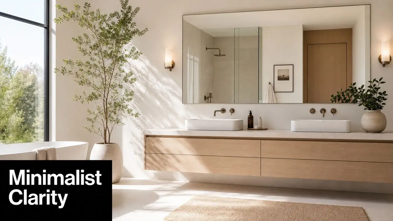
A modern minimalist bathroom featuring a floating wooden vanity, double vessel sinks, and an indoor potted tree.

Minimalist bathroom design is disciplined design. The room is edited so the layout reads clearly, storage is built in, and the finishes work together instead of competing for attention. Good minimalism still has warmth and character. It just avoids decorative noise that makes a bathroom feel busy, smaller, or harder to clean.

In renovations across Highett and wider Melbourne, I find the best minimalist bathrooms usually share a few traits:

  • Clear benches and vanity tops because everyday items are stored properly
  • Simple, consistent forms that reduce visual breaks across the room
  • Less grout, fewer trims, and fewer awkward junctions so cleaning is easier
  • A stronger sense of space created by planning, proportion, and restraint

That last point matters. A bathroom does not need to be large or packed with expensive finishes to feel high-end.

Minimalist does not mean expensive

A lot of homeowners assume a minimalist bathroom needs imported stone, designer tapware, and custom joinery everywhere. Sometimes those choices suit the job. Often they are where budgets get burned without improving how the room functions.

A better result usually comes from spending money where the eye notices order and where daily use benefits from it. That might mean one well-sized vanity with full drawers, a large-format tile that cuts grout lines, and a mirrored cabinet recessed into the wall if the framing allows. Then you save on areas that do not need a premium material to look good, such as using quality porcelain instead of natural stone, or choosing a clean off-the-shelf vanity profile and upgrading the handle and benchtop.

A simple rule applies on site. If a feature does not improve use, storage, durability, or visual calm, it is probably not helping the design.

Bathroom renovation costs can vary widely depending on layout changes, waterproofing condition, fixture selection, and finish level. For Victorian homeowners trying to get a designer look on a realistic budget, the key is not stripping everything back for the sake of it. It is choosing fewer elements and choosing them well.

Why it suits Victorian homes

Many Victorian homes, and plenty of later homes around Bayside too, have bathrooms with tight footprints, odd corners, or older plumbing positions that punish over-design. Minimalism works well here because it forces sharper decisions early. You commit to a tighter palette, avoid unnecessary plumbing moves, and use each wall more efficiently.

That is why this style often looks more refined in real homes than trend-driven bathrooms with multiple feature tiles, open shelving, and oversized fittings. A floating vanity can make a narrow room feel lighter. A recessed niche can replace add-on shower storage. One tile used consistently across the floor and walls can make a modest bathroom feel more resolved than three premium finishes fighting each other.

Done properly, minimalist bathroom design is not about having less for the sake of it. It is about building a bathroom that looks composed, works hard every day, and feels more expensive than the budget suggests.

The Four Pillars of Bathroom Minimalism

Minimalism becomes much easier to apply when you stop thinking of it as a style and start treating it like a filter for decision-making. Four pillars usually separate a bathroom that merely looks sparse from one that feels resolved.

Intentionality over accumulation

The first question is simple. Why is each item in the room there?

If the answer is vague, the room starts to bloat. Double accessories, oversized mirrors, decorative shelving, feature tiles in three directions, and hardware in mixed finishes all add visual traffic. Minimalism cuts that back. The room should support the way you live, not the way a display suite is staged.

A good test is whether each inclusion earns its footprint. In family bathrooms, that often means prioritising drawer storage, usable bench space, and shower shelving before considering decorative extras.

Clean lines and simple forms

The strongest minimalist rooms rely on geometry. Straight runs, uncomplicated silhouettes, and surfaces that read clearly from the doorway all help a bathroom feel calmer. This is one reason wall-hung vanities, frameless or low-profile screens, and uncomplicated basin shapes work so well.

Not every item has to disappear. It just needs to belong.

A bulky federation-style vanity with ornate handles can work in another setting. In a minimalist room, it usually interrupts the whole composition. Clean forms don't mean clinical. Timber texture, soft stone tones, and brushed finishes can still bring warmth.

A restrained palette

Most modern bathrooms lose their edge when too many finishes compete. Minimalist bathrooms usually hold together because the palette is limited and repeated consistently.

That might mean:

  • One dominant tile finish across floor and walls
  • One timber tone for vanity joinery
  • One metal finish for tapware, shower fittings, and accessories
  • One accent move only, such as a niche tile variation or a curved mirror

Many designer bathrooms feel expensive, not because they say more, but because they repeat the right things.

A bathroom can be simple and still feel rich. Texture often does more work than contrast.

Light and space have to be designed

Minimalism falls flat in dim or cramped rooms. The visual calm people associate with the style comes from how light moves through the space and how much interruption sits at eye level.

That means paying attention to mirror size, shower screen placement, vanity depth, and where taller elements sit. If a room is small, the wrong tall cupboard can make it feel boxed in. If the lighting is harsh, every surface feels colder than intended.

A minimalist bathroom should allow the eye to travel. That's why open floor area, controlled materials, and unobtrusive fittings matter so much. They help the room breathe, even when the footprint is modest.

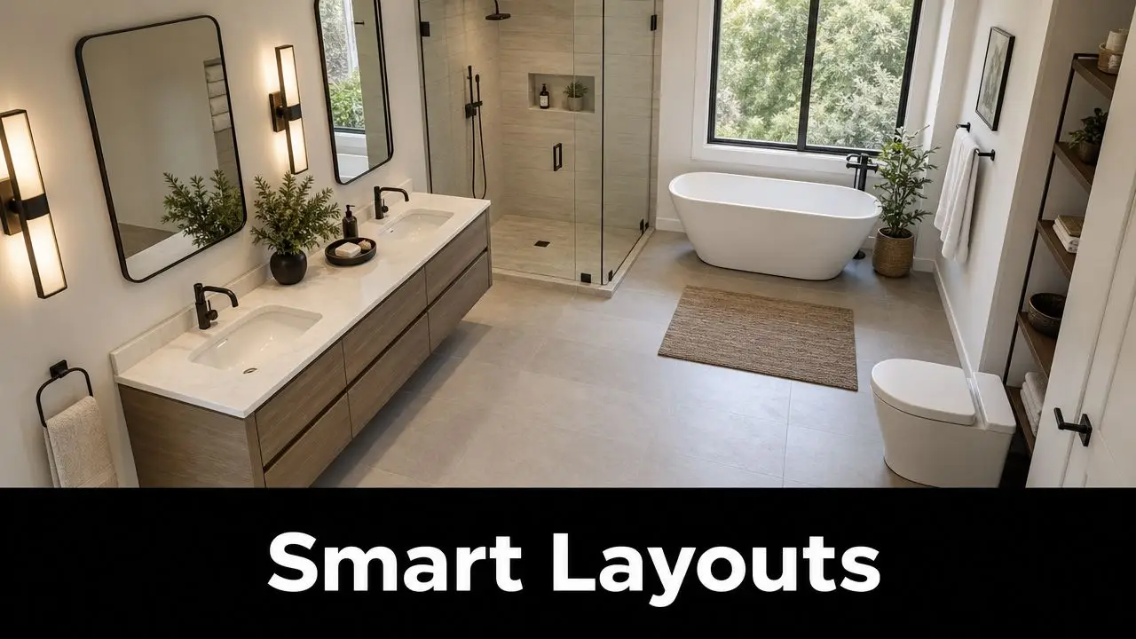
Smart Layouts for Modern Minimalist Bathrooms

A minimalist bathroom usually succeeds or fails before the tiles are chosen. I see it often in Highett and across older Victorian homes. Clients want the clean, designer look, but the room is fighting them with a narrow footprint, an awkward door swing, or plumbing that was never placed well in the first place.

A modern minimalist bathroom featuring a double vanity, a glass shower, and a freestanding soaking tub.

Start with the room's actual shape

Good layout work starts with the shell of the room. Measure wall lengths, ceiling height, window position, door clearance, and where the existing waste and water points sit. Then decide what the bathroom needs to do each day.

In many compact Victorian bathrooms, a linear layout is the most efficient option. Vanity, toilet, and shower sit along one wall, which keeps plumbing simpler and leaves clearer floor space through the centre of the room. That approach often gives a bathroom a more expensive feel because the eye reads one organised zone instead of several competing elements.

For tighter footprints, these bathroom design ideas for small spaces show how fixture placement can improve movement without adding size.

Layouts that usually work best

A few layouts consistently suit minimalist bathrooms because they reduce visual interruption and use space properly:

  • Linear layouts for narrow rooms where keeping services on one side controls cost
  • End-shower layouts where the shower sits at the back and helps the room feel longer
  • Open wet area plans where glazing is limited and floor lines run with less interruption
  • Floating fixture arrangements where wall-hung vanities or toilets expose more floor and make the room easier to clean

The wrong move is trying to fit every luxury item into a room that cannot carry it. A freestanding bath, separate shower, wide vanity and tall storage tower might sound appealing on a plan, but in a modest bathroom they often create dead corners, tight walkways and a crowded look.

That is where budget and layout need to work together.

A high-end minimalist result does not come from adding more. It comes from giving each element enough space to sit properly. In many Victorian renovations, I would rather spend money on a better vanity proportion and cleaner shower detailing than force in a bath that makes the whole room feel compressed.

Clearance is what makes the room feel calm

Minimalism has to work in real life. You need enough room to open a drawer, step out of the shower, dry off, and clean around the toilet without bumping into edges.

Small planning decisions matter here. A reduced-depth vanity can free up circulation without looking cheap. An in-wall cistern can pull the toilet zone back just enough to improve the walkway. A fixed shower panel can read cleaner than a full framed enclosure and often costs less than clients expect, especially compared with overcomplicated custom glass setups.

If you have to shuffle sideways past a fixture, the layout still needs work.

Keep plumbing moves honest

One of the simplest ways to get a designer look on a realistic budget is to avoid moving every service point just for the sake of novelty. In older homes across Victoria, relocating wastes and water lines can trigger more floor work, more wall repairs, and more labour than homeowners allow for at the start.

Keeping the toilet close to its existing position, or placing the new shower near the original waste, often frees up budget for the details people see every day. Better tile set-out. A custom-look mirrored cabinet. A wall-hung vanity in a practical finish that mimics timber or stone without the premium price.

That trade-off is worth making. A restrained layout with disciplined planning usually looks more refined than an expensive plan that has been stretched too far.

The Minimalist Toolkit Materials and Fixtures

Walk into a newly finished minimalist bathroom and the expensive look usually comes down to restraint, not rare materials. In Highett and across Melbourne's bayside suburbs, I see the same pattern. Homeowners assume they need natural stone, custom glass, and imported fittings to get that clean designer feel. In practice, careful selection does more of the work.

Screenshot from https://siteprobathrooms.com.au

Tiles that look calm, not busy

Tiles set the tone of the whole room. If the tile choice is fussy, no amount of tidy styling will make the bathroom feel minimalist.

For a high-end result on a realistic budget, I usually steer clients toward mid-range porcelain in a soft stone look, concrete look, or plain matte finish. Porcelain is hard-wearing, easy to clean, and far more forgiving than many people expect. Used well, it can give you much of the visual effect of pricier materials without the cost, sealing, or maintenance concerns that come with them.

Consistency matters more than novelty. One tile range across the floor and main wall areas often looks more refined than a patchwork of feature tiles, mosaics, and contrasting trims. Rectified edges help keep grout joints tighter, which suits minimalist design, but they only look good if the substrate is properly prepared. That is one of those trade-offs homeowners do not always see at the start. A cheaper tile can still look excellent. Poor installation never does.

If you're narrowing down finishes, this guide on how to choose bathroom tiles can help match the tile to the room size, use, and cleaning demands.

Grout colour deserves more attention than it gets. A soft grey or tone-matched grout usually reads calmer than bright white, especially on floors in Victorian homes where daily dust and traffic show up quickly.

Fixtures that support the look

Minimalist fixtures should disappear into the design, not fight for attention. Clean profiles, even proportions, and repeatable finishes usually give a better result than statement pieces.

The strongest selections often include:

  • Tapware with simple lines and no ornate detailing
  • Wall-hung or visually light vanities that keep the room feeling open
  • Basins with clean geometry that do not crowd the benchtop
  • Shower screens with minimal framing to keep the tile work visible
  • Flush plates, hooks, and accessories in the same finish family so the room reads as one design

Finish selection affects the mood more than many clients expect. Brushed nickel, brushed stainless, matte black, and muted gunmetal can all work, but they do not age the same way in every bathroom. Matte black looks sharp in the right setting, though it can show soap marks and hard water more clearly. Brushed finishes are often easier to live with day to day.

Warmth has to be built in

Minimalism can feel cold if every surface is flat, pale, and hard. The better bathrooms balance restraint with texture.

That can come from timber-look joinery, a lightly veined porcelain top, warmer whites, or a mirror cabinet with a subtle shadow line instead of a heavy frame. Large-format tiles also help, because fewer grout lines make the room feel quieter. In smaller Victorian bathrooms, that quieter surface treatment often gives a more expensive impression than adding extra details.

I also advise clients to be selective with trend-driven ideas such as full material wrap or wet room styling. These can look excellent, but only if the waterproofing, falls, ventilation, and glass detailing are handled properly. In the wrong room, they add cost without improving the outcome.

One useful planning tool

Before ordering tiles or locking in fixture sizes, it helps to test the room properly. SitePro Bathrooms offers browser-based bathroom design software with 3D views, so homeowners can check how materials, vanity proportions, and fixture placement will read before work starts.

That matters in minimalist bathrooms because there is nowhere for poor choices to hide. A tap set too high, a niche that cuts through a grout line, or a vanity finish that clashes with the floor will stand out straight away.

Clever Storage for a Clutter-Free Sanctuary

You see the problem a few weeks after handover. The finishes still look sharp, but the benchtop starts collecting electric toothbrushes, skincare, hair tools, spare rolls, and half-used bottles. In a minimalist bathroom, poor storage shows up fast.

Good storage is what makes the style workable in a real family home, especially in many Victorian bathrooms where the footprint is tight and every recess has to earn its keep. The high-end look people want usually comes from what stays out of sight, not from adding more features.

Storage should disappear into the design

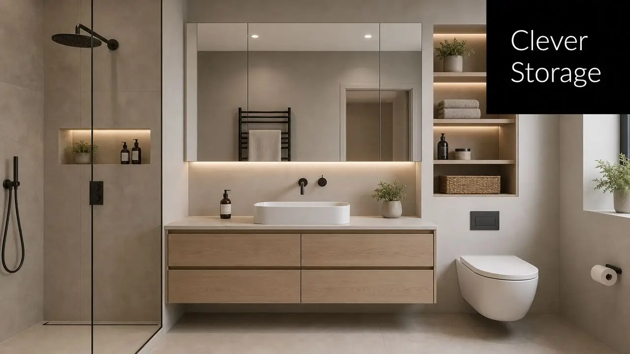
The best storage is built in early, before tile setout and vanity sizing are locked in. A recessed mirror cabinet is one of the most cost-effective upgrades I recommend. It gives you everyday storage at eye level, keeps the vanity top clearer, and often delivers a cleaner result than trying to add extra joinery elsewhere.

Drawers are usually a better use of money than cupboard doors below the vanity. In practice, drawers waste less space and make morning routines faster because everything is visible and grouped properly. That matters in smaller homes where one bathroom may need to serve parents, kids, and guests.

Built-in niches help too, but they need restraint. One well-sized shower niche, planned to suit the tile layout, looks deliberate. Several small cut-ins can make a minimalist bathroom feel fussy and often cost more in waterproofing and detailing than people expect.

A modern minimalist bathroom featuring wood cabinetry, integrated lighting, open shelving, and a sleek wall-mounted toilet.

Visual calm and practical storage work together

Wall-hung vanities help because they free up floor area and make the room easier to clean, but they are not always the right answer. In some renovations, particularly older Victorian homes with uneven walls or limited cavity depth, a floor-mounted vanity with full-depth drawers gives better storage and costs less to install. The minimalist result can still look refined if the proportions are right and the kickboard is handled neatly.

Toilet placement matters as well. The Australian National Construction Code sets minimum space and access requirements so fixtures remain comfortable and usable. Minimalism only works if the room functions easily day to day. Tight clearances, hard-to-reach storage, and doors clashing with drawers will ruin the experience no matter how restrained the palette is.

Storage decisions that pay off

A clutter-free bathroom usually starts with a few practical choices made early:

  • Prioritise drawer storage for daily-use items, backups, and shared family products
  • Choose a mirror cabinet over a plain mirror if bench space is limited
  • Size the shower niche for the bottles you use, not for a showroom photo
  • Allow for cleaning products, spare towels, and toilet paper so utility items have a proper home
  • Use one or two open shelves at most if you are committed to keeping them tidy

For homeowners trying to balance a designer look with a realistic spend, storage is one of the smarter places to be selective. Custom joinery throughout is rarely necessary. A standard vanity cabinet, upgraded with better drawer internals, a recessed shaving cabinet, and one well-positioned niche will usually give a cleaner result for less money. If you are planning costs carefully, this guide to budgeting a bathroom remodel helps frame those decisions before you overcommit to custom work.

Closed storage keeps a minimalist bathroom looking expensive on an ordinary Tuesday, not just in the photos.

Budgeting Your Minimalist Bathroom Renovation

A minimalist bathroom can look expensive without demanding a luxury budget, but only if the money goes into the right parts of the room.

I see the same mistake often in Victorian homes around Highett. Homeowners strip the design back, assume the build will be cheaper, then spend heavily on custom finishes that do little for function. The final room still looks simple, but the budget has been eaten up in places that do not improve daily use.

Minimalist style does not set the price. Scope does. The biggest cost drivers are layout changes, plumbing relocation, tile choice, glazing, and how much custom joinery you introduce. A clean, restrained bathroom can be cost-effective. It can also become expensive very quickly if every item is bespoke.

Real budget ranges for 2026

For a professionally managed small bathroom renovation in Australia with a minimalist brief, realistic 2026 pricing usually falls into these tiers:

Renovation Tier Estimated Cost Range (AUD) Key Inclusions
Cosmetic refresh Starting at $8,000 Surface-level updates, selected fixture or finish changes, limited structural intervention
Professional minimalist small bathroom $20,000 to $29,995 Standard tile sizes, mid-range fixtures, minimal plumbing changes, shower, toilet, vanity
Mid-range minimalist renovation $29,000 to $38,000 Added features such as a bath, custom shower screens, or brick niches
High-end transformation From $35,000 and up Freestanding bath, separate shower, upgraded materials, more extensive design detailing
Luxury renovation range in Australia Exceeding $35,000+ Premium finishes, broader scope, more customised execution

For Victorian homeowners, the sweet spot is usually the middle of the market. That is where you can get a bathroom that feels sharp and designer-led without paying for every premium product in the showroom.

Good minimalist budgeting is less about choosing the cheapest option and more about choosing the right substitute. Large-format imported tiles often get replaced with a well-selected local porcelain in a standard size. Wall-hung vanities can be done in a standard cabinet range with a custom top instead of full custom joinery. Frameless shower screens look refined, but a well-detailed semi-frameless screen can save money and still suit the look.

If you are still mapping out allowances, this guide on how to budget a bathroom remodel will help you set the numbers before selections start drifting.

Where minimalist budgets usually go wrong

Budget blowouts usually come from a stack of small upgrades.

A client keeps the same footprint but decides to move the vanity slightly, shift the shower waste, add underfloor heating, upgrade to a recessed rail, choose a feature tile for the niche, then swap a standard mirror for custom cabinetry. Each decision sounds manageable on its own. Together, they push a disciplined renovation into a much higher bracket.

The common pressure points are:

  • Moving plumbing that could have stayed put
  • Using premium finishes in too many areas instead of one or two
  • Choosing custom sizes where standard fixtures would fit cleanly
  • Adding bespoke joinery late because the storage plan was never priced properly
  • Paying for intricate tile layouts that increase labour without improving the room much

In a minimalist bathroom, labour matters as much as materials. Simple-looking rooms often need tighter set-outs and cleaner detailing, so it makes sense to save on product selection where the visual difference is small and spend on workmanship where the difference is obvious.

Where to spend and where to save

If the goal is a high-end look on a realistic budget, I would protect these items first: waterproofing, tile installation, lighting, and the main fixtures you touch every day.

Savings usually come from smarter specification:

  • Keep the existing layout if it already works
  • Use standard tile sizes to reduce cuts and labour time
  • Choose one hero finish, not four competing ones
  • Use off-the-shelf vanities and mirrors where dimensions allow
  • Pick durable mid-range tapware over designer labels with a similar profile

That mix usually gives better value than pouring money into statement pieces. In practice, a calm palette, accurate installation, and good proportions do more for a minimalist result than a long list of premium upgrades.

Why professional coordination matters

Minimalist bathrooms leave little room to hide mistakes. If the tile set-out is uneven, you notice it. If the vanity feels oversized, the room loses balance. If the screen, niche, and tapware do not line up, the bathroom starts to feel unresolved even with expensive finishes.

That is why coordination matters. For homeowners who want a controlled result, working with a registered builders unlimited team and a clear design process helps keep cost decisions tied to the overall plan, not made one by one under site pressure.

A minimalist bathroom rewards early planning, careful selections, and disciplined spending. That is how you get the designer look without building a budget that fights the rest of the home.

Bringing Your New Bathroom Idea to Life

The projects that come together best usually start the same way. A homeowner has a room that feels crowded, dated, or harder to use than it should. They've collected new bathroom ideas, saved images of modern bathrooms, and noticed they keep returning to the same look. Clean lines, calm materials, good storage, and enough warmth that the space still feels lived in.

From there, the work becomes practical. Strip back the unnecessary. Keep the layout honest. Choose materials that deliver the effect without wasting the budget. Make storage part of the architecture, not an afterthought. That's how minimalist bathroom design moves from inspiration to a finished room that works on a Monday morning, not just in a photo.

For Victorian homes, especially in suburbs like Highett where room sizes and existing conditions vary so much, clarity at the planning stage matters more than chasing trends. A 3D design process helps because you can test layout, fixture spacing, and sightlines before demolition starts. That removes guesswork and makes the final decisions easier.

If you're weighing up bathroom renovations and want a space that feels cleaner, sharper, and easier to live with, the next step is simple. Book a consultation, bring your measurements, and talk through what your bathroom needs to do. The strongest designer bathrooms don't begin with expensive products. They begin with a plan that fits the home, the budget, and the way you live.


Ready to turn your bathroom into a calmer, more functional space? Speak with the team at SitePro Bathrooms to discuss your layout, finishes, and renovation priorities.

  • siteprobathrooms

Mid Century Modern Bathtub: Your Guide to a Timeless Look

You're probably in the same spot as many Victorian homeowners. You've saved a folder full of bathroom inspiration, you know you want something cleaner and calmer than a standard white box renovation, and one feature keeps showing up: a sculptural tub with simple lines, warm finishes around it, and a room that feels both retro and current.

That pull makes sense. A mid century modern bathtub sits in a sweet spot between statement piece and practical fixture. It can soften a hard-edged room, anchor the layout, and give older homes a design language that feels more intentional than trend-driven. The challenge is that online inspiration rarely shows what happens behind the walls, under the floor, or at the bathroom door where a large tub still has to get inside the house.

In Victorian homes, that gap matters. Period homes and post-war homes often ask for different solutions, but both can benefit from the same discipline: choose a style with staying power, then adapt it to modern building standards, modern waterproofing, and how people live. That's why the mid-century look keeps resurfacing in bathroom renovations. It isn't fussy, it isn't overloaded, and it works well when you want a room to feel organised rather than decorated.

A good result starts by separating the look from the fantasy. The best mid-century bathrooms aren't just beautiful. They're easy to clean, easy to move through, and shaped around what the room can realistically support. If you're still deciding on colours, finishes, or overall direction, looking through bathroom decor ideas for Australian homes can help clarify what feels timeless versus what only looks good in a photo.

Introduction Embracing Timeless Bathroom Design

A homeowner might begin with one simple goal: replace an outdated bath and freshen the room. Then the scope expands. The vanity feels too bulky. The tiles feel cold. The layout wastes space. Before long, the project isn't about swapping fixtures. It's about creating a bathroom that feels composed.

That's where mid-century modern design earns its place. It gives you a framework, not just a mood board. Clean lines, uncluttered surfaces, practical storage, and a tub that looks deliberate rather than ornamental. For homeowners searching for new bathroom ideas, that combination is powerful because it avoids both extremes. It doesn't feel old-fashioned, and it doesn't feel sterile.

Why the style still works

The appeal isn't nostalgia alone. Mid-century bathrooms suit the way people want to use a bathroom now. They favour openness, visual calm, and materials that read as durable rather than delicate. In a family home, that usually translates into better daily use. In a smaller room, it can make the space feel lighter without stripping away warmth.

A well-chosen tub doesn't carry the whole room by itself. It works because the vanity, tapware, tile scale, and circulation all support the same idea.

The bathtub becomes the centrepiece because it expresses the style so clearly. A freestanding oval, a low-profile built-in, or a softened rectangular form can all work. The common thread is restraint. If the tub shape is strong, the rest of the room should settle around it.

What homeowners often get wrong

Most mistakes happen when the tub is chosen first and the room is forced to suit it later. That's when circulation tightens, storage disappears, and the bathroom starts looking like a showroom photo copied into the wrong footprint.

The better approach is to ask a few grounded questions early:

  • How do you bathe now. Quick practical baths for children, long soaking baths, or mostly showers with a bath as a secondary feature.
  • How much floor area can the room spare. A freestanding bath needs breathing room around it to look right.
  • What should the room feel like. Warm timber-led, crisp architectural, or softly retro.
  • What standard must it meet. Daily family use, guest bathroom expectations, or a future-proofed design with easier access.

That's the core promise of this style. It gives you a timeless visual language, but it only succeeds when beauty and function stay linked.

The Hallmarks of Mid-Century Modern Bathroom Style

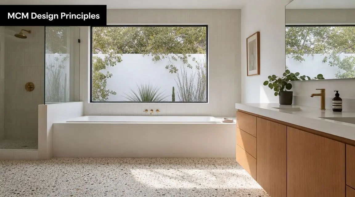
Mid-century modern isn't a catch-all term for any bathroom with a timber vanity and a curved bath. It has a specific design logic. In Australia, it's best understood as a post-World War II design response from the 1945 to late 1970s period, with an emphasis on clean lines and materials such as metal, glass, and plastic. The look was shaped by practicality, not ornament, and that's part of why it still feels current. The background on that era and material shift is outlined in this history of Danish and mid-century design influences.

A modern bathroom with a white bathtub, light wood vanity, and terrazzo flooring under a large window.

That same historical thread matters for bathtubs. The aesthetic developed around the modern enamel-coated cast iron tub, first standardised in 1883, which made durable and easier-to-clean bath fixtures practical for later homes. In other words, the style was never about lavish detailing. It was about modern living becoming more achievable.

What defines the look

A proper mid-century bathroom usually includes a few recognisable traits:

  • Clean geometry. Not severe, but disciplined. Lines are simple, and the room avoids visual clutter.
  • Organic contrast. Straight edges are often balanced with curved mirrors, rounded tubs, or softer lighting forms.
  • Warmth through material. Timber tones, tactile surfaces, and muted earthy colours keep the room from feeling clinical.
  • Minimal ornament. The design relies on proportion and finish, not decorative extras.

Many so-called modern bathrooms tend to drift away from the style. They might be sleek, but they miss the warmth. Mid-century rooms need some softness and some human scale. A cold monochrome palette with oversized glossy surfaces can feel contemporary, but it won't necessarily feel mid-century.

The role of functionality

The style came out of a period that valued practical living. That means function shouldn't be hidden as an afterthought. Floating vanities, open visual lines, and simple storage solutions fit the aesthetic because they make a bathroom easier to use.

A few elements usually work well:

  • Wall-hung or visually light vanities that keep more floor visible
  • Frameless glass where a shower screen is needed
  • Simple tapware silhouettes rather than ornate traditional fittings
  • Limited material changes so the room feels calm instead of busy

Practical rule: If every item in the room is trying to be the statement piece, the bathroom loses the mid-century character immediately.

What feels authentic in a Victorian renovation

Victorian homeowners often worry that a mid-century look will clash with the house. In practice, it can work extremely well if you avoid turning the bathroom into a movie set. The goal isn't strict historical recreation. It's a designer bathroom that borrows the era's discipline and ease.

That usually means choosing a restrained bath shape, a vanity with warm natural character, and finishes that don't fight each other. Authenticity comes less from copying a decade and more from respecting the principles that made the style durable in the first place.

Choosing Your Perfect Mid-Century Modern Bathtub

The tub is the anchor, but not every tub that looks right on a screen works in a real renovation. The best choice depends on how much space you have, how you use the bathroom, and how much visual weight the room can carry.

A mid century modern bathtub generally falls into two broad categories. There's the freestanding sculptural bath that acts as the hero, and there's the integrated bath that keeps the room tighter and more architectural. Both can suit the style. They solve different problems.

Freestanding or built-in

A freestanding tub usually gives the strongest mid-century expression. It reads as furniture-like, especially when paired with a floating vanity and pared-back wall finishes. In a larger room, that's often the right move.

In a tighter footprint, it can backfire. You lose practical floor area around the bath, cleaning gets harder if clearances are too tight, and the tub can dominate a room that really needs storage or circulation more than sculpture.

A built-in or alcove tub can be the smarter choice when:

  • The bathroom is compact and every centimetre needs to work
  • You need a shower over bath arrangement or a more family-focused layout
  • The room already has strong architectural features and doesn't need another focal point
  • You want the bath to support the room rather than lead it

Material matters more than many buyers expect

Material changes how the bath feels, how it performs, and what the installation asks of the house. For Australian renovations, a sound specification is often a freestanding acrylic or cast-stone tub with enough internal volume for a proper soak without becoming excessive. Common modern bathtubs hold around 80 gallons (302 L), while a typical bath uses 35 to 50 gallons (132 to 189 L), according to bathtub dimensions and capacity guidance. That affects hot water demand and filling behaviour, so the material choice shouldn't be made on appearance alone.

Mid-Century Modern Bathtub Material Comparison

Material Heat Retention Weight Maintenance Typical Cost
Acrylic Good for everyday use. Often improved further by quality construction Lighter and easier to handle on site Easy to clean, generally straightforward to maintain Usually more budget-friendly
Cast stone Typically feels more substantial and holds warmth well Heavier than acrylic Smooth finish, but correct cleaning products matter Usually positioned in a higher price range
Enamelled cast iron Traditionally solid and durable Very heavy, often the hardest to bring into older homes Hard-wearing surface, but chips need attention Often premium once product and installation demands are considered

How I'd narrow it down

If the priority is a strong visual statement with easier installation, acrylic is often the practical winner. If the priority is tactile quality and a more substantial feel, cast stone often justifies the extra planning. Cast iron suits some projects, but it asks a lot from access, structure, and labour.

Ask yourself three things before deciding:

  1. Will this bath still make sense after the novelty wears off
  2. Can the room support the shape without becoming awkward
  3. Does the rest of the renovation budget still work once the tub is selected

The best tub usually isn't the most dramatic one. It's the one that makes the whole room feel resolved.

Practical Planning for Your Bathtub Installation

A bath can look perfectly proportioned in a showroom and still be wrong for your home. Installation planning is where many bathroom renovations either stay on track or start generating expensive corrections.

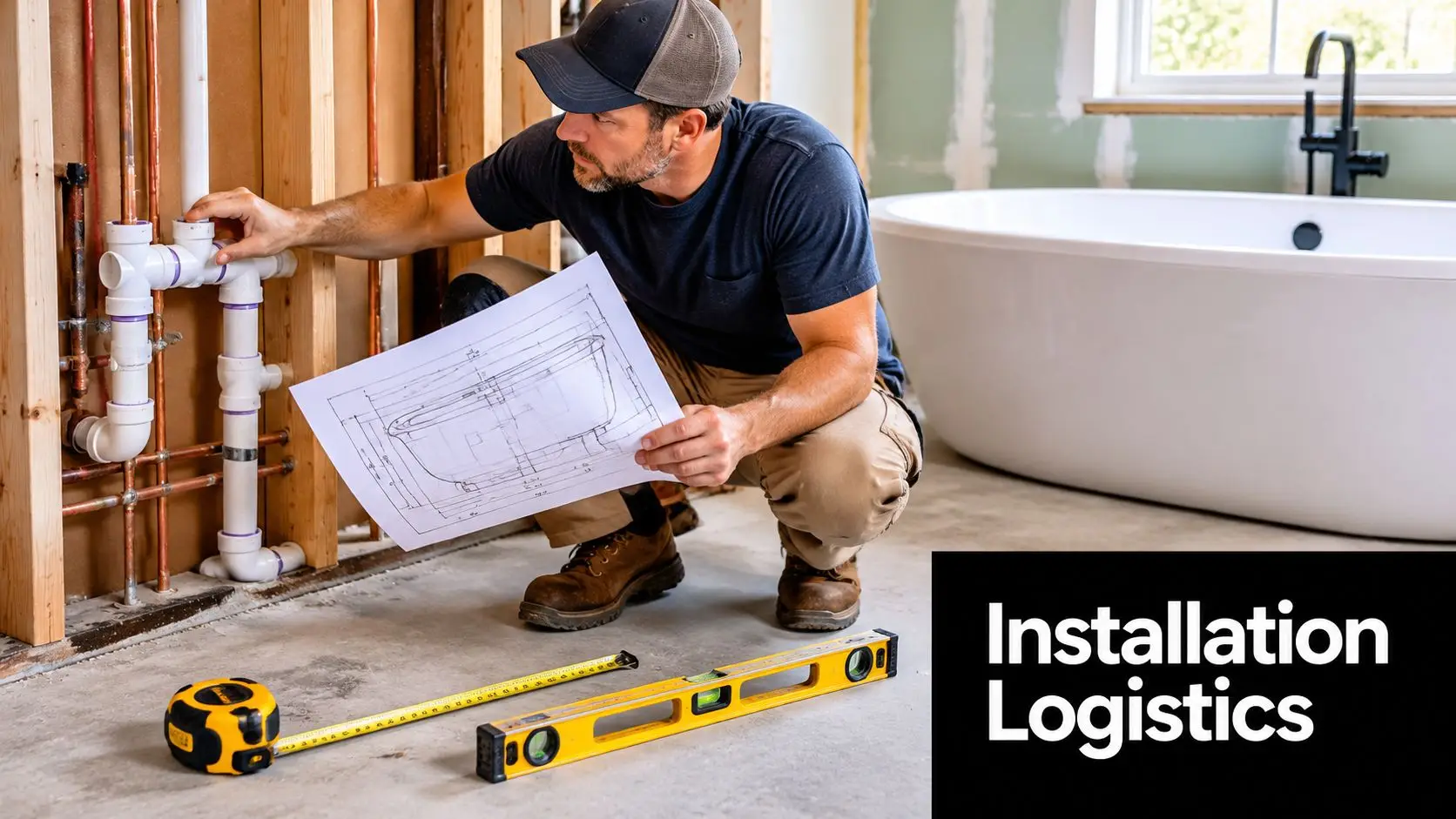
A professional plumber checks pipes while referencing a bathroom blueprint in a house under construction.

The first check is basic but often skipped. Measure not only the bathroom, but also the path into it. Door openings, hallway turns, stair access, and wall projections can all become the actual limiting factor. A tub that fits the room on paper may still be impossible to deliver without damage or major inconvenience.

Clearance is part of the design

Mid-century bathrooms work best when they feel open. That effect comes from disciplined spacing, not from empty styling. Design guidance recommends at least 15 inches (381 mm) from either side of the toilet to the centreline, with 36 inches total toilet niche width preferred for comfort, as outlined in this mid-century bathroom design guide. The same guidance stresses strong ventilation to manage humidity and protect finishes.

Those numbers matter because a beautiful bathroom still has to function when someone is stepping out of the bath, opening a vanity drawer, or helping a child at the basin. Tight clearances quickly make a space feel cheap, no matter how refined the fixtures are.

Check these before you approve the layout

  • Bath access zone. Make sure entry and exit feel stable, not squeezed beside a vanity corner or toilet pan.
  • Toilet spacing. Respect the recommended clearances so the room doesn't become uncomfortable in daily use.
  • Screen and door swing. A bath edge, shower screen, and room door can clash if they're all competing in the same space.
  • Ventilation path. Moisture control protects timber looks, painted finishes, and general longevity.

Good bathroom planning isn't about fitting everything in. It's about making every movement in the room feel natural.

Water volume and hot water reality

A larger soaking tub changes the demands on the plumbing system. As noted earlier, common modern bathtubs can hold 302 L, and a typical bath uses 132 to 189 L when filled for use. That has a direct effect on fill time, hot water availability, and whether the water temperature stays comfortable through the fill.

If the selected tub is generous in capacity, you may need to review hot water access and the strategy for delivering stable mixed water. In such cases, homeowners benefit from experienced trades and, in many projects, from understanding why using a registered builder matters for your bathroom renovation. The visual choice and the technical system have to be solved together.

Structure and moisture control

Heavy tubs, water load, and occupant load all sit on one floor system. In older homes, especially where bathrooms have been altered before, that deserves proper assessment. The same goes for ventilation. A mid-century palette often includes warm timber tones and refined finishes, and they won't look good for long if steam lingers and moisture sits where it shouldn't.

The smartest bathtub choice is the one the room can support physically, hydraulically, and spatially.

Integrating Your Tub into a Bathroom Renovation

A bathtub replacement is rarely just a bathtub replacement. Once the old fixture comes out, the room often reveals why the bath looked awkward in the first place. Plumbing may sit in the wrong position, the floor may need correction, waterproofing may be due for a full rebuild, and the layout may need to shift to make the new bath work properly.

That's especially true when you're fitting a mid-century shape into an Australian renovation. A frequently missed issue is practicality. Inspiration images tend to show large rooms with generous empty floor space, but many Victorian homes need careful redesign so a sculptural tub doesn't compromise circulation or accessibility. That fit-out reality is highlighted in this overview of mid-century bathtub practicality.

The real project sequence

In a properly managed renovation, the bath decision affects several stages:

  1. Demolition and strip-out
    The old room is removed so the actual substrate, plumbing positions, and any hidden issues can be assessed.

  2. Layout confirmation
    At this stage, a bath stays, shifts, or gets replaced with a different type because the room's best use becomes clearer.

  3. Plumbing rough-in
    Freestanding baths often need different waste and tap arrangements from built-in units. That can mean more floor planning than homeowners expect.

  4. Waterproofing and levelling
    A freestanding bath especially needs a properly prepared base. If the floor falls away or the waterproofing detail is rushed, the final finish suffers.

  5. Tiling, fit-off, and final placement
    The visible stage looks simple, but it only works well when the hidden work has been coordinated carefully.

Where projects commonly go wrong

The most common problem isn't bad taste. It's underestimating what the chosen bath asks of the room. A freestanding filler might end up in an awkward position. A bath may look balanced in elevation drawings but crowd the circulation path in real life. Or the room may lose practical storage because too much area has been handed over to the feature piece.

For homeowners looking at registered builders unlimited and qualified trades, the value is straightforward. Compliance, sequencing, and accountability matter more when plumbing, structure, waterproofing, and finish quality all intersect in one compact space.

The best renovation results don't happen because the bath looked good in a brochure. They happen because every trade solved the same layout problem in the same way.

A mid-century bathroom should feel effortless. Getting there usually isn't effortless at all. It takes coordination.

Styling and Pairing for a Cohesive Look

Once the tub is in place, the room still needs visual discipline. Mid-century style falls apart when the supporting finishes pull in unrelated directions. A sculptural bath with ultra-ornate tapware, oversized stone veining, and high-gloss cabinetry won't read as coherent. It will read as several trends sharing one room.

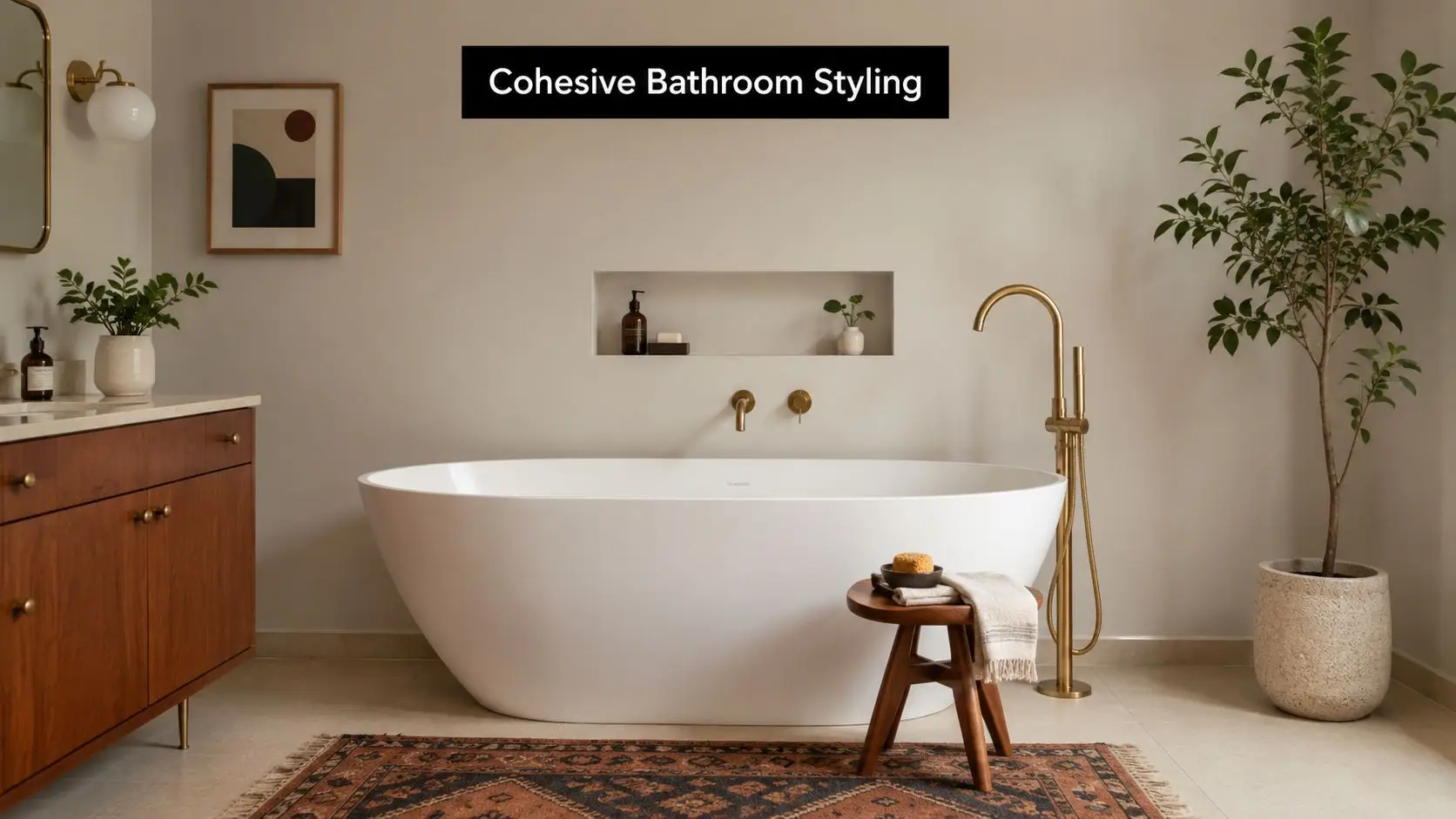
A modern bathroom with a freestanding white bathtub, wooden stool, rug, and brass fixtures on beige walls.

The strongest pairings usually rely on contrast with restraint. A white bath against warm timber-look porcelain. A soft terrazzo floor under a simple floating vanity. Brass or chrome tapware that adds definition without dragging the room into either industrial or traditional territory.

Tiles that support the bath

Tile choice should frame the tub, not compete with it. For many designer bathrooms, that means one quiet field tile and one material with character.

Good options include:

  • Simple ceramic wall tiles for a crisp backdrop
  • Terrazzo-style flooring for period flavour without fussiness
  • Timber-look porcelain where you want warmth without real timber maintenance concerns
  • Geometric feature use in moderation, such as a niche, splashback, or small floor zone

If you're refining combinations, guidance on choosing bathroom tiles can help narrow down what works visually and practically in wet areas.

Tapware, colour, and furniture tone

The vanity often determines whether the room feels authentically mid-century or just broadly contemporary. Warm timber tones usually help, especially if the grain is visible and the form is simple. Floating vanities work particularly well because they keep sightlines clear.

Tapware and accessories should follow the same discipline:

  • Brushed brass adds warmth and suits earthy palettes
  • Polished chrome keeps the room crisp and timeless
  • Matte black can work, but it's easiest to overdo in a mid-century scheme

For colour, think muted and grounded. Off-white, clay, olive, ochre, soft teal, warm beige, and walnut-adjacent tones all sit comfortably in this style. One accent usually reads better than three.

Small details that lift the room

The finishing layer matters more than people expect. A mirror with a gentle curve, a wall light with a simple globe form, or a timber stool beside the bath can reinforce the style without cluttering the room.

A few details worth considering:

  • Keep accessories sparse so the architecture and materials stay visible
  • Choose soft textiles in earthy or neutral tones rather than bright pattern overload
  • Use greenery carefully if the room has natural light and enough ventilation
  • Repeat one finish across hardware so the room feels organised

A cohesive bathroom doesn't need more features. It needs fewer competing decisions.

That's what makes the mid-century look so effective. It feels designed, but it doesn't feel overworked.

Your Highett Bathroom Renovation Partner

A mid-century bathroom looks simple when it's done well. Behind that calm finish sits a lot of decision-making. The tub has to suit the room. The layout has to support movement. The plumbing, waterproofing, and construction all have to line up with the design intent.

That's where a local renovation specialist makes the process easier. For homeowners in Highett and across Victoria, SitePro Bathrooms delivers end-to-end bathroom renovations with a focus on planning, build quality, and practical outcomes. That matters when you're trying to turn inspiration into a room that is practical in an existing home.

Screenshot from https://siteprobathrooms.com.au

The advantage of a coordinated team is consistency. Design choices, fixture selection, layout planning, and on-site execution are handled as one connected job rather than a string of disconnected decisions. That's particularly valuable when a mid century modern bathtub is central to the renovation, because style, structure, and services all need to support the same final result.

If you're exploring new bathroom ideas, updating one tired room, or planning a full renovation with the guidance of experienced designers and builders, SitePro Bathrooms offers that local expertise. You can browse completed projects, review the renovation approach, and take the next step through SitePro Bathrooms.


A well-designed mid-century bathroom doesn't chase attention. It earns it through proportion, clarity, and smart planning. If that's the kind of room you want, start with the bathtub, but don't stop there. The best results come when every surrounding decision is just as deliberate.

  • siteprobathrooms

Best Bathroom Heated Towel Rail: 2026 Buyer’s Guide

A lot of people start looking at a bathroom heated towel rail after the same moment. It's a cold Highett morning, the shower's done its job, and the towel hasn't. It's still damp from yesterday, the room feels chilly, and what was meant to be a fresh start feels a bit second-rate.

That's why this choice matters more than it first appears to. In real bathroom renovations, a heated towel rail affects layout, electrical rough-in, wall framing, tile set-out, and how the room feels to use every day. It sits right at the intersection of comfort, compliance, and design. If you get it right, it feels effortless. If you get it wrong, you end up with a rail that looks good on the wall but doesn't suit the room, costs more to run than expected, or lands in the wrong spot for Victorian installation rules.

Why a Heated Towel Rail Is More Than Just a Luxury

The idea that a heated towel rail is just a decorative extra is fairly modern. Its roots go back to the early 20th century, when central heating became more common and bathrooms started using heated pipework and radiator-style forms as part of the room's actual heating setup. By the 1920s, cast-iron water-heated towel warmers, often called bath radiators, were already established, which is why they still make the most sense when they're treated as part of the bathroom plan rather than an afterthought, as outlined in this history of towel radiators and bath radiators.

That history still shows up in renovation work now. The homeowners who are happiest with the result usually aren't the ones chasing a “luxury item”. They're the ones solving a practical problem. They want towels to dry properly, less lingering dampness in the room, and a bathroom that feels considered rather than pieced together.

What changes in day-to-day use

A good rail improves the routine in small but noticeable ways:

  • Towels dry between uses so they don't sit heavy and cold on the hook.
  • The room feels more finished because the rail becomes part of the wall layout, not just another accessory.
  • Storage pressure can ease in compact bathrooms because towels can hang and dry where they're used.

A bathroom heated towel rail works best when it solves a daily annoyance, not when it's chosen purely because it looks high-end in a showroom.

That's especially true in bathroom renovations where wall space is limited. In many modern bathrooms and designer bathrooms, every fitting has to earn its place. A rail can do that, but only if it matches the room, the power plan, and the way your household uses the bathroom.

Understanding the Types of Heated Towel Rails

Most homeowners are really choosing between electric and hydronic. The right answer depends less on fashion and more on what's happening behind the walls.

Electric rails

Electric rails are the most straightforward fit for many renovations. They're commonly used when you want a dedicated bathroom heated towel rail without tying it into a larger whole-home heating setup.

In practice, there are a few versions you'll come across:

  • Hardwired electric rails are fixed into the electrical system and give the cleanest finish because there's no visible lead.
  • Plug-in styles can suit some situations, but they're often less elegant in a fully renovated bathroom and can create placement limits.
  • Dry-element and liquid-filled designs behave a bit differently in how they warm up and hold heat, but from a renovation point of view the bigger issue is usually safe location, cable planning, and access for installation.

Electric rails are also often chosen because they can be controlled independently. That matters if you only want heat in the bathroom at certain times rather than running a broader heating system.

Hydronic rails

Hydronic rails connect into a plumbing-based heating system. They make the most sense when the house already uses hydronic heating or the renovation includes a broader services upgrade.

For most standard bathroom renovations, hydronic introduces more coordination. You're dealing with pipe runs, plumbing access, and how that rail ties into the rest of the heating design. It can be a very tidy solution in the right home, but it isn't usually the simplest retrofit.

Heated towel rail comparison

Feature Electric (Hardwired) Hydronic
Heat source Mains electrical connection Hot water from a hydronic system
Best fit Renovations, retrofits, apartments, single-bathroom upgrades Homes already using or adding hydronic heating
Installation trade-off Requires electrical planning and compliant placement Requires plumbing integration and broader system coordination
Control Usually easier to run independently Usually linked to the wider heating setup
Design flexibility Often simpler to position where wall space allows Depends on pipe routing and system layout
What can go wrong Wrong location, visible cabling, poor wall prep Overcomplicated install for a bathroom-only need

What works in real renovations

If the project is a standard Victorian bathroom renovation, electric is often the more practical path because it's easier to integrate into the room without redesigning other services. If the rail is being included in a larger, high-spec project with coordinated heating throughout the home, hydronic can make sense.

The mistake is choosing the technology first and asking how to make it fit later. Start with the house, the bathroom layout, and the way the room will actually be used.

That's where a lot of new bathroom ideas either become practical or fall apart. A finish sample on a display wall doesn't tell you whether the system suits your renovation.

Choosing the Right Size and Heat Output

A rail that looks right on the wall can still disappoint on a cold Highett morning. I see that often in renovations where the homeowner expects one slim rail to dry two towels and warm the whole bathroom. Sometimes it will. Often it will not.

The first decision is the job you want the rail to do. If the goal is warm, dry towels, a smaller unit can be perfectly reasonable. If you want it to help heat the room as well, size needs to be based on the bathroom itself, not just the available wall space or the look of the rail.

Room volume matters, but so does heat loss. A compact ensuite with good insulation, no large window, and an internal wall position will usually need far less output than a larger family bathroom with an external wall, older glazing, and higher ceilings. That trade-off gets missed in a lot of showroom decisions.

In many Victorian homes, especially older ones, a heated towel rail is best treated as a comfort add-on rather than the primary room heater. That is the sensible expectation to set from the start.

What changes the result

A rail's real performance depends on the room around it:

  • External walls lose heat faster in winter.
  • Windows make a noticeable difference, especially if the glazing is older.
  • Ceiling height increases the volume of air that needs warming.
  • Insulation and draught sealing affect whether the warmth stays in the room.
  • Towel load matters too. A rail carrying thick, folded towels will feel less effective than one with lighter towels spaced properly.

A larger rail is not always the better answer. Bigger units need enough clear wall area, need to suit the proportions of the room, and can push up running costs if they are used for long periods. In a tight bathroom, an oversized rail can also create practical issues around reach, cleaning, and the placement of mirrors, vanities, or shower screens.

That is why I usually weigh three things together:

  1. How many towels need to hang properly
  2. Whether the rail is expected to assist with room heating
  3. What the wall and bathroom layout can realistically accommodate

For homeowners planning modern bathroom renovations, style and practicality must align. A narrow designer rail may suit the palette and proportions, but if the room runs cold and the rail only holds one towel comfortably, the choice will feel wrong after the first winter.

Victorian compliance also affects the decision indirectly. If the rail is electric, the final position and wiring method have to work with bathroom electrical safety rules, which can limit where a larger unit can go. So the right size is not only about heat output. It also has to fit the room, the use case, and the installation rules without forcing compromises later.

Design and Placement in Modern Bathrooms

A bathroom heated towel rail shouldn't feel bolted on. In well-resolved modern bathrooms, it looks like it belonged there from the first sketch.

A modern, minimalist bathroom design featuring a floating wooden vanity, walk-in glass shower, and elegant ambient lighting.

The design decision usually starts with shape and finish. Ladder styles remain popular because they're practical and easy to use. Vertical rails can work beautifully in tighter layouts where horizontal wall space is limited. Chrome stays versatile, while matte black and brushed brass often suit newer palettes and more obviously designer bathrooms.

If you're collecting inspiration for modern bathroom renovations, the rail should be considered alongside tapware, shower frame finish, vanity hardware, mirror lighting, and robe hooks. It's part of the composition, not a separate layer.

Placement that feels natural

The best position is usually close enough to the shower or bath that the towel is easy to grab, but not so close that it compromises safety, crowding, or overall wall balance.

Good placement often follows these principles:

  • Reach matters. You want the towel close to the wet area, but not where it interferes with entry, exit, or cleaning.
  • Sightlines matter. A rail can anchor a wall, but it shouldn't fight with the vanity, mirror, niche, or feature tile.
  • Towel drop matters. Make sure the towel can hang freely without brushing the toilet, vanity edge, or floor.

What tends to work best

In practical terms, these placements usually age well:

  • Near the shower return wall where towels are easy to access but the rail isn't the first thing you see.
  • Adjacent to the vanity zone when the room needs balanced vertical elements.
  • On a clear wall opposite the wet area in tighter bathrooms where circulation is more important than direct reach.

In small bathrooms, the right rail often does double duty. It warms the towel, fills an otherwise awkward section of wall, and reduces the need for separate towel storage.

Design mistakes worth avoiding

Some choices look good on a plan and disappoint in person:

  • Overly wide rails on narrow walls can make the room feel cramped.
  • Dark finishes in low-light bathrooms can disappear unless they connect with other fixtures.
  • Rails behind doors often end up inconvenient, even if they technically fit.
  • One tiny rail in a busy family bathroom can create more frustration than comfort.

A strong result comes from treating the rail as part of the joinery, lighting, and tile set-out discussion. That's how new bathroom ideas become rooms that still work properly once people are living with them.

Installation Rules for Victorian Bathroom Renovations

Generic advice usually becomes unhelpful. In Victoria, the rail can't just go wherever it looks good. Location, wiring method, wall preparation, and bathroom zoning all matter.

A luxurious victorian style bathroom interior displayed next to six essential installation rules for renovation projects.

For electric heated towel rails, independent guidance recommends keeping them at least 60 cm away from water-contact areas such as bathtubs and showers, with placement preferably in zone 3, as explained in this electric towel rail installation and zoning guide. In practical renovation work, that single siting decision can affect tile layout, switch position, cable route, and whether the chosen rail is even suitable for the wall you had in mind.

The compliance mindset

Homeowners often ask whether a rail can sit “just next to” the shower or vanity. The answer depends on the exact room layout, the product, and the installation details. What matters is that the decision gets made before waterproofing and tiling are locked in.

The safe approach is simple:

  • Keep electric rails away from direct water exposure.
  • Plan the exact fixing point early so the electrician and builder can coordinate rough-in.
  • Check the product's rating and installation method against the intended location.
  • Don't assume a stylish product is suitable for every bathroom zone.

This is not a styling question first. It's a compliance question first.

Why pre-tiling planning matters

Once the wall is sheeted, waterproofed, and tiled, moving the rail becomes expensive. If the original position doesn't comply, you may need rework that affects finished surfaces and other fixtures.

Pre-tiling planning should cover:

  1. Cable path for a hardwired unit.
  2. Wall support so fixings land properly and don't rely on guesswork after tiling.
  3. Clearance from shower, bath, and vanity based on the actual site dimensions.
  4. Switching and control location so operation is convenient and compliant.

If the design also includes extra electrical work, details like downlights in a bathroom should be considered at the same time. Wet-area electrical planning works best when it's coordinated, not handled as a series of isolated decisions.

Who should do the work

A hardwired electric rail needs to be handled as part of a properly managed renovation. That means the electrical connection should be completed by a licensed electrician, while the overall works should be coordinated within the renovation by the appropriate qualified professionals.

For homeowners comparing bathroom renovations, this is one of the reasons working with registered builders unlimited or another suitably registered and appropriately licensed renovation team matters. The rail itself may look like a small fixture, but it crosses into bigger project issues: compliance, sequencing, and accountability.

Common installation mistakes

These are the problems that cause frustration most often:

  • Choosing the wall before checking the zone.
  • Leaving the decision until after tiles are selected.
  • Forgetting wall depth and fixing points for concealed installations.
  • Expecting the rail to sit right beside the shower because it seems convenient.
  • Assuming any electrician can solve a poor layout decision after the room is finished.

A bathroom heated towel rail should never be the item that forces compromise late in the build. If the placement is right on paper and right on site, the room comes together cleanly.

Comparing Energy Use and Running Costs

A heated towel rail usually costs less to run than many homeowners expect, but only if it is chosen for the job it can do. In Highett bathrooms, the mistake I see most often is treating the rail like a room heater when it was really bought to dry towels and take the edge off a cold space.

A comparison chart showing energy consumption and monthly costs for a portable air conditioner versus a window fan.

Cost depends on wattage, how many hours it runs, and whether the bathroom already has decent heating and extraction. A low-watt rail on a timer can be a sensible addition. A larger rail left on all day, in a bathroom that already has other heating, is where the value starts to fall away.

What you are really paying for

Most households are not buying a heated towel rail to heat the whole bathroom. They are paying for three practical benefits:

  • Drier towels between uses
  • Less damp smell in cooler months
  • A bit more comfort after showering

That can be worth it, especially in winter, but only if expectations are realistic. If the room itself feels cold because of poor ventilation, no ceiling heat, or a generally underpowered heating setup, the rail will not fix the bigger problem.

Where running costs get pushed up

Usage habits matter more than the product brochure.

Costs usually climb when:

  • the rail runs for long periods without a timer
  • the wattage is higher than the household needs
  • the rail is used as the main heat source for the room
  • towels are draped so heavily that drying is slow and the rail stays on longer

In practical terms, timed control is often the difference between a rail that feels worthwhile and one that becomes an annoyance on the power bill. For many Victorian renovations, I recommend deciding on the control method early, because a hardwired setup with the right switching arrangement is usually a better long-term result than relying on people to remember to turn it off.

The Victorian renovation angle that gets missed

Running cost should never be looked at in isolation from compliance and installation method. In Victoria, if the rail is hardwired, it needs to be planned and installed properly as part of the bathroom works. That affects not just safety and legal compliance, but also how easy it is to control the rail efficiently once the room is finished.

This is also one of the practical reasons to understand why using a registered builder matters for your bathroom renovation. Good coordination leads to better placement, proper rough-in, and controls that suit how the household will use the bathroom.

When a heated towel rail is good value

A rail generally makes sense when the household reuses towels, wants them dry by the next use, and does not want to rely on the rail to warm the entire room.

It makes less sense where:

  • the bathroom already performs well without it
  • the choice is driven only by appearance
  • another heating or ventilation upgrade would solve the problem more effectively

That is the trade-off many design-focused articles skip. A bathroom heated towel rail can be stylish and useful, but in a Highett renovation it should still earn its place through sensible running costs, proper controls, and a compliant installation.

Key Questions to Ask Your Bathroom Renovator

The right conversation with your renovator will usually tell you more than a product display ever will. If they can answer these clearly, the project is probably being thought through properly.

Questions that reveal whether the planning is solid

  • How will you confirm the rail location is suitable for the bathroom layout and wet-area rules?
  • Will the wall need extra framing or fixing support before sheeting and tiling?
  • Is this rail being chosen mainly for towel drying, room heating, or both?
  • What controls will be used so it isn't left running unnecessarily?

Questions about sequencing

Some of the most expensive errors happen because the rail gets considered too late. Ask:

  • When does the final rail position need to be locked in?
  • Will the electrician rough in before waterproofing and tiling?
  • How will the rail position affect tile set-out and other fittings on that wall?
  • If the chosen model doesn't suit the location, when will that be picked up?

Questions about who is responsible

A bathroom renovation runs better when responsibilities are clear from the start.

A bathroom heated towel rail is a small item with oversized consequences. Ask the right questions early, and it becomes one of the most satisfying details in the room. Ask them too late, and it can turn into an avoidable compromise.


If you're planning a bathroom renovation in Highett or elsewhere in Victoria, the right heated towel rail choice comes down to three things: compliant placement, realistic performance, and a design that suits how you live.