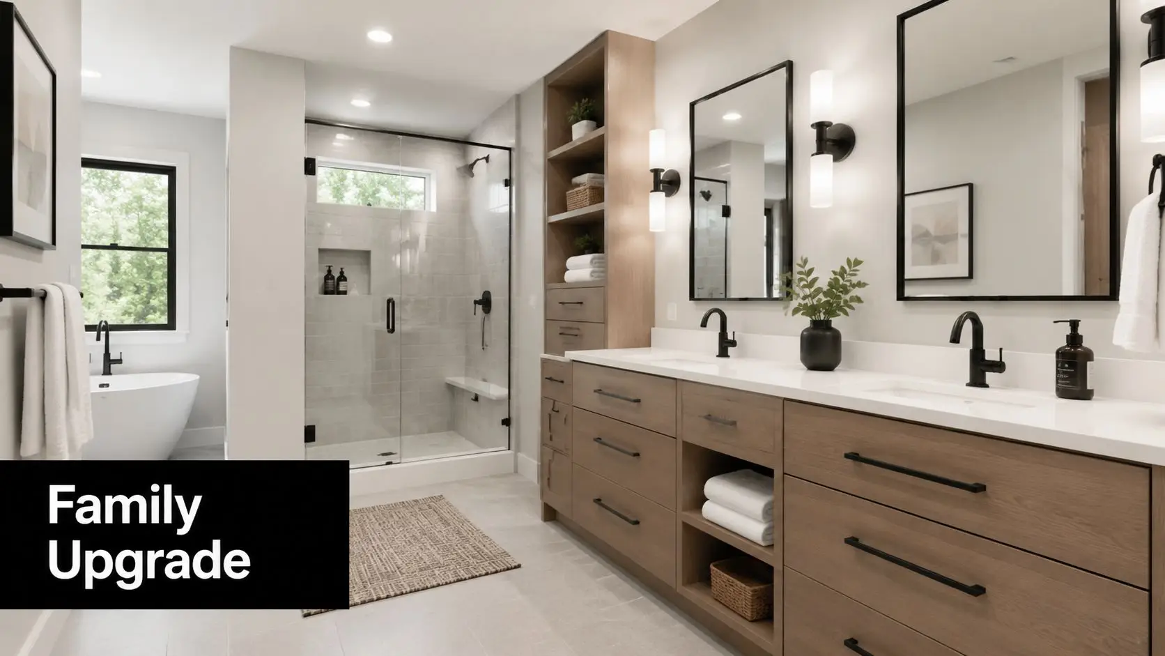
Top 8 Ensuite Designs Small for 2026
Transform Your Cramped Ensuite Into a Smart Sanctuary
You step into the ensuite at 6:30 am, turn sideways to clear the vanity, bump the door against the toilet, and realise the room is working against you before the day has even started. That problem usually comes down to planning, not floor area.
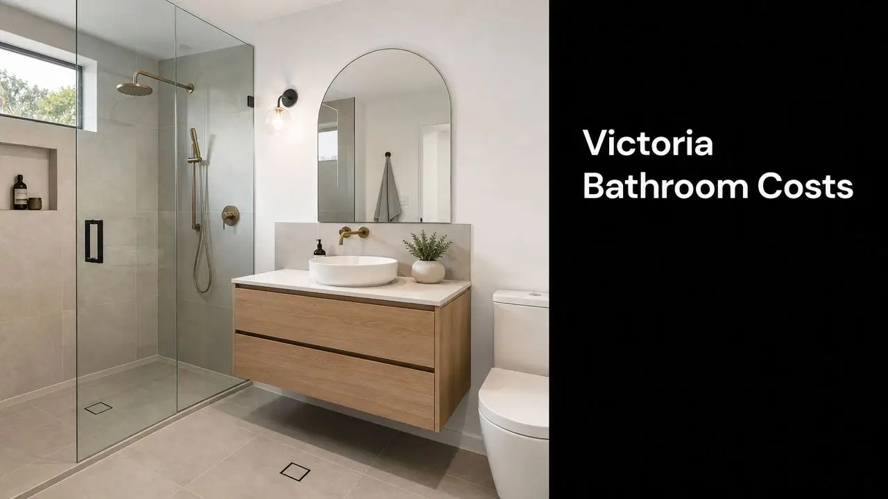
In Melbourne homes, I see the same issue again and again. Older ensuites often have tight footprints, awkward plumbing positions, and door swings that steal usable space. Small rooms can still feel refined and expensive, but only when every fitting is chosen with clearances, storage, and day-to-day use in mind.
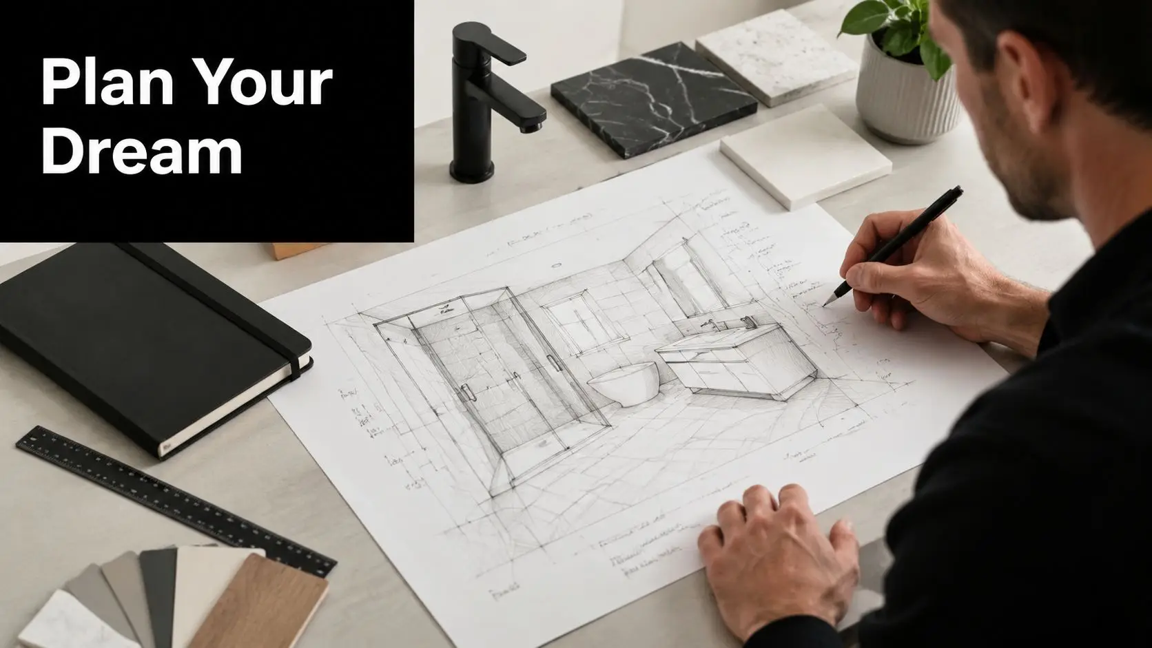
The difference is proving the layout before construction starts.
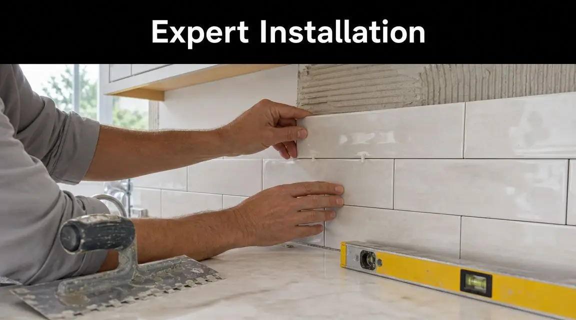
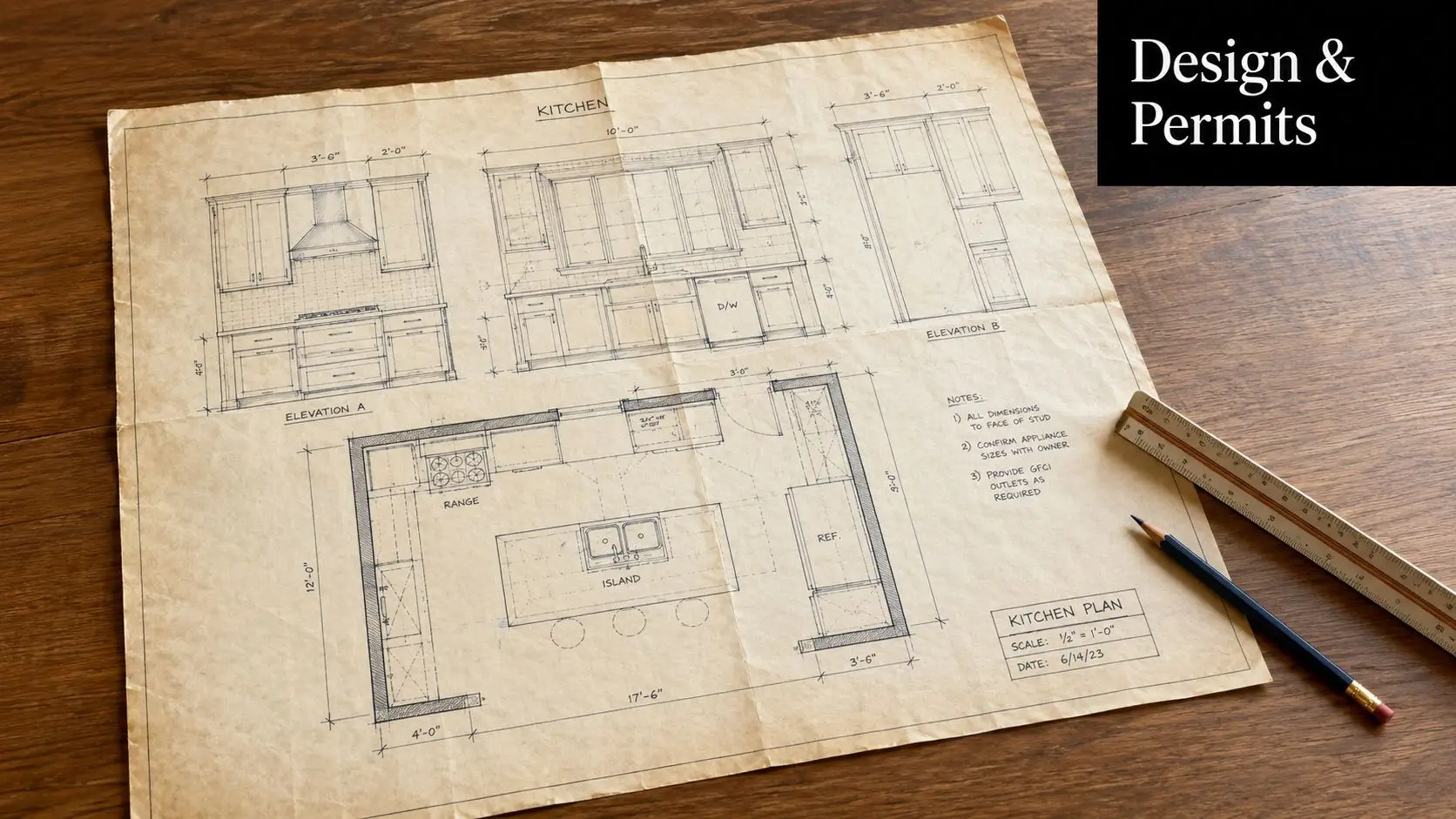
A strong small ensuite design is not just a set of ideas pulled from inspiration photos. It needs to be tested at full scale so you can see whether the vanity depth is too aggressive, whether the toilet pan crowds circulation, and whether the shower screen makes the room feel closed in. That is why 3D planning sits at the centre of the process here at SitePro Bathrooms. Clients get to assess the room properly before tiles are ordered, walls are lined, or plumbing is shifted. It saves expensive corrections and gives much better control over the final result.
Design direction matters too. If you are weighing up finishes, joinery style, or a more current layout, these 2025 bathroom design trends for Australian homes show where compact bathrooms are heading. The key is applying those ideas in a way that fits the room, rather than forcing a look that only works in a larger space.
The eight concepts below focus on that exact balance. Each one is practical to build, suited to compact ensuites, and far more effective when reviewed in 3D before work begins. That is how good small bathrooms stop being a compromise and start feeling resolved.
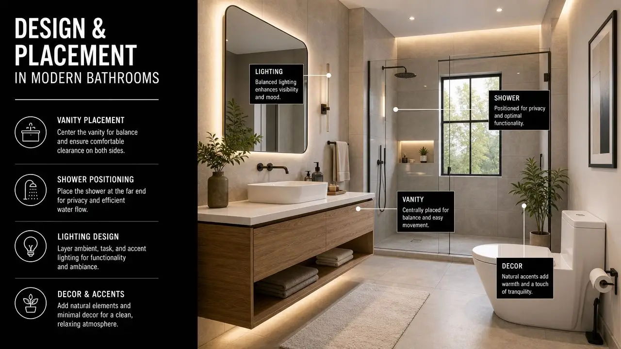
1. Corner-Mounted Vanity with Floating Design
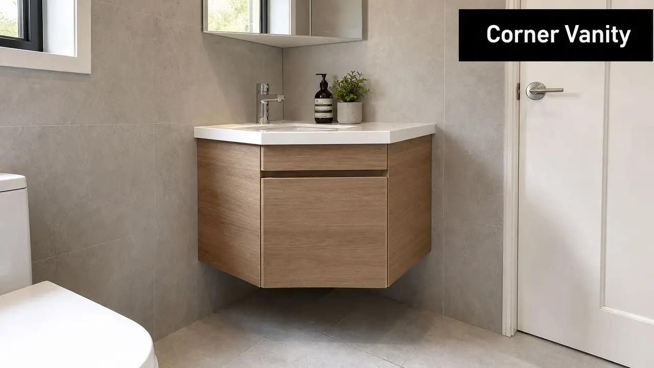
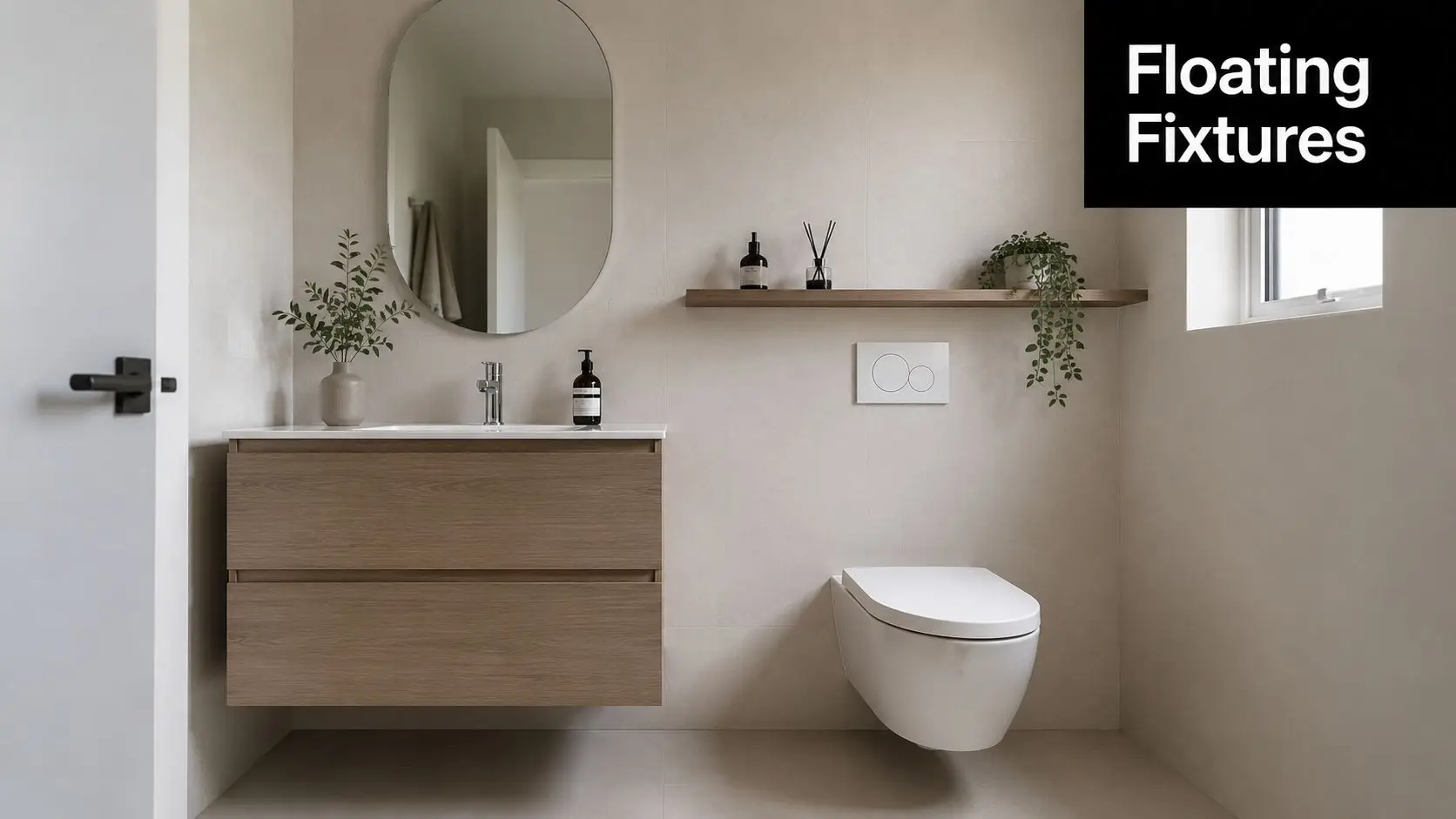
You open a small ensuite door and the vanity is what sets the tone straight away. If that unit projects too far, the room feels cramped before you even step in. Put the vanity into the corner and lift it off the floor, and circulation improves fast.
That combination solves two common problems at once. It uses a part of the room that often does very little, and it keeps more floor visible, which helps the ensuite read as larger and cleaner. In practical terms, it also reduces that shoulder-check feeling you get when a standard vanity sits too close to the entry or shower line.
I use this layout regularly in apartment ensuites, narrow side-by-side plans, and older homes where existing plumbing does not leave much room to move. It suits compact rooms, but it still needs discipline. A corner vanity can look sharp in drawings and still fail on site if the basin overhang is too generous, the drawer hardware clashes with the wall, or the tap set-out is left unresolved until rough-in.
A few details matter here:
- Keep the basin projection tight: A compact bowl protects elbow room and makes the bench more usable.
- Choose a true floating unit: The visual gain comes from seeing floor area under the cabinet, not from shaving a few millimetres off the depth.
- Use drawers where possible: In tight ensuites, drawers are easier to use than cupboard doors that swing into your body.
- Resolve services early: Waste position, water points, power for mirrored cabinetry, and tile set-out all need to line up before wall linings go on.
The trade-off is storage. A corner unit rarely gives the same drawer width as a full straight vanity, so the joinery has to work harder. That is why I like pairing this idea with a mirrored cabinet or recessed storage elsewhere in the room, rather than asking one small vanity to do everything.
Practical rule: If the vanity sits in the first sightline from the door, keep it light, compact, and off the floor.
This concept is also one of the easiest to test properly in 3D before construction starts. At SitePro Bathrooms, we use that planning stage to check whether the corner angle feels refined or forced, whether the basin edge interrupts movement, and whether the mirror and lighting still sit comfortably on the wall. If you are reviewing 2025 bathroom design trends for Australian homes, this layout is a strong way to bring in a current high-end look while keeping the room practical to build and use.
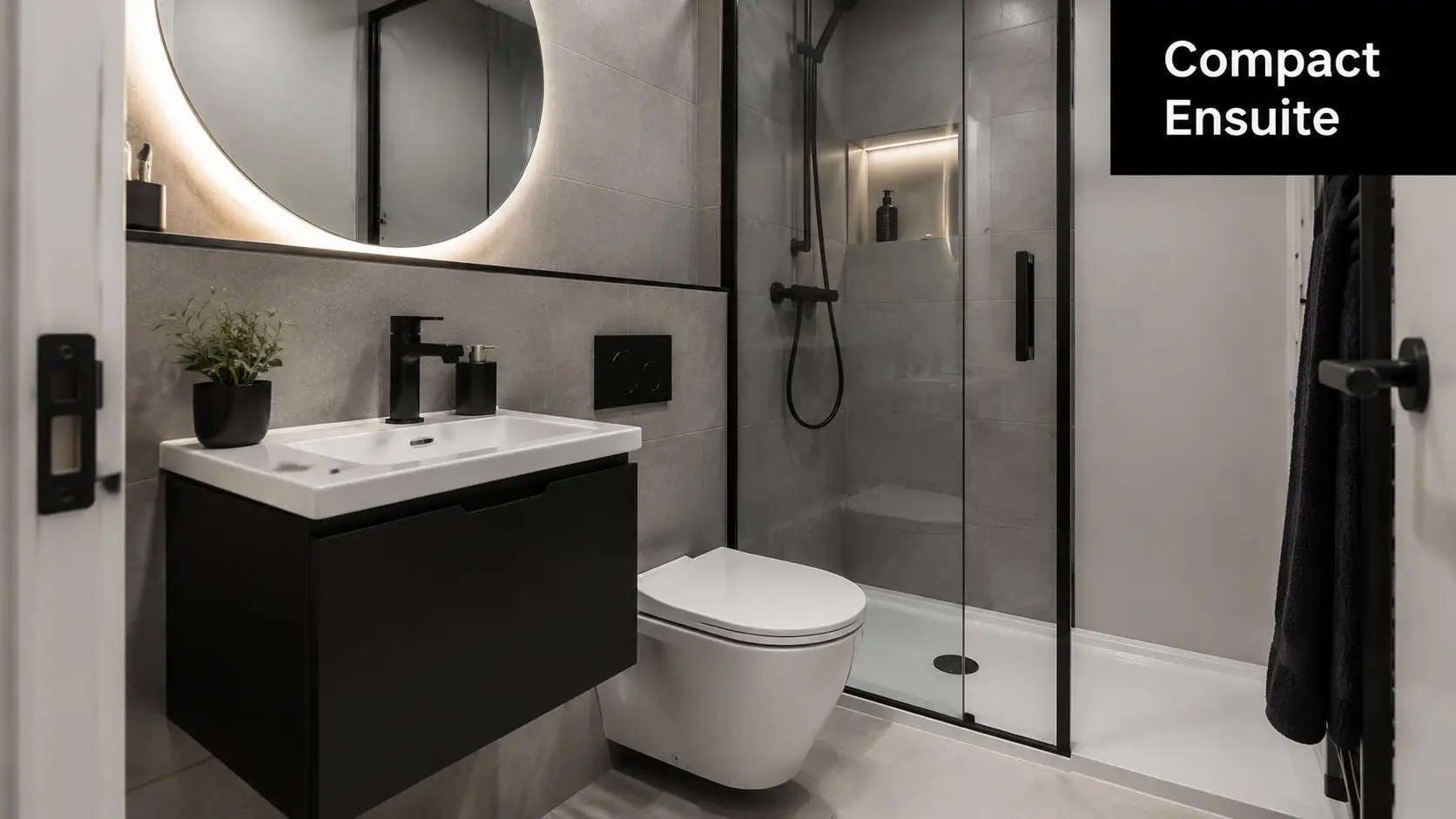
2. Compact Wall-Hung Toilet with Integrated Bidet
A wall-hung toilet is one of the smartest upgrades in ensuite designs small enough to feel crowded with standard floor-mounted fixtures. It clears the floor line, reduces visual bulk, and makes cleaning easier. In a room where every edge is visible, that matters.
The integrated bidet option is worth considering when you want more function without adding another fitting. Instead of trying to squeeze extra features into a layout that already struggles, you combine them into one better fixture.
What works and what doesn't
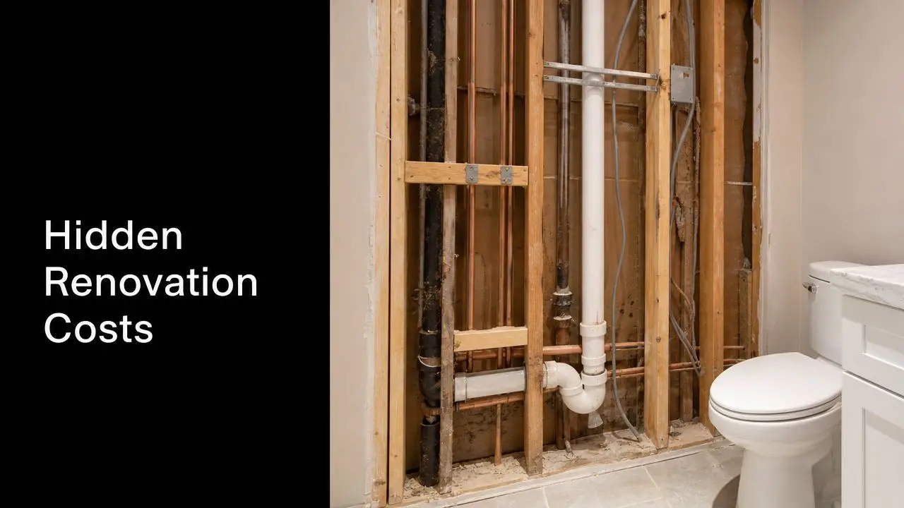
This is one area where sleek design can hide poor planning. The pan might look compact, but the in-wall cistern still needs proper wall depth, service access, and the right framing arrangement. If the builder or designer leaves that decision too late, the whole room starts making compromises for one product.
One Australian guide for small ensuites points to practical comfort targets of about 900 x 900 mm for a shower, roughly 800 mm clearance in front of the toilet, and around 700 to 800 mm circulation space, while also recommending a P3 to P4 slip rating under AS 4586 for bathroom floors in these spaces, as outlined in this Australian small ensuite article. That's the key conversation. Not just whether the toilet looks modern, but whether the room still feels comfortable and safe once everything is installed.
The best wall-hung toilet layouts don't just save space on paper. They preserve movement in front of the pan and stop the room from feeling pinched at the knees.
In practical terms, this suits compact Melbourne renovations where the brief is clean lines, easy cleaning, and less visual clutter. Brands with slim seats and concealed cistern systems often suit that look well. Add flush plates in a brushed finish and the room starts to feel considered rather than merely compressed.
If you're adding bidet functionality, make sure the electrical point is coordinated early. That's one of those details clients often assume can be “sorted later”. It can't, not cleanly.
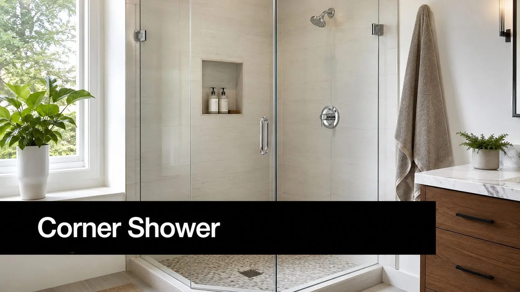
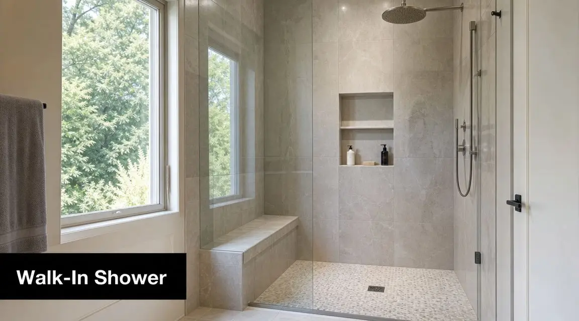
3. Wet Room Layout with Frameless Shower Enclosure
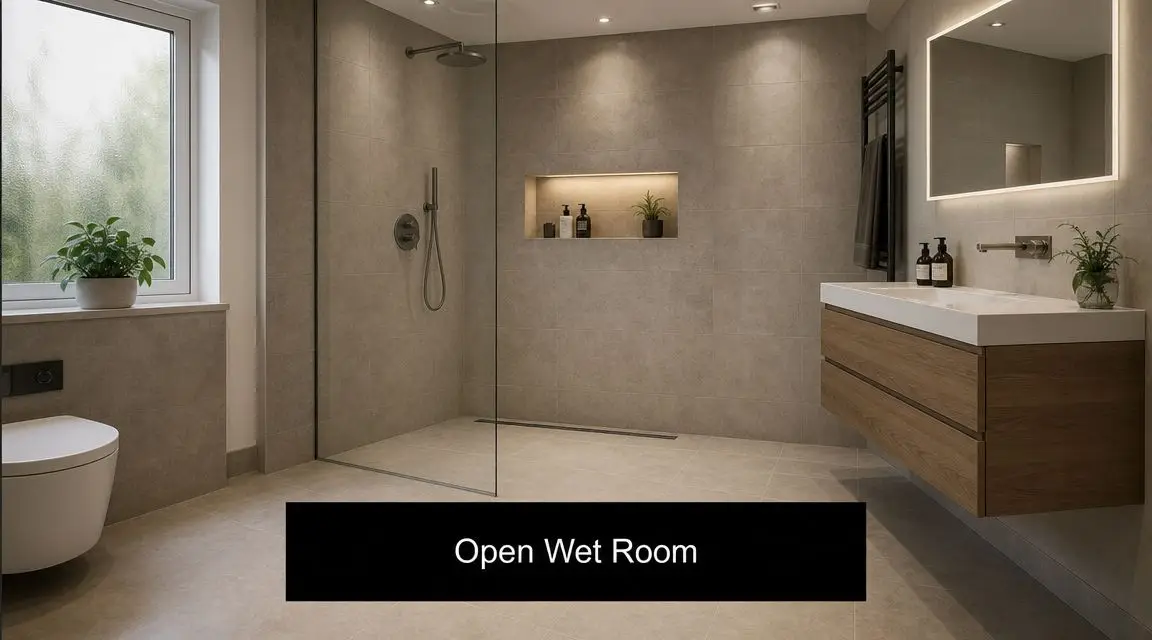
When a small ensuite feels boxed in, removing the shower cubicle can completely change the room. A wet room layout opens the floor, simplifies the lines, and lets the eye travel from wall to wall without interruption. That's why this approach keeps turning up in modern bathrooms with a luxury feel.
Frameless glass is the key part. Even a minimal fixed panel can do the job without creating a heavy visual barrier. In small rooms, the absence of chunky framing and shower hobs often makes a bigger difference than the actual floor area.
The trade-offs you need to respect
Wet rooms look effortless when they're done well. They're not effortless to build. Falls to drains, waterproofing transitions, floor levels, ventilation, and tile selection all have to be handled properly from the start.
A consistently cited benchmark for compact ensuites is the use of floating vanities, wall-mounted toilets, and larger-format tiles to increase perceived and functional space. Larger tiles reduce grout lines and help the room feel more continuous and easier to clean, as described in this ensuite design inspiration guide. In a wet room, that advice is particularly useful because too many visual breaks can make the floor feel messy and smaller than it is.
I'd also say this plainly. Wet rooms aren't ideal for every client. If you hate wiping down glass, dislike open shower spray, or have poor ventilation in the existing structure, a conventional screened shower may be the better move.
- Use a linear drain: It makes tile set-out cleaner and simplifies the visual line.
- Choose slip-conscious floor finishes: A beautiful floor that feels risky when wet is a bad specification.
- Model the water zone in 3D: At this point, clients often realise whether they want fully open or semi-screened.
If you're exploring designing an ensuite, this is one of the layouts where visualisation pays for itself fast. You can test splash zones, sight lines, niche placement, and whether the room still feels warm rather than clinical.
4. Vertical Storage Solutions with Floor-to-Ceiling Cabinetry
Storage is usually the first thing people underestimate in a small ensuite. They focus on the shower, vanity, and tiles, then realise too late there's nowhere to hide daily clutter. The result is a room that looked clean at handover and messy two weeks later.
Tall cabinetry fixes that, but only if it's handled with restraint. Floor-to-ceiling joinery can make a compact room feel organised and premium, or it can make it feel like a cupboard with plumbing. The difference comes down to depth, finish, and how much open visual relief you leave in the design.
How to stop it feeling bulky
I prefer one tall storage zone rather than several medium-height units scattered around. A single vertical tower near the vanity or over the toilet wall keeps the room cleaner to read. In family homes, it's often the best way to separate daily-use items from backup products, cleaning stock, and spare towels.
A good setup usually includes:
- Closed lower storage: This hides practical items that never improve the look of the room.
- Lighter upper sections: Open shelving or mirrored fronts reduce the visual weight.
- Integrated lighting: Soft cabinet lighting helps the space feel designed, not overbuilt.
For investors and landlords, this kind of storage can be a strong practical win because it improves usability without demanding more floor space. For owner-occupiers, it supports that high-end hotel feel where everything has a place.
In a small ensuite, clutter doesn't just look untidy. It makes the room feel smaller every day.
This is also where 3D design is useful for proportion checks. A cabinet can look sensible on plan and still dominate the room once visualized and rendered. I'd always rather adjust width, handle style, or colour before manufacturing than stand on site wishing it looked less heavy.
5. Pocket Door and Bi-Fold Entrance Solutions
Some of the worst small ensuites are not too small. They're just losing usable area to a swinging door. If the door arc clashes with the vanity, toilet, or a person standing at the basin, the room will always feel awkward no matter how stylish the finishes are.
A pocket door fixes that by taking the door out of the room entirely when open. A bi-fold can also work where the wall cavity can't be used. Neither option is universal, but both are far better than forcing a hinged door into a layout that doesn't want one.
Best use cases in older Victorian homes
In established suburbs, ensuite footprints are often shaped by what the original house allows. You're working around existing studs, drainage points, windows, and robe walls. That's exactly where a pocket door earns its keep. It can free up the wall where the vanity should go, or stop the entry from colliding with the toilet zone.
What I look for first:
- Wall cavity availability: Pocket doors need clean coordination with plumbing and electrical work.
- Privacy needs: Frosted or solid options change the feel of the adjoining room.
- Maintenance access: Hardware quality matters. Cheap tracks become a long-term annoyance.
Bi-folds are the fallback when wall conditions are against you. They're not as integrated, but a well-made unit can still solve an entry problem without chewing up room inside the ensuite.
This is one of those changes clients often underestimate because it's “just the door”. Then they see the 3D layout with and without the swing path and the decision becomes obvious. If the entry is currently making the room feel cramped, changing the door type can transform the layout before a single tile is chosen.
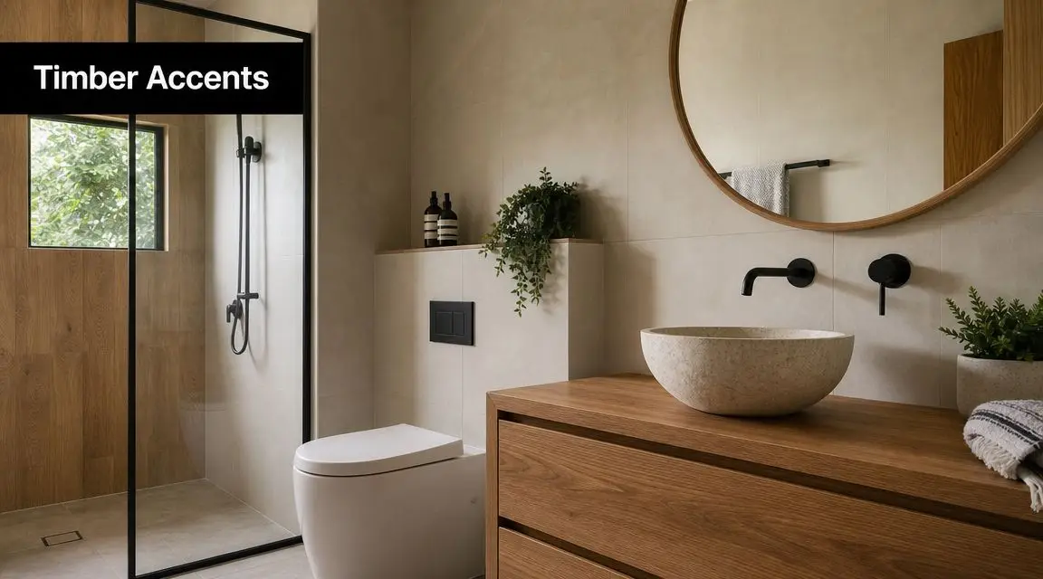
6. Pedestal Sink Alternatives with Wall-Mounted Trough Sinks
Pedestal basins belong in some bathrooms. They don't belong in most small ensuites. They leave you with no meaningful storage, expose plumbing that often looks fussy, and rarely deliver enough bench utility for real daily use.
A wall-mounted trough sink is a better answer when you want a lighter look without falling into the no-storage trap of a pedestal. It gives you a slim profile, a stronger designer edge, and enough basin length to feel generous even when the room isn't.
Where this style earns its place
This works well in guest ensuites, minimalist apartments, and high-end renovations where the client wants a cleaner architectural line than a standard vanity provides. It can also suit narrow rooms where a conventional cabinet would feel too boxy.
To make it practical, pair it with something else that carries the storage load:
- Add a recessed mirror cabinet: That keeps products hidden without making the room feel heavy.
- Use wall-mounted accessories: Towel rails, soap ledges, and robe hooks need to be deliberate.
- Keep the plumbing neat: Bottle traps and exposed pipework need to look intentional, not leftover.
The trough style also plays nicely with premium tapware. A wall mixer above a slim white basin, paired with stone-look tile and a large mirror, gives a compact ensuite a proper designer bathroom finish.
The mistake is treating this as a shortcut fixture. It isn't. If you remove under-basin cabinetry, the rest of the room has to compensate. In a well-planned ensuite, that trade-off can look excellent. In a poorly planned one, it turns into bench clutter and nowhere to put anything.
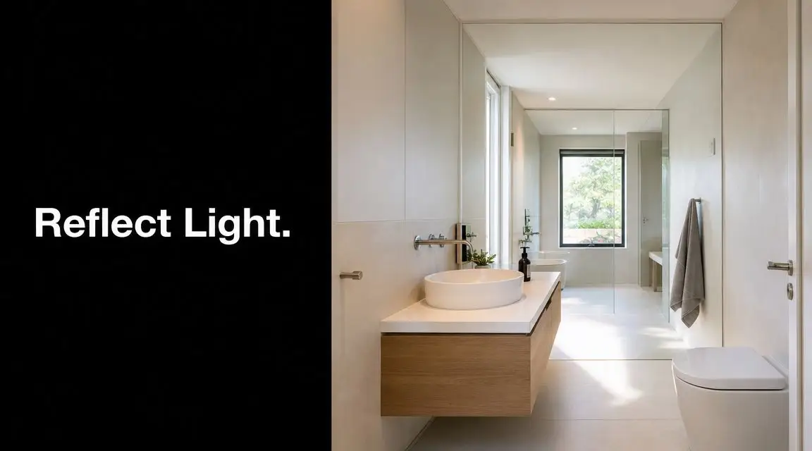
7. Mirror Wall Illusion and Lighting Integration for Spatial Perception
A small ensuite can be technically well laid out and still feel mean. That's usually a lighting problem, a mirror problem, or both. Good spatial perception doesn't come from one trick. It comes from how reflective surfaces, shadow lines, and task lighting work together.
Large mirrors are one of the fastest ways to improve ensuite designs small in footprint but short on visual depth. They bounce light, widen the room visually, and reduce the stop-start effect created by too many materials or joinery breaks.
Make the mirror do more than reflect
Backlit mirrors are especially effective in compact modern bathrooms because they soften the room and remove the harshness you often get from a single ceiling fitting. They also help a vanity wall feel more architectural. That's useful when you want the room to read as a complete design rather than a collection of products.
A few principles hold up well on site:
- Run the mirror wider than the basin: It broadens the wall and stops the vanity area feeling undersized.
- Layer lighting: Use mirror lighting for faces and ceiling or niche lighting for overall mood.
- Control glare: Gloss everywhere can make a compact room feel harder, not larger.
“If you can't change the footprint, change how the eye reads the room.”
This is exactly the kind of move that benefits from 3D visualisation. Clients often think they want a certain mirror size until they see it in relation to the vanity, tile joints, and wall lights. Once it's modelled properly, the better choice usually becomes clear. For inspiration, these small ensuite bathroom ideas show how proportion and visual balance can carry just as much weight as the fixture list.
8. Recessed Niche Storage and Integrated Shelving Systems
Recessed storage is one of the cleanest ways to make a compact ensuite work harder without making it feel busier. Instead of adding baskets, shelves, or bulky shower caddies, you build the storage into the wall line itself. The room stays tidy, and the essentials stay close at hand.
Done properly, niches look custom and calm. Done badly, they look like afterthoughts. Position, size, waterproofing, and tile set-out all matter.
The best places to integrate it
Shower walls are the obvious location, but they're not the only one. A niche above the toilet can hold spare paper and small accessories. A slim recess beside a vanity can take daily-use bottles without crowding the benchtop. In narrow ensuites, these details often make the difference between a room that feels organised and one that always feels full.
I usually recommend multiple smaller recesses over one oversized opening. That keeps the wall composition neater and helps avoid a big dark rectangle cutting through the tile work.
Good niche design usually comes down to:
- Set it out with the tiles: The niche should look like it belongs to the wall, not like it was carved in later.
- Match depth to product use: Shampoo bottles need a different depth from decorative shelving.
- Light it carefully: A subtle LED strip can improve the finish if the wiring is planned early.
This is another feature that sells the value of proper pre-construction planning. In 3D, you can test whether the niche aligns with the screen, mirror, tapware, and grout lines. That lets you create a result that feels intentional. In a compact ensuite, that level of coordination is what separates a decent renovation from a polished one.
8-Point Small Ensuite Design Comparison
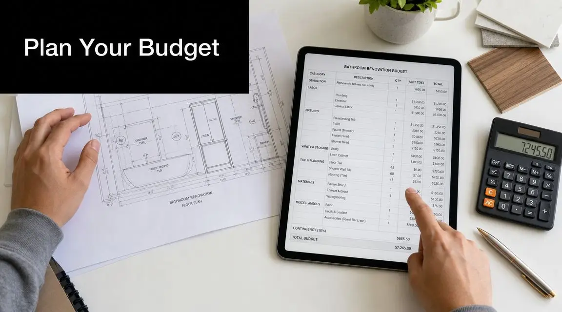
A small ensuite can look great on a mood board and still fail once real dimensions, wall framing, plumbing positions, and door swings come into play. This comparison is more useful if it helps you choose what suits your room, your budget, and your renovation appetite before work starts.
That is also where 3D visualisation earns its keep. We can test these options against the actual footprint, sight lines, tile set-out, and service locations, so you are not choosing ideas in isolation.
| Design option | Best suited to | Build risk level | Maintenance level | Resale appeal | Best checked in 3D before approval |
|---|---|---|---|---|---|
| Corner-Mounted Vanity with Floating Design | Very tight rooms where every walkway matters | Medium. Plumbing location and wall support need to be right | Low to medium. Easy floor cleaning, but corner clearances need thought | Strong, especially in modern apartments and compact homes | Vanity depth, drawer opening, mirror size, and how much circulation space it actually gives back |
| Compact Wall-Hung Toilet with Integrated Bidet | Premium compact ensuites and projects already opening walls | High. In-wall services, power, and access planning must be resolved early | Medium. Cleaning is easy, servicing concealed components needs planning | High if the rest of the ensuite matches the quality level | Pan position, wall thickness, carrier fit, and whether the added cost is justified in the room |
| Wet Room Layout with Frameless Shower Enclosure | Larger small ensuites, accessible layouts, and high-end renovations | High. Falls, drainage, waterproofing, and ventilation must all work together | Medium to high. More open spray zones mean more regular wiping and good extraction | High in the right property, but only if detailing is excellent | Shower spray path, drain placement, glass extent, and whether the room feels open or exposed |
| Vertical Storage Solutions with Floor-to-Ceiling Cabinetry | Households that need real storage without using more floor area | Medium. Joinery, lighting, and service locations need coordination | Low to medium. Great for keeping clutter away, but tall cabinets need practical internal layout | Strong for family buyers and owner-occupiers | Door swings, overhead bulk, bench clearance, and whether the joinery makes the room feel tighter |
| Pocket Door and Bi-Fold Entrance Solutions | Layouts where a standard swing door wastes usable space | Medium. Pocket doors involve more wall work. Bi-folds are simpler but less refined | Medium. Hardware quality matters over time | Good, particularly where the space gain is obvious | Door clearances, wall cavity conflicts, privacy, and how the entry feels from the bedroom |
| Pedestal Sink Alternatives with Wall-Mounted Trough Sinks | Minimalist ensuites and shared morning-use bathrooms | Low to medium. Fixing and waste placement are straightforward if planned well | Medium. Open plumbing and splash zones need regular attention | Moderate. Style-driven choice, not right for every buyer | Tap placement, splash control, under-sink usability, and whether open space feels practical or empty |
| Mirror Wall Illusion and Lighting Integration | Dark or visually cramped ensuites that need a stronger sense of width | Low to medium. Electrical rough-in and exact mirror sizing matter | Low. Good lighting lasts well if specified properly | Strong, because buyers notice light and perceived space quickly | Reflections, glare, shadow lines, and whether the mirror improves the room or just duplicates clutter |
| Recessed Niche Storage and Integrated Shelving Systems | Almost any small ensuite that lacks bench or cupboard space | Low to medium. Framing, waterproofing, and tile set-out need accuracy | Low. Easy daily use if sizing is right | Good, because it reads as built-in and intentional | Height, width, product fit, grout alignment, and how each recess sits with screens, fittings, and tile lines |
The key value in a comparison like this is seeing the trade-offs side by side. Some ideas save space but cost more to build. Others are affordable and effective, but only if they are proportioned properly. In a compact ensuite, one wrong call on depth, clearance, or wall build-up can undo three good decisions.
That is why we model these choices before construction. A 3D bathroom plan shows which options improve the room, which ones only look good in isolation, and where a smaller adjustment will produce a better finished result.
Ready to Visualise Your New Bathroom?
The best small ensuites aren't designed by guesswork. They're solved through planning. That means understanding what the room can realistically do, which fixtures earn their place, and where the pressure points are before demolition starts. In compact bathroom renovations, that process matters even more because there's less room to absorb mistakes.
A lot of homeowners come in with strong new bathroom ideas, but they haven't yet tested how those ideas perform together. They might love the look of a floating vanity, a wall-hung toilet, a wet room shower, and full-height tile. The problem is that every one of those choices affects movement, sight lines, service positions, and storage. Until you model it properly, you're still making assumptions.
That's why 3D visualisation is such a valuable planning tool. It bridges the gap between inspiration and buildability. You can see whether the vanity depth is too aggressive, whether a pocket door is worth the wall work, whether recessed niches line up cleanly, and whether your tile choice helps the room feel larger or more fragmented. It also helps couples and families make decisions faster because everyone is looking at the same outcome instead of imagining different versions of it.
From a builder's perspective, that early clarity reduces avoidable compromises on site. It's much easier to adjust a layout in design than to move plumbing after rough-in or discover a door clashes with a towel rail after installation. For clients, it means fewer surprises and better confidence in the final result. For registered builders unlimited in capability and scope, it's also the cleanest way to align design intent with construction reality.
SitePro Bathrooms approaches modern bathrooms and designer bathrooms with that practical mindset. The job isn't just to make the ensuite look better. It's to make it work better every single day. That applies whether you're upgrading a tired master ensuite in Highett, reworking a compact apartment bathroom, or improving a property for long-term rental appeal.
If your current ensuite feels cramped, dated, or hard to use, start with the plan, not the demolition. SitePro Bathrooms delivers end-to-end bathroom renovations backed by professional 3D design, so you can walk through your space before construction begins and refine the details with confidence. If you're ready to turn smart ideas into a finished room that feels calm, functional, and properly resolved, contact the Highett-based team for a detailed consultation and quote.