
• siteprobathrooms

8 Bathroom Tile Patterns for a Modern Renovation

What if the tile you pick is only half the decision, and the pattern is what decides whether the room feels calm, cramped, or expensive? In bathroom renovations, the layout does more visual work than expected. A good pattern can make modern bathrooms feel sharper, help designer bathrooms read as intentional, and stop a small room from looking pieced together.

The pattern choice also affects the job behind the scenes. Registered builders know that some layouts are more forgiving, while others need tighter planning, better substrate prep, and more waste allowance. That matters in real homes, especially in older Victorian properties, compact ensuites, and awkward apartment bathrooms where every cut shows.

There's a reason classic white wall tile and simple geometric floors became the visual baseline for modern bathrooms in the early 1900s. Historic bathroom design settled on 3 x 6 inch glazed white tile in running bond, with black-and-white hexagonal floors and checkerboard layouts also widely used, because those clean formats suited the germ-theory era and stayed practical to maintain historic bathroom tile history. Later, the postwar boom widened the palette again, with tile makers producing more than 200 shades of wall tile and nearly 100 floor-tile colours by the early 1950s, while one industry account says about five million of the 20 million new homes built between 1946 and 1966 received some form of pink bathroom, which is why retro-inspired schemes still have so much pull in Australian homes postwar bathroom tile colours.

If you're planning new bathroom ideas, don't start with a Pinterest image and hope for the best. Start with the pattern that suits the room shape, the maintenance you want, and the installer you have. That's the difference between a room that looks designed and one that looks like it fought the fit-out.

1. Herringbone Pattern

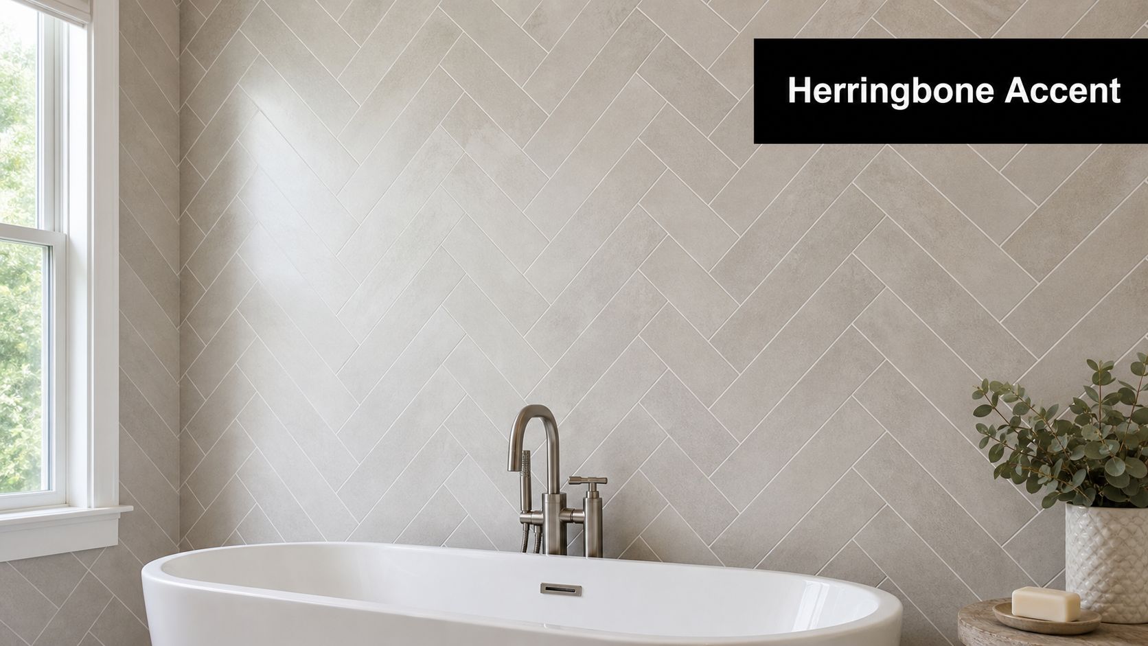
Herringbone works because it moves the eye. Rectangular tiles are set at angles so the layout creates a constant zigzag, which adds rhythm to walls and floors without needing loud colour or ornate decoration. In modern bathrooms, that movement can make a plain ensuite feel deliberate, and in designer bathrooms, it can turn a feature wall into the focal point of the whole room.

A modern bathroom wall featuring a stylish light grey tile in a herringbone pattern behind a white bathtub.

The layout is unforgiving. Herringbone rewards careful starting lines, especially around a bath niche, shower screen, or window opening, because a slight drift becomes obvious fast. I'd only use it where the room can handle the visual energy, or where the builder can centre the pattern properly on the most visible wall.

Practical rule: put herringbone where the eye naturally lands first, then let the rest of the room stay quieter.

For bathroom renovations, that usually means one feature wall, a shower surround, or a vanity splash area rather than wrapping every surface. Pairing it with matching grout creates a softer, more continuous look, while contrast grout makes the geometry punch harder. If the room is small, a neutral porcelain herringbone is usually safer than a busy marble mix, because the pattern already does plenty of work on its own.

A good registered builder will also plan the tile cuts before the first sheet goes up. That matters because herringbone uses angled cuts, and the waste allowance is higher than a straight grid. Grout maintenance also needs more attention than most homeowners expect, because the pattern creates more lines than a large-format install. If you want a practical guide after handover, keep how to clean floor tile grout handy for regular upkeep.

2. Subway Tile Pattern

Subway tile is the safest pattern for a reason. The brick-like stagger feels familiar, works with nearly any palette, and suits everything from a compact family bathroom to a polished transition space. It's also one of the easiest ways to get a clean, finished look without overdesigning the room.

What makes it durable is not just the tile itself, but the restraint. A white subway field with black grout can lean industrial, soft grey grout can feel calmer, and matching grout can make the wall read as a single quiet surface. In modern bathrooms, that flexibility is valuable because fixtures, mirrors, and lighting can carry the style without fighting the wall finish.

For installers, subway tile is more straightforward than herringbone or chevron, but there's still a right and wrong way to do it. A vertical stack can lift a compact room visually, while a standard stagger often feels more relaxed and traditional. Larger subway formats also reduce grout lines, which helps in small bathrooms where too much segmentation can make the room feel busy.

Here's where it earns its place in bathroom renovations. It can act as the main field tile and still let you introduce a second pattern in a niche, border, or vanity splash zone. That gives the room depth without turning it into a pattern sample board.

  • Use matte or glossy finishes deliberately: Gloss feels more classic and reflective, matte feels softer and more contemporary.
  • Choose grout as part of the design: Dark grout highlights the grid, while matching grout quietens it.
  • Let the fixtures finish the look: Chrome, brushed nickel, or matte black all change the final read of the room.
  • Mix only one accent pattern at a time: A subway field with a small herringbone inset or border keeps the design controlled.

If you're building a room that needs to age well, subway tile is still one of the most dependable new bathroom ideas around. It gives you a clean base, then leaves room for lighting, tapware, and joinery to do the styling.

3. Moroccan and Zellige Pattern

Zellige is for homeowners who want the bathroom to feel collected, not assembled. The hand-glazed look, irregular surface, and intricate geometry give the room personality before you even add mirrors or fittings. In designer bathrooms, it works best as a feature because the tile itself already carries a lot of visual weight.

The challenge is balance. A full room in zellige-inspired tile can become noisy quickly, especially in a small ensuite where there's already glass, chrome, and cabinetry competing for attention. That's why this pattern performs best on a shower wall, vanity backdrop, or powder room feature, where the eye gets one strong moment and then settles.

The right surrounding materials matter just as much as the tile. Neutral porcelain on the other walls, simple stone-look flooring, and warm metal fixtures let the zellige read as the hero instead of the entire story. Brass and gold-toned fittings suit the jewel-tone feel particularly well, while overcomplicated cabinetry usually dulls the effect.

For a project like this, bathroom renovations need a builder who understands specialty tile handling. Specialty cuts, colour variation, and the way artisanal surfaces reflect light mean layout decisions have to be made early. That's also where how to choose bathroom tiles becomes a useful decision aid, because the finish, tone, and surrounding materials all need to work together before installation starts.

Good zellige design should feel edited, not crowded.

That's the line I use on site. If the room already has a strong vanity, sculptural mirror, or bold lighting, keep the tile quieter. If the tile is the statement, everything else should stay restrained. In the right bathroom, zellige brings warmth and artistry that standard ceramic layouts can't match.

4. Hexagon and Geometric Tile Pattern

Hexagon tile suits homeowners who want pattern without clutter. It carries the look of classic geometric flooring, yet it still feels current in modern bathrooms because the shape is clean, structured, and easy to scale from subtle to bold. On a floor, it gives the room weight. On a wall, it reads as more architectural.

Geometric bathrooms have stayed relevant for a reason. Early bathroom design often used black-and-white hexagonal floors and checkerboard layouts because they created a tidy, easy-to-maintain visual language. That approach still holds up when the goal is a bathroom that feels ordered rather than decorative for its own sake.

Hexagon patterns are also useful in rooms with awkward proportions. The shape can soften irregular corners without looking loose, and a single-colour hex floor can make a compact room feel deliberate instead of crowded. Push too many colours into the mix, and the room starts to lose its calm. I usually steer clients toward one dominant tone and a grout colour that supports it rather than fighting it.

In bathroom renovations, this pattern often works best on the floor, then gets paired with simpler wall tile. That lets the geometry anchor the room while the walls keep the visual field quiet. If you want more personality, add it through brushed metal tapware, timber shelving, or a fluted vanity front instead of layering a second pattern beside the hexagon.

A clean geometric floor also suits family bathrooms where durability matters more than chasing a trend. The pattern adds texture without overwhelming the room, which makes it easier to live with over time. For homeowners looking for new bathroom ideas, that balance is usually the sweet spot, enough character to feel custom, not so much that it dates quickly.

5. Chevron and V-Pattern Tile Arrangement

Chevron is the sharper, more directional cousin of herringbone. Instead of overlapping rectangles, the cut ends meet to form a strong V, and that creates an unmistakable arrow-like movement across the surface. In modern bathrooms, it gives the room confidence fast.

That confidence is also the risk. Chevron has a harder visual edge than many people expect, so it works best where the room needs one decisive statement rather than constant pattern across every wall. Shower floors are a strong use case because the directionality feels purposeful underfoot and helps the layout read as designed, not random.

It also demands accuracy from the installer. The angles need to be planned before the first tile is fixed, because once the V starts drifting, the pattern stops looking elegant and starts looking off. That's why I'd only use chevron with a builder who has handled directional layouts before, not someone treating it like a standard brick bond with fancier cuts.

For a high-end result, keep the colour range tight. Monochrome grey, tonal stone, or a restrained marble look usually works best. If you introduce too much contrast, the chevron can take over the whole room and make the finish feel loud instead of refined.

Best use case: one controlled chevron zone, usually a shower floor or a single feature wall.

That approach gives bathroom renovations a strong design moment without blowing up the rest of the palette. It also pairs well with minimal fixtures, frameless glass, and simple joinery. In the right room, chevron reads as architectural. In the wrong room, it reads as busy.

6. Basketweave Pattern

Basketweave sits in a useful middle ground. It has more texture than a straight grid, but it doesn't shout the way some geometric layouts do. That makes it a smart choice for homeowners who want a bit more depth in modern bathrooms without drifting into a busy finish.

The pattern works by alternating horizontal and vertical groupings so the tile surface echoes woven material. On a bathroom floor, that brings a sense of structure and movement without overpowering the rest of the room. It suits transitional spaces especially well, where you want the bathroom to sit between classic and contemporary rather than lean heavily into one direction.

The trick is restraint in the surrounding finishes. Clean-lined vanities, plain mirrors, and simple tapware let basketweave do its work. If you pair it with too many competing elements, the pattern loses its sophistication. A charcoal grout can sharpen the definition, while a softer grout will quiet it down and make the floor feel more continuous.

In bathroom renovations, basketweave is often the kind of pattern that rewards a careful eye more than a big budget. The visual effect depends on clean alignment and a consistent starting point, so the tile setter needs to stay disciplined from the first row to the last. That's especially important if the bathroom has a recessed shower, a toilet nib, or a vanity return where the layout can easily drift.

Because the pattern is contained and readable, it works well in family bathrooms where you want something more considered than plain straight-laid tile but less dramatic than chevron or zellige. It's also one of the better new bathroom ideas when the client wants the room to age gracefully. The pattern feels classic without looking old-fashioned.

7. Large-Format and Minimalist Monolithic Tile Pattern

What gives a bathroom that calm, high-end look without adding visual noise? Large-format tile is usually the answer. Fewer grout lines, broader surfaces, and a cleaner field across the room help the space feel larger and more refined, and in modern bathrooms that restrained finish also makes day-to-day cleaning easier.

Large-format bathroom tile is generally understood as tile with one side at least 600 mm, and that scale changes the installation from the ground up. The substrate has to be flat, waterproofing needs to be correct, and the setter has to control lippage with care. If the base is off, large tile makes that problem obvious fast, which is why prep matters more here than it does with smaller formats.

I usually steer this pattern toward shower walls, main wall runs, and floor areas that benefit from a continuous surface. It suits projects where the brief calls for a quiet, high-end finish rather than a decorative pattern. For people comparing new bathroom ideas, it is often the safest choice when the room already has strong fixtures, good proportions, and a disciplined layout.

Material choice matters as much as size. Porcelain is usually the practical option because it has lower porosity and better dimensional stability than cheaper ceramic alternatives, which helps reduce lippage risk in wet-area installs. That is one reason registered builders often favour porcelain for large surfaces where performance has to match the finish.

If you want a clearer sense of how that approach reads in a finished room, SitePro Bathrooms' large-format bathroom tiles guide is worth a look before you commit. This pattern is the cleanest option on the page, but only when the prep work is exact. A flawless large-format wall looks effortless because a lot of effort went into it.

8. Encaustic and Hand-Painted Tile Pattern

Encaustic and hand-painted tiles bring a completely different energy into the bathroom. Each tile carries its own visual character, so the room stops feeling purely functional and starts feeling curated. That's why this pattern is so effective in designer bathrooms and powder rooms where you want a memorable impression.

The best use case is usually a feature zone, not full coverage. A border, entry wall, vanity splashback, or shower detail gives the room artistry without making it feel heavy. If you wrap every wall in a highly detailed pattern, the room can become visually exhausting, especially where there's limited natural light.

This is one of the patterns where the builder's coordination matters as much as the tile itself. Specialty tile needs careful handling, and the installation plan should account for how the design lines up with fixtures, niches, and edges. That's especially true when the tiles are artisan-made or custom-commissioned, because replacement and matching are not as simple as ordering another box.

For homeowners comparing bathroom renovations, encaustic work is ideal when personality is the brief. It suits heritage-inspired spaces, powder rooms, and transitional bathrooms where a bit of old-world reference feels deliberate rather than themed. In the right room, it can create that “finished by someone who cared” feeling that standard tile can't always deliver.

Use the rest of the room to support the art. Plain porcelain, subdued stone-look surfaces, and restrained tapware let the pattern remain the focal point. If the room is already busy, hand-painted tile can quickly tip from expressive to chaotic, so editing is essential.

Top 8 Bathroom Tile Patterns Comparison

Pattern Implementation complexity Resource requirements Expected outcomes Ideal use cases Key advantages
Herringbone Pattern High, precise angled cuts and alignment Skilled tiler, increased labour, moderate material waste Dynamic zigzag, depth and perceived space Feature walls, ensuites, contemporary renovations Timeless sophistication, strong directional flow, photogenic
Subway Tile Pattern Low, straightforward staggered layout Standard tiles, typical labour, cost-effective Clean, timeless, highly versatile finish All bathroom types, first-time renovations, rentals Most versatile, economical, easy to maintain
Moroccan / Zellige Pattern Very high, intricate mosaic placement Premium handcrafted tiles, specialist installers, high cost Rich, artisanal, jewel-toned statement aesthetic Statement powder rooms, designer luxury bathrooms Distinctive cultural character, high visual impact
Hexagon & Geometric Pattern Medium, precise cutting for shapes and edges Moderate material cost, common skilled labour Modern tessellated look, architectural interest Floors, feature walls, contemporary projects Contemporary appeal, versatile sizes, more affordable than bespoke mosaics
Chevron / V-Pattern High, exact angle cuts and careful alignment Skilled tilers, higher labour costs, precise layout planning Bold V-shaped directionality and strong focal lines Shower floors, feature walls, designer renovations Striking statement, guides sightlines, highly photogenic
Basketweave Pattern Medium, patterned placement, moderate precision Standard tiles, moderate labour, possible DIY for experienced Subtle woven texture, understated rhythm Floors, transitional bathrooms, family bathrooms Sophisticated without excess, hides imperfections, affordable relative to complex patterns
Large-Format / Monolithic Tiles High, requires level substrate and specialist handling Premium large tiles, specialized installers, higher material cost Seamless, spacious minimalist surfaces with minimal grout Compact bathrooms, luxury and minimalist renovations Minimal grout, easy cleaning, creates sense of space and luxury
Encaustic / Hand-Painted Tiles Very high, bespoke placement and careful curation Artisan tiles, custom sourcing, specialist installers, high cost Unique, artistic, highly personalized interiors Accent walls, powder rooms, bespoke designer bathrooms One-of-a-kind expression, strong artistic value, memorable focal points

Bring Your Bathroom Tile Pattern to Life

Choosing the right bathroom tile patterns is only the start. The outcome depends on how the layout is planned, cut, and installed. A pattern that looks effortless in a showroom can fall apart in an actual bathroom if the room shape is awkward, the substrate is uneven, or the installer doesn't understand how to centre the design around the most visible wall.

That's where working with experienced registered builders pays off. In Victoria, domestic building work, including renovation, alteration, improvement, repair, and maintenance of a home, sits under the Domestic Building Contracts Act framework, and work over $10,000 generally requires a written major domestic building contract, with builders registered for the class of work they perform Victorian domestic building registration and contract rules. For bathroom renovations, that legal and practical structure matters just as much as the tile choice itself.

The best outcomes usually come from treating pattern, material, and build method as one decision. Herringbone and chevron need more planning and more cut discipline. Subway, basketweave, and hexagon can be easier to control. Large-format tile demands better substrate prep, while zellige and encaustic need tighter design editing so the room doesn't feel overloaded. That's what underpins modern bathrooms, and it's where a good builder earns their keep.

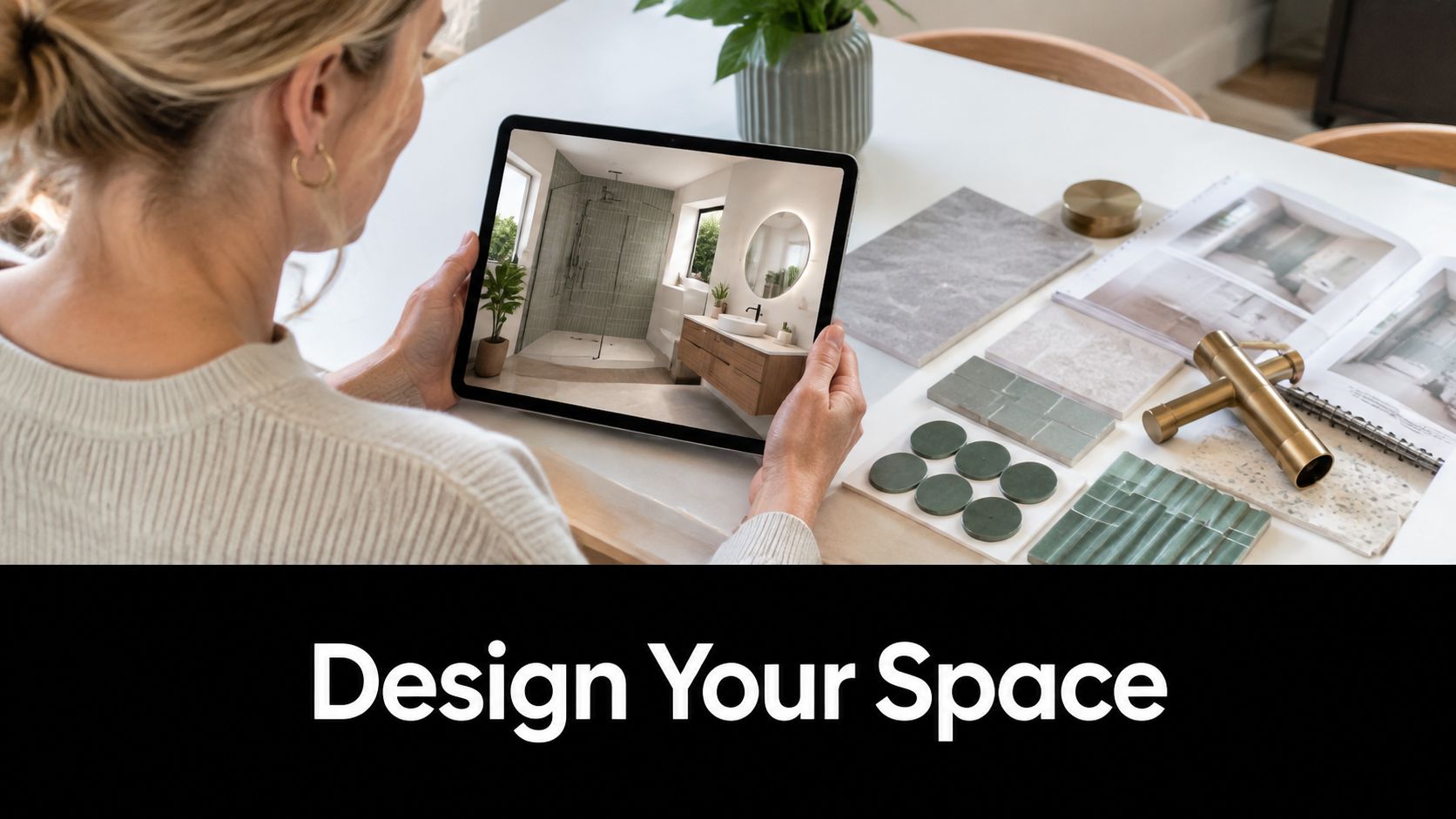
At SitePro Bathrooms, the strongest projects usually start with 3D planning, because it lets you test how the pattern sits around the vanity, screen, niche, and floor waste before anything is fixed in place. If you're weighing up new bathroom ideas for a home in Highett or greater Victoria, talk to a team that understands both the visual result and the build sequence. Contact SitePro Bathrooms to discuss your bathroom renovation, review pattern options, and map out a design that looks right from day one through to final handover.

  • siteprobathrooms

Double Vanity Size Guide for Australian Bathroom Renovations

The most practical double vanity size for Australian shared bathrooms is 1524 to 1829 mm wide, with 1524 mm as the workable minimum and 1829 mm as the comfortable standard. In a morning rush, that difference decides whether two people can stand side by side without bumping elbows or fighting for basin space.

A lot of bathroom renovations in Victoria start with the same mistake, the vanity is chosen like a furniture piece instead of a working surface. The right double vanity has to clear doors, respect plumbing locations, leave room to move, and still give both users enough counter to function properly.

Why Double Vanity Size Matters in Australian Bathrooms

Shared bathrooms put pressure on the vanity fast. One person is brushing teeth, the other is shaving, and a unit that looked roomy in a showroom can feel tight as soon as it is installed in a real Victorian home. The problem is usually not the style, it is the working space.

A practical double vanity size for Australian shared bathrooms usually sits in the 1524 to 1829 mm range. 1524 mm is the workable minimum, while 1829 mm is the more comfortable standard. That width gives two users enough room to stand, wash, and reach without turning the basin zone into a daily argument over elbows and bench space.

The wall width has to work before the style does

Homeowners often start with the finish and try to make the size fit later. In the field, that usually goes badly because bathrooms are governed by door swings, circulation paths, and plumbing locations, not by the vanity photo.

A double vanity only performs properly when the wall can carry the load of two active stations. If the run is too tight, the centre section stops working as shared bench space and becomes a narrow strip that neither user can claim comfortably. If the run is too long for the room, the vanity starts to crowd the doorway or pinch the route past it.

Wall width also affects how the room feels at peak use. Two people can technically use a vanity, yet still be forced into awkward side steps, clipped elbows, and blocked access to drawers if the layout gives them nowhere to move. In a Victorian renovation, that is the difference between a vanity that suits the room and one that fills the wall.

For homeowners in Victoria, that is the test. The question is whether the bathroom can support two stations without giving up front circulation, storage access, and door clearance.

Standard Double Vanity Dimensions Explained

The practical way to judge a double vanity is to measure the whole footprint, not only the width on the product label. Width sets the starting point, but depth, height, and sink-centre spacing decide whether two people can use the vanity at the same time without bumping shoulders or fighting for bench space.

In Australian renovations, double vanities are commonly set around 152 to 182 cm wide, with depth usually around 450 to 600 mm and height around 820 to 900 mm. That range works in many bathrooms because it leaves usable circulation at the front while keeping the cabinet comfortable for daily use and the plumbing layout manageable (ArchiPro).

Width, depth, height, and spacing

Width matters because two sinks need real separation. Once the basin centres are pushed too close together, the middle section stops functioning as shared bench space and becomes a cramped strip that neither user can use properly.

A sensible layout keeps 300 to 400 mm between sink centres, allows about 750 mm front clearance for movement and door swing, and uses total countertop lengths of 1400 to 1800 mm for comfortable dual use. That detail gets missed often. A room may accept two basins on paper, yet still feel tight if the centres are crowded or the front zone is blocked (Bathroom Mountain).

Dimension Minimum Comfortable Standard Why It Matters
Width 1524 mm 1829 mm Two users need enough sink and counter separation to reduce elbow conflict and shared-use congestion
Depth 450 mm 600 mm Depth affects basin fit, splash control, and how far the vanity projects into the room
Height 820 mm 900 mm Correct height supports standing comfort across different users
Sink centres 300 mm apart 400 mm apart Wider spacing reduces elbow collision and makes simultaneous use easier
Front clearance 750 mm 750 mm or more Keeps movement safe and avoids a door or body-clash zone

A vanity can still be wrong if the depth or front clearance steals the room around it.

If you are comparing options, check the cabinet footprint, not only the benchtop edge. That is where many bad fit decisions start.

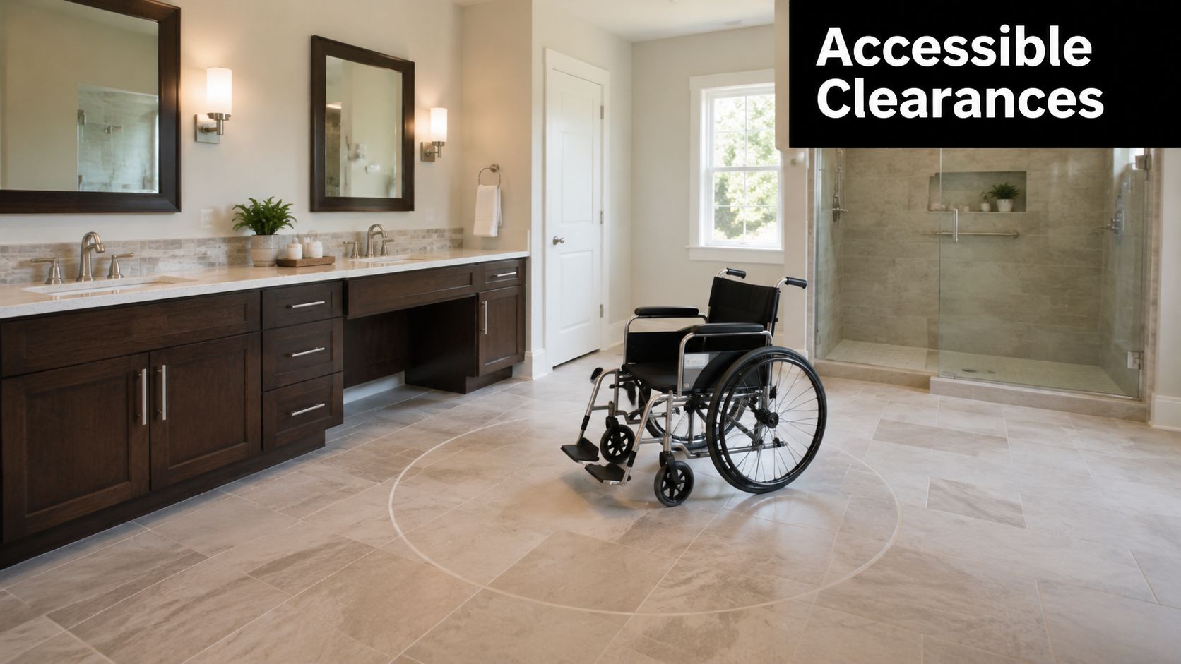
Clearances and Accessible Bathroom Considerations

A wheelchair positioned in the center of a spacious, accessible bathroom with a double vanity design.

A double vanity only earns its keep if the room still works around it. Cabinet width matters, but front circulation decides whether two people can use the room without bumping elbows, clipping a door, or standing in each other's path.

Clear floor space in front of the vanity should be generous enough for daily movement, and the smallest practical double units are only suitable when the room can still give them proper approach space. That matches what shows up on site. If the front zone is cramped, the vanity loses its value fast, even when both basins are fitted correctly.

Circulation is the real test

A room can measure up on paper and still fail in use if the vanity sits too close to a door, toilet, or shower entry. I've seen bathrooms where the basin positions were fine, but the door swing made the front edge awkward every time someone walked in.

Accessibility thinking helps in ordinary family homes too. Wall-mounted vanities and dual-height layouts can make the room easier to use for children, older users, and anyone who benefits from seeing more floor space. In rental fit-outs and long-term liveability planning, that open feel often gives more practical value than squeezing in another drawer.

The cleanest layout is the one that lets two people use the room without negotiating who moves first.

If the room is meant to suit different ages and mobility levels, judge the vanity with the whole bathroom in view. Check its relationship to the shower screen, toilet zone, towel storage, and the path back to the door. A well-sized double vanity with poor approach space still behaves like a barrier.

Layout Examples for Common Bathroom Sizes

The right double vanity size depends on how the room behaves in daily use. A vanity that looks generous on paper can still fail if it pins people against a door swing or steals the front circulation zone, while a slimmer wall-mounted run can keep a tight Australian bathroom working properly. Bigger only helps when the room has the width to support it.

For two users, sink-centre spacing and elbow clearance matter as much as the overall cabinet width. A practical double layout usually gives each person enough counter and basin room to move without brushing arms, and the common format sits around 60 inches or 72 inches, with custom widths reaching 84 inches in larger primary suites (The Cabinet Coach). That is the choice point, compact efficiency, or enough shared bench to make the vanity pleasant at peak use.

Compact ensuite

A compact ensuite needs discipline. A 1200 mm unit can work well if the room is small, especially when it is wall-mounted or kept shallow, because the priority is preserving a clear path rather than chasing bench length.

In that setting, every millimetre has to earn its place. Deep drawers can be more useful than a bulky cupboard if the cabinet has to stay visually light, and a reduced depth can stop the room from feeling pinched at the front edge. The trade-off is straightforward, less bench and less storage volume, but better circulation and a room that still feels workable.

Standard family bathroom

A standard family bathroom is where a double vanity starts to prove its value in everyday traffic. A run in the 1400 to 1800 mm range usually suits a room that sees two people at the basin at the same time and needs enough separation between users to avoid constant shoulder contact.

Dual-height planning can also help here. Adults and children do not always need the same working height, and a layout that allows for that can feel more natural than forcing every user onto one fixed line of fixtures. In many modern bathrooms, the better result comes from a cabinet that fits the room cleanly and leaves the front circulation open, not from adding width just because the wall can take it.

Spacious primary suite

A larger suite can take custom widths up to 84 inches (The Cabinet Coach). That extra span is useful when the brief calls for long bench runs, more drawer storage, and a built-in look that suits a more considered bathroom fit-out.

The catch is proportion. A bigger cabinet still needs room to breathe, and if the extra width narrows the approach or crowds the shower and door zone, the added surface stops being an advantage. I would rather fit a slightly shorter vanity that lets the room move well than force in a showpiece that dominates every path through the room.

For homeowners comparing cabinet height with the rest of the layout, this standard benchtop height guide helps when you are matching the vanity to the room's working clearances.

Selection Criteria for Storage Basins and Benchtops

The vanity can fit the wall and still work poorly in daily use if the basin and benchtop choices are off. Storage layout, basin profile, and top depth all change how a double vanity handles elbow room, shared access, and front circulation.

For a practical benchmark, many Australian fit-outs keep double vanity widths in the 152 to 182 cm range, with depths around 450 to 600 mm and heights around 820 to 900 mm to maintain comfortable standing use and keep the room moving. That span gives you room to choose between storage-heavy cabinets, slimmer tops, and different basin styles without pushing the layout into awkward territory.

Storage and basin choices change the usable footprint

Drawer storage usually works better than deep cupboards for everyday use because toiletries stay visible and within reach. Cupboards still make sense where plumbing sits through the middle of the cabinet, but they often waste the easiest access zones under a double vanity.

Basin style changes how the bench performs as shared space. An undermount or integrated basin keeps more useful surface than a bulky above-counter bowl, while a semi-recessed basin can suit tighter rooms where the cabinet depth needs to stay under control. If the basin profile takes too much bench, the vanity stops functioning like a common worktop and starts feeling like two separate basins with very little shared space between them.

For homeowners checking how bench height sits with the rest of the room, this standard benchtop height guide is a useful reference point before you commit to the final layout.

What tends to work best on site

  • Drawer-led storage: Best when the household uses the vanity hard and needs quick access to daily items.
  • Cupboard-led storage: Better when plumbing restrictions control the middle section.
  • Shallower benchtops: Useful where front circulation is tight and the bathroom needs more breathing room.
  • Deeper tops: Better where the room can handle more projection and the brief calls for extra bench comfort.

Plumbing still drives a lot of the final decision. Waste routing, tap reach, and isolation access can all force changes to the cabinet layout, which is why a vanity that looks right on paper can need a different internal setup once it is measured against the wall.

Measurement Checklist Before You Commit

A vanity that fits the wall can still fail the room. Before you order anything, measure the actual site, not the idealised space in your head.

Start with the wall width at more than one height, because skirting, tile edges, and uneven plaster can change the usable run. Then check where the plumbing rough-in sits, because the cabinet has to cover and access those points without awkward cut-outs or shifted basins.

Mark the room before you buy

Use masking tape on the floor to outline the proposed vanity footprint. That simple step shows you whether the front clearance still feels comfortable and whether the room can handle two people moving through at once.

  • Measure wall width carefully: Check the full run, then check again above skirting and tile lines.
  • Confirm plumbing positions: Mark wastes, water points, and any fixed obstruction before choosing the cabinet.
  • Test the door swing: Open the door fully and see whether it clashes with the vanity zone.
  • Check level and floor finish: A slope or tile lip can change how the cabinet sits and how the doors align.
  • Look for trim interference: Architraves and skirting boards often steal more usable width than people expect.

If you're assembling a broader renovation scope, the planning list in this bathroom renovation checklist is a useful companion before you lock in materials and trades.

Tape on the floor solves more arguments than a showroom visit ever will.

Once the footprint is marked out, stand in the room and use it for a few minutes. If the layout feels tight before demolition, it won't feel looser after the cabinets arrive.

When to Engage a Registered Builder and Designer

A double vanity can look straightforward on paper and still create problems once the room is measured in millimetres. The cabinet has to work around plumbing, wall straightness, door swing, tile build-up, and the space people need to stand at the basin without knocking elbows.

Some bathroom jobs stay simple. A vanity swap in the same position can often be handled with limited disruption. Once the plan shifts into layout changes, new services, or wider structural work, the job belongs with a registered builder who can coordinate the full sequence instead of treating the vanity as an isolated purchase.

For bathroom renovations in Victoria, a registered builder is generally required when the domestic building work passes the state's threshold for higher-value or more complex jobs, and the Domestic Building Contracts Act framework applies when the contract price is over A$10,000 (Wayfair guide). That matters when the bathroom is being reworked, not just refreshed with a new cabinet.

Unlimited registration matters when the scope grows

The difference between domestic builder limited and domestic builder unlimited matters as soon as the scope expands. Unlimited registration covers broader classes of domestic building work than limited registration, which is relevant for bathroom remodels that involve altered layouts, integrated services, or full-house renovation packages.

A designer adds another layer of control. A proper room plan shows how the double vanity sits beside tiles, lighting, mirrors, and circulation space before anything is ordered, and that is where avoidable mistakes usually get caught. It is easier to adjust sink spacing on a drawing than to discover the basin centres fight with a wall return after cabinetry arrives.

SitePro Bathrooms uses that same design-and-measure process in Victoria, with 3D design and on-site measurement to settle the fit before construction starts. For homeowners planning a registered-builder pathway with coordinated design, why using a registered builder matters for your bathroom renovation is a practical next read.

What a professional team changes

  • Design accuracy: Better alignment between room size, vanity width, and plumbing placement.
  • Trade coordination: Less rework when tiles, cabinetry, and services all have to meet in one room.
  • Build confidence: Clearer decisions around when a compact layout is enough and when a larger run is justified.
  • Finish quality: More reliable outcomes in modern bathrooms and designer bathrooms where the vanity is part of the overall composition.

If you are comparing layouts for bathroom renovations in Highett or elsewhere in Victoria, book a site measure and ask for a room-scaled plan before you order cabinetry. The right double vanity size is not the biggest one that fits on a showroom floor, it is the one that still leaves elbow room, front circulation, and clean access after the plumber, tiler, and electrician have done their part.

  • siteprobathrooms

Timber Cabinets Kitchen Guide for Victorian Homeowners

You're standing in a Highett kitchen that still works, but only just. The doors stick, the corner cupboard wastes space, and the timber finish looks tired in the places you touch every day. That's the moment most homeowners start weighing up whether to refresh what's there or pull it out and do it properly.

For timber cabinets kitchen projects, the wrong decision is usually obvious two years later, when the finish has moved, the hardware sags, or the layout keeps annoying everyone who cooks there. The right decision feels calm from day one. It gives you a kitchen that suits the house, the climate, and the way Australian families live.

Why Timber Cabinets Matter in a Victorian Kitchen Renovation

A Highett homeowner opens an old cupboard door, sees swollen edges, and compares timber with laminate. That comparison is fair, but it misses the issue. The house is already telling you what belongs there.

Australian housing gives timber cabinetry a strong case because the market is dominated by occupied dwellings, and many are separate houses where built-in kitchen joinery is standard rather than decorative. ABS data show there were 10.9 million occupied private dwellings at the 2021 Census, and roughly 63% were separate houses (ABS housing context cited via NAR). In Victoria, that matters because detached homes usually give you room for proper built-ins, not a quick surface update.

A woman kneeling on a rug examining the worn interior of an old wooden kitchen cabinet.

What the age of the house changes

The second pressure point is age. Australia's median dwelling age was 29 years in 2021 (ABS housing context cited via NAR), and that shows up in kitchens long before it shows up anywhere else. Doors go out of line. Shelves bow. Corners stop making sense.

Practical rule: if the carcass is tired, a fresh door front won't save the kitchen. Replace the structure, then choose the finish.

That is why timber still earns its place in Victorian renovations. It suits established suburban homes where cabinetry has to look good, hold weight, and survive hard use. It also fits the way buyers read quality in a renovated kitchen, which is one reason wood cabinets keep showing up in serious remodels (ABS housing context cited via NAR).

The four decisions that matter

Homeowners usually obsess over colour first. That is backwards. The decisions that drive the result are species, carcass quality, layout, and who builds it.

A timber face can look premium and still fail if the cabinet box is flimsy. A strong carcass can be let down by a poor corner layout. A beautiful finish can still be the wrong call if the builder is not set up for the scope.

The market logic also supports timber as a mainstream renovation choice, not a niche one. Australian furniture and fitted furniture work sits inside a sizeable manufacturing base, with 30,222 Australian businesses in furniture and other manufacturing in 2023 (Mordor Intelligence via ABS industry context). That helps explain why timber cabinetry keeps turning up in serious renovations. It has a real supply chain behind it, not just a style trend.

For a broader look at cabinet material choices, see kitchen cabinet material options.

Choosing the Right Timber Species and Engineered Option

Pick the surface based on how you use the kitchen, not on showroom mood lighting. That's the blunt truth. Solid timber, veneer, and timber-look panels each solve a different problem, and if you choose the wrong one, you'll end up paying for the wrong kind of prestige.

Solid timber versus engineered timber

Treat solid timber like a hardwood floor. It's genuine, it moves with the seasons, and it needs room to behave. In a dry, open-plan kitchen where the cabinets are more visual than exposed to steam and splashes, it can be a strong choice if you want the grain to age naturally.

Treat engineered timber-faced board like a plywood-backed panel with a timber skin. It's more stable in wet kitchen zones because the substrate helps control movement. That's why it often performs better around sinks, dishwashers, and areas that see repeated temperature and moisture changes.

For Victorian homes, I'm usually direct about this. If the kitchen is busy, go engineered for the main cabinet run and save solid timber for the places where touch and appearance matter most. If you want a lighter maintenance path, that's the smarter spend.

Species choice and how it behaves

Australian hardwoods such as Tasmanian oak and spotted gum bring a different visual character to imported oaks. Tasmanian oak reads softer and calmer. Spotted gum brings more grain movement and visual energy. Both can look excellent, but neither should be chosen just because the sample board looks rich under lighting that no real kitchen will ever have.

Good timber choice is about restraint. The more steam, sun, and handling a kitchen gets, the more you should favour stable construction and a finish that ages evenly.

If your kitchen faces strong sunlight, think carefully about how a finish will change over time. Some timber tones deepen gracefully, while others can yellow or look patchy as the room ages. That's why the better question isn't “which timber looks richest now?” It's “which timber will still look intentional after years of cooking, cleaning, and daylight?”

For a practical material overview, the kitchen cabinets materials guide on SitePro's kitchen cabinet materials page is worth reading before you sign off on samples.

The selection rule I give homeowners

Use this simple filter:

  • High-use family kitchen: choose engineered timber-faced panels for stability.
  • Dry, design-led space: consider more solid timber presence where the grain is the point.
  • Bright sunlit room: ask how the finish will age, not just how it photographs.
  • Busy cooking zone: prioritise a finish that's easy to maintain and less likely to move.

That's the core species decision. Everything else sits underneath it.

Cabinet Geometry and Hardware Standards That Change Everything

A timber kitchen can look convincing from the doorway and still fail at the joinery level. Doors and benchtops get the attention. The carcass, hinges, runners, and support structure do the work. Miss those details, and the kitchen feels expensive on delivery day, then cheap after the first hot summer.

Why carcass dimensions matter

Cabinet sizes are not a guess. Australian cabinetry practice treats built-in cabinetry as a proper construction class, with common kitchen dimensions built around 24 inches deep for base cabinets, 12.5 inches deep for wall cabinets, toe-kick spaces of about 4 inches high, and shelf adjustment commonly set in 32 mm increments (AS 4386-2018 reference.pdf)). Those dimensions decide whether the kitchen opens cleanly, stores properly, and stays easy to service.

Get the depth wrong and drawers hit handles. Make the toe-kick awkward and the whole kitchen feels clumsy at floor level. Ignore regular shelf spacing and you waste vertical space, then struggle to adjust anything later.

What to ask for on the quote

Before any cabinet order goes ahead, I want the quote to spell out the construction details in plain language.

Element Typical Specification Why It Matters
Cabinet depth Around 24 inches for base units Controls workspace and appliance clearances
Wall cabinet depth Around 12.5 inches Affects reach, visual balance, and head clearance
Toe-kick height About 4 inches Improves stance at benches and floor-level comfort
Shelf spacing 32 mm increments Makes shelves adjustable without fighting the carcass
Face frame 3/4-inch solid wood Adds stiffness at the opening and improves alignment
Shelves 3/4-inch veneered plywood Helps reduce sag and supports repeated use
Hardware Soft-close concealed hinges and full-extension drawer runners Reduces wear at moving joints and improves access

That table is the reference point. The door sample is not enough.

The load issue people underestimate

The carcass also has to carry weight without sagging or twisting. CASF's Australian timber installation guide calls for 16 mm minimum panel thickness and says benchtop load transfer should go through each end gable or division, not through shelves or local fixings alone (CASF timber installation guide). It also gives indicative module weights of 36 kg for 1200 × 900 × 32 mm and 81 kg for 3600 × 900 × 32 mm.

That is where cheap cabinetry starts to wobble. If the benchtop is heavy, the cabinet box has to act like structure, not furniture.

Ask for carcass thickness, hinge spec, drawer runner type, and load path. If the quote cannot answer those cleanly, the quote is not clean enough.

For cabinet sizing and layout checking, this kitchen cabinet sizes reference is worth opening before you compare builders.

Corner Cabinets and the Hidden Storage Problem

Corner cabinets look efficient in plan view and frustrating in real life. They're the dead letter office of the kitchen, full of things people own but can't reach quickly. In timber kitchens, the visual bulk of a corner unit can make the problem feel even heavier.

When the corner is a waste of space

Blind corners are the worst offenders. Guidance from woodworking practice notes that they can leave roughly 18 inches of unreachable depth (corner cabinet guidance). In plain English, that's a lot of lost storage if the kitchen is already awkward or non-square.

A Lazy Susan helps in some layouts because it turns a hard-to-reach void into rotating access. But it's not a magic fix. In a narrow or crooked Victorian kitchen, the hardware can still eat usable space and create a bulky visual lump right where the eye lands first.

What timber does to the corner

The timber finish matters more than people expect. A strong timber grain can hide the awkwardness of a corner unit if the cabinet is integrated properly. It can also exaggerate the bulk if the unit is oversized or too dark for the room.

Open corners and angled solutions often work better in older homes with imperfect walls. They let the kitchen breathe. They also stop you from paying for a deep, trapped void that nobody uses properly.

Use the corner to solve the room, not to protect a layout on paper. If the corner is the most complicated part of the plan, it deserves the most honest design.

My rule for Victorian renovations

If the kitchen is small or the walls are out of square, don't force a traditional corner just because it's familiar. Consider one of three outcomes instead.

  • Blind corner: only if you need hidden bulk storage and can accept access limits.
  • Lazy Susan or hinged corner: when you want easier reach and the room can spare the hardware.
  • Open or angled corner: when layout efficiency matters more than maximising enclosed volume.

That decision affects the timber treatment too. A bulky dark corner in a compact room can dominate the whole kitchen. A lighter timber tone, or an open detail, can make the space feel designed rather than forced.

Durability, Moisture and Maintenance in Australian Kitchens

A timber cabinet only earns its place in an Australian kitchen if it survives real daily use. That means steam from the cooktop, water near the sink, constant wiping, and the kind of wear that shows up after the renovation excitement has worn off. Kitchens stay high on the list for owner-occupied homes, and the reason is simple, people want a space they can cook in, clean properly, and trust for years.

A close-up view of a polished wooden cabinet door with a single water droplet resting on it.

Moisture determines durability

Steam, splash zones, heat, and repeated wiping punish weak cabinetry. Solid timber can be repaired and refreshed, which is a real advantage, but it also moves more than other constructions. Veneer is more stable, although the edge detailing and substrate quality have to be right or it will fail early at the joins. Timber-look panels usually ask less of the homeowner, but they do not give you the same material character.

I tell clients to match the construction to the exposure. Put the tougher, more forgiving build where water and heat are constant. Keep the more expressive timber detailing for spots that are not constantly soaked, scrubbed, or hit by steam.

Maintenance you'll live with

Cleaning is only part of the job. Timber finishes can also ask for oiling, recoating, or more careful care, and that only works if the household will keep doing it after the novelty fades. A kitchen should suit the way people live, not turn everyone into unpaid maintenance staff.

The sensible approach is straightforward:

  1. Check the finish type. Ask whether the surface handles everyday wiping without special products.
  2. Inspect the edges. Moisture usually finds the weak point first.
  3. Look under sinks and around dishwashers. Inferior construction shows itself there early.
  4. Put premium timber where exposure is lower. Save the more delicate detailing for areas that are less likely to be constantly wet.

Bathroom and kitchen thinking should line up in the same house. Wet areas fail for the same reasons, so the same discipline applies, and kitchen waterproofing requirements are worth checking before you commit to finishes. Durable renovation work starts with moisture control, then finish selection.

What I'd spend on

Spend on stability, edge protection, and good hardware before you spend on visual drama. A timber cabinet that stays aligned and resists moisture is worth more than a beautiful one that starts swelling or binding after the first serious cleaning cycle.

That is especially true in a family kitchen. You want a finish that can take knocks, a structure that does not move, and a surface you will not resent maintaining.

Custom Joinery Versus Flat-Pack and the Builder Registration Question

A Highett kitchen can look simple on paper and still become a mess on site. Once walls are opened, corners are out, and the timber finish has to meet real conditions, the joinery choice stops being cosmetic. Scope, durability, and builder registration decide what belongs in the room.

A perfect fit or off-the-rack

Custom joinery gives you the exact fit. It follows uneven walls, handles awkward storage, resolves appliance spacing properly, and lets the timber finish sit cleanly with the rest of the renovation. That is the right spend when the kitchen is structurally involved, the layout is non-standard, or the cabinetry needs to carry the design rather than sit behind it.

Flat-pack is the off-the-rack option. It works in straightforward rooms with standard dimensions, and it can suit a quick refresh or a tighter budget. The trade-off is plain, less flexibility on fit, less control over finish consistency, and fewer site-specific adjustments once the job is underway.

Where registration matters

Victorian renovation work carries a compliance layer, and kitchen work is part of that reality. Registered builders in Victoria fall into VBA categories that include domestic builder and unlimited building registrations, and the project scope determines which registration class is appropriate on site (VBA registration context). Domestic builders must be properly registered or licensed before carrying out or advertising domestic building work over the statutory threshold.

That matters because a kitchen replacement tied into structural work, waterproofing, or a larger remodel is a different job from swapping in a few cabinets. The builder's registration status affects what can legally be managed and supervised, and that affects how safely the whole project is delivered.

Do not separate the cabinetry question from the builder question. If the joinery is custom and the scope is complex, the builder needs to be legally able to carry it.

My recommendation

Use custom joinery when the room needs correction, the timber finish is supposed to anchor the design, or long-term durability matters more than the first invoice. Use flat-pack when the footprint is standard and the renovation is really a replacement job.

SitePro Bathrooms, for example, offers end-to-end kitchen renovation work that covers concept development, 3D design, construction, and finishing. That kind of workflow suits custom timber cabinetry when the project has several moving parts.

Using 3D Design to See Timber Cabinets Before Demolition

3D design is where timber decisions stop being theoretical. A sample chip in the hand tells you almost nothing about how the room will feel once the wall comes down, the corner is rebuilt, and the cabinets sit next to the benchtop under real light.

What should be modelled

A proper 3D render should show the timber species, carcass depth, corner treatment, and the way the benchtop weight is carried. It should also show how the kitchen sits beside any bathroom renovation if both are happening together, because trades, access, and sequencing matter more than most homeowners expect.

That's the value of a coordinated workflow. Concept development, detailed 3D design, construction, and finishing should line up before demolition starts, not after the walls are open and the job has become expensive to change.

Why the render matters in timber kitchens

Timber finishes can look warm in one light and heavy in another. A 3D model helps you see whether the grain reads calm or busy, whether the corner cabinet dominates the room, and whether the carcass proportions make the kitchen feel solid or clunky.

It also helps you sign off on hardware clearances. If a drawer front is too deep, or a handle clashes with a nearby wall return, you want to see that before anything is built.

If the design isn't clear on screen, it won't be clear on site.

That's the part many homeowners skip, then regret. The demolition only looks simple until the wrong cabinet depth or corner solution has already been ordered.

What good sign-off looks like

Before you approve anything, check that the render shows:

  • The actual timber tone in the room, not a generic substitute.
  • Cabinet depths and clearances against walls, windows, and appliances.
  • Corner storage access so the awkward zone isn't hidden by pretty visuals.
  • The relationship to any bathroom work if the renovation is part of a wider scope.

A design-led renovation saves arguments later. More important, it stops you from paying for a cabinet line that looked fine in theory and wrong in the room.

Your Timber Cabinets Decision Checklist

Use this as your quote-meeting filter. If a builder or designer can't answer these cleanly, keep walking.

  • Species choice: Have you chosen solid timber, veneer, or timber-look panels for the right reasons, not just appearance?
  • Carcass quality: Are panel thickness, face frames, shelf spacing, and hardware all specified clearly?
  • Corner layout: Does the floorplan use the corner well, or is it hiding wasted storage behind a pretty finish?
  • Durability: Will the finish cope with steam, splashes, and daily cleaning without becoming a maintenance headache?
  • Builder scope: Is the person running the job properly registered for the work they're taking on?
  • 3D sign-off: Have you seen the timber kitchen in a render before demolition, including any bathroom tie-in?

The right timber cabinets kitchen decision is the one that survives contact with a real house. Choose the timber for the room, not for the showroom. Choose the carcass for the load, not for the brochure. And choose the builder who can deliver the scope you're paying for.

If you're planning a Highett kitchen or a combined kitchen and bathroom renovation, book a detailed design discussion before you remove a single cabinet. Bring your room measurements, photos of the existing corner layout, and a clear idea of how much maintenance you're willing to live with, then make the timber decision on facts, not guesswork.