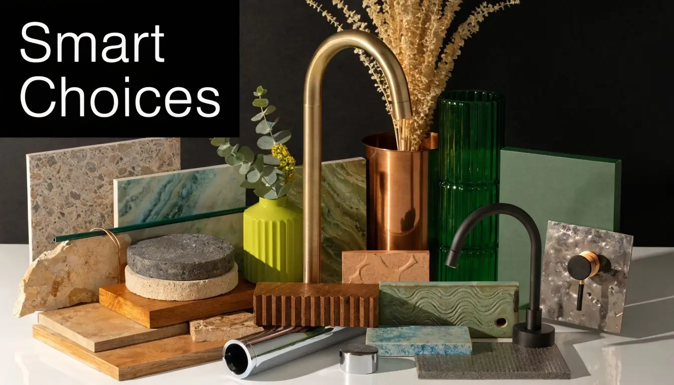
Remodelling Bathroom Cost: A 2026 VIC Guide
A standard bathroom renovation in Victoria typically costs A$20,000 to A$35,000, but the full range is wider. A cosmetic update can sit around A$10,000 to A$20,000, while a premium designer bathroom can run A$35,000 to A$50,000+.
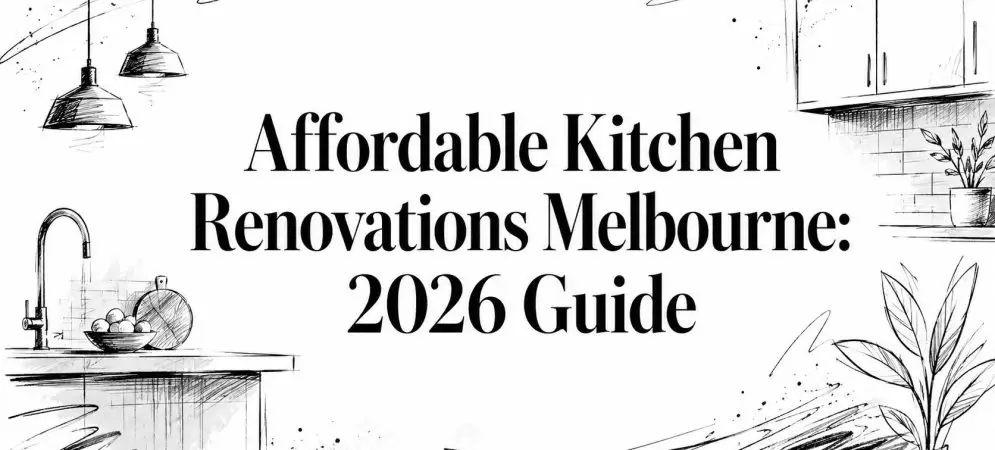
If you're standing in a tired bathroom in Highett, looking at cracked grout, a swollen vanity, old fittings and poor storage, you're probably asking the same question most homeowners ask first. What will this cost once the walls open up and the trades start?
That's the right question. Bathroom renovations look small on a floor plan, but they're one of the most trade-heavy spaces in any house. The room might be compact, yet the work still pulls in demolition, plumbing, waterproofing, tiling, electrical, ventilation, fit-off and final finishing. That's why remodelling bathroom cost in Victoria is rarely about tiles alone. Labour, compliance and layout decisions shape the number far more than many online guides admit.
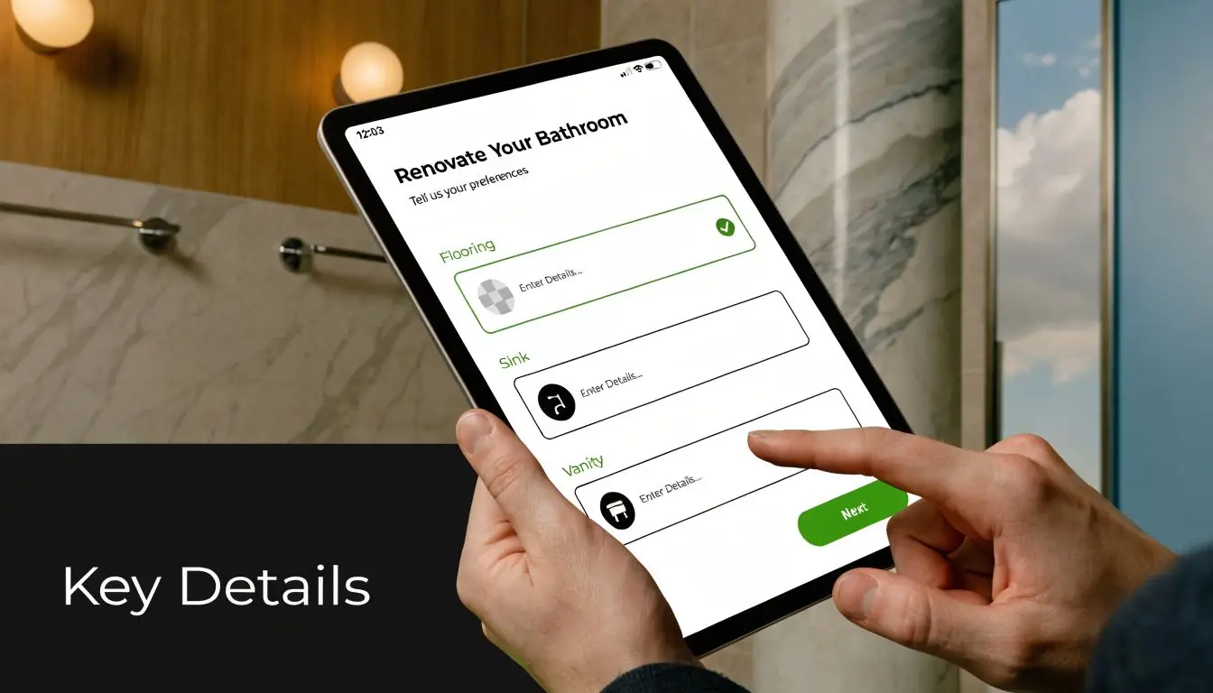
Embarking on Your Bathroom Renovation Journey
A lot of bathroom projects start the same way. You don't wake up one morning thinking about waterproof membranes or plumbing rough-ins. You notice the shower leaks onto the floor, the vanity no longer suits the family, or the room feels stuck in another decade.
For some homeowners, it's a lifestyle issue. The bathroom doesn't function well before work, school drop-off, or evening routines. For others, it's a property decision. They know the room needs attention before leasing, refinancing or selling.
That pressure has become more common. In Australia, renovation activity climbed sharply through the early 2020s, and bathrooms remained one of the most frequently upgraded rooms because they combine daily utility with strong resale appeal. Market guides also show that full-scale bathroom work often starts around A$20,000 and can go beyond A$50,000.
Why homeowners get caught out
The surprise usually isn't that a bathroom costs money. It's where the money goes.
A homeowner may begin with a simple idea. Replace the shower, update the vanity, retile the floor, maybe make it look more like the modern bathrooms they've saved online. Then the quote lands and the number feels high. In most cases, that's because the visible finishes are only one layer of the job.
Bathrooms are expensive because they stack specialist work into a very small footprint.
In older Melbourne homes, that stack can get heavier. Once demolition starts, you may uncover uneven framing, outdated plumbing, moisture damage, poor ventilation or earlier work that doesn't meet current expectations. None of that is glamorous, but it matters more than the colour of the tapware.
The real starting point
If the layout stays broadly the same and you want a full, durable result, most homeowners should budget for the middle of the market, not the bottom. That means thinking in terms of a proper renovation rather than hoping for a bargain figure that won't survive first contact with trade labour and compliance.
A practical way to frame it is:
- Cosmetic work: best for a bathroom that's tired but sound
- Mid-range renovation: best for most family bathrooms that need full replacement
- Premium renovation: best for layout changes, custom finishes and designer bathrooms
That's the point where planning starts to save money. Not by cutting essentials, but by making the right decisions early.
Typical Bathroom Remodelling Costs in Victoria for 2026
In Victoria, the cleanest way to estimate remodelling bathroom cost is by scope, not just by room size. National guidance places a basic cosmetic update at A$10,000 to A$20,000, a mid-range renovation at A$20,000 to A$35,000, and a premium bathroom at A$35,000 to A$50,000+. It also notes that the total can rise quickly once plumbing, waterproofing, tiling and electrical work are combined.
The three cost tiers most homeowners work within
Some bathrooms only need a refresh. Others need a complete strip-out and rebuild. The difference matters because the labour profile changes fast.
| Tier | Estimated Cost | Typical Inclusions |
|---|---|---|
| Basic cosmetic update | A$10,000 to A$20,000 | Surface-level improvements, selected fixture replacement, limited layout change, simpler finishes |
| Mid-range full renovation | A$20,000 to A$35,000 | Full strip-out, new waterproofing, new tiling, replacement fixtures, vanity, shower, toilet, lighting, ventilation improvements |
| Premium or designer renovation | A$35,000 to A$50,000+ | Layout changes, premium finishes, custom joinery, feature lighting, larger-format tiles, upgraded shower or bath zone, more detailed design work |
What each tier usually means in practice
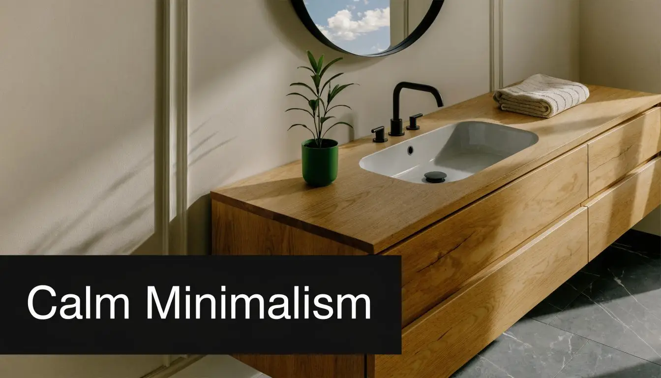
Basic isn't the same as cheap. It generally suits bathrooms where the layout still works and the hidden structure is in decent shape. The goal is to improve appearance and function without turning the room inside out.
Mid-range is the bracket most family bathroom renovations fall into. This is usually the sweet spot for homeowners wanting a fresh room, better storage, reliable waterproofing and a finish that feels current without pushing into luxury detailing.
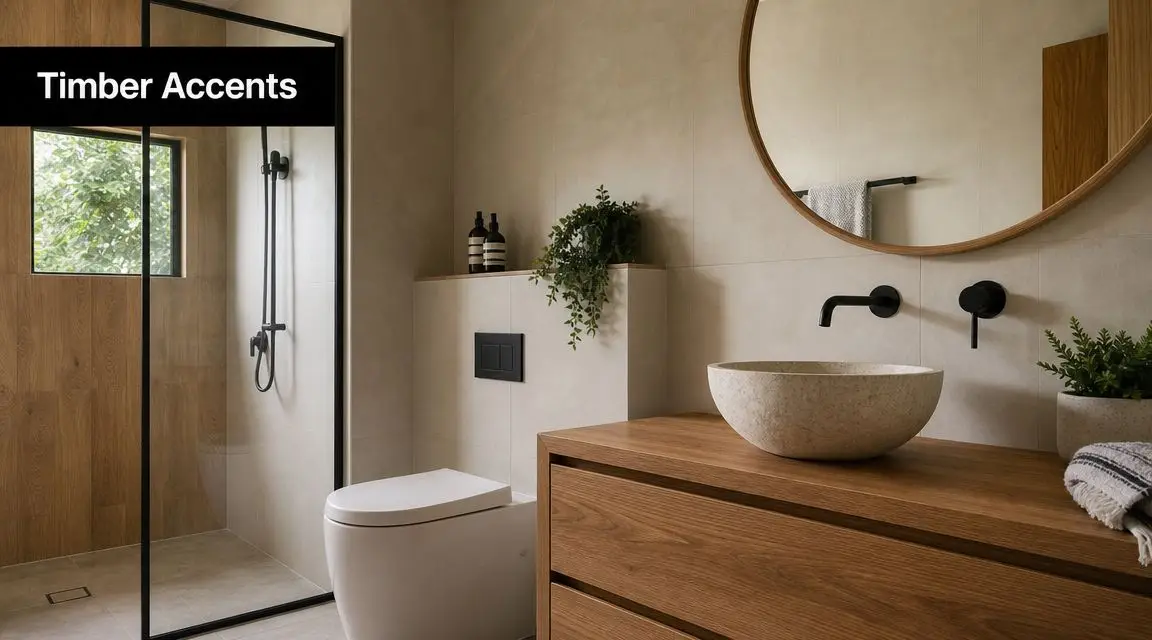
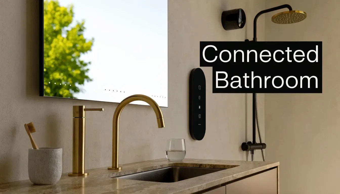
Premium is where the brief starts to change. The bathroom may become an ensuite retreat, a statement room, or part of a larger home upgrade. This is also where new bathroom ideas often move from inspiration to cost reality, especially when custom joinery, feature tile work or plumbing relocation enters the picture.
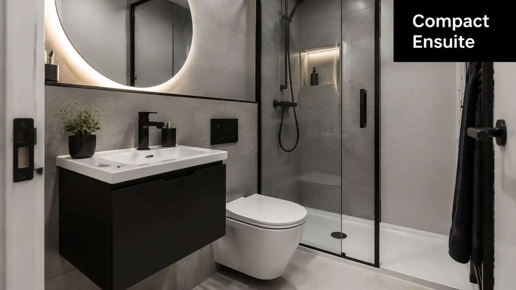
Why small bathrooms don't always mean small budgets
A compact bathroom can still cost more than expected because a lot of key costs don't shrink in proportion with floor area. Demolition still happens. Waterproofing still has to be done correctly. Trades still need to come through the room in sequence.
Practical rule: A small bathroom can use fewer materials, but it doesn't avoid the fixed labour and compliance steps that make bathrooms expensive.
That's why comparing your room to someone else's by square metres alone rarely helps. Two bathrooms of similar size can land in very different cost brackets depending on access, age, layout and finish level.
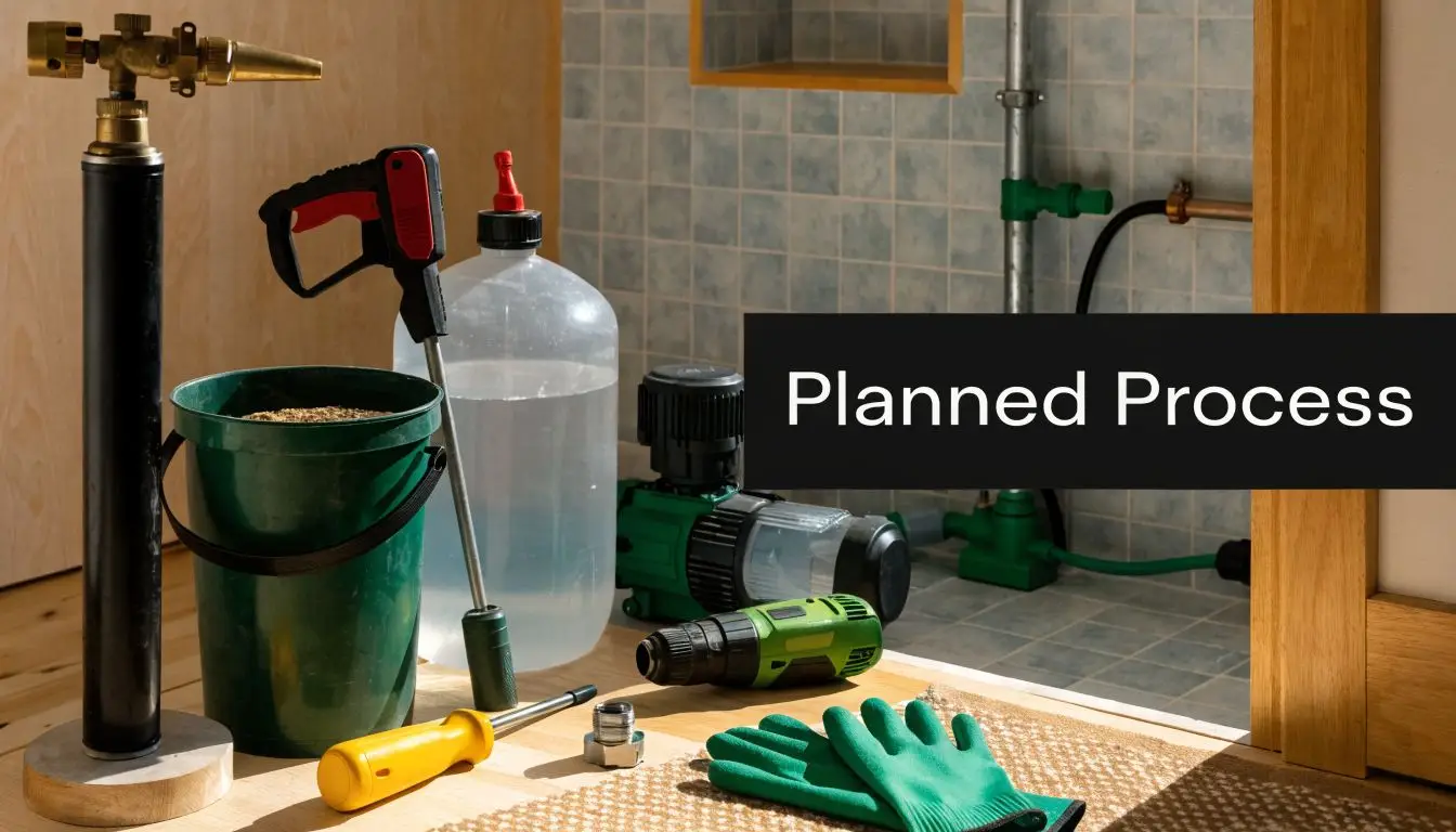
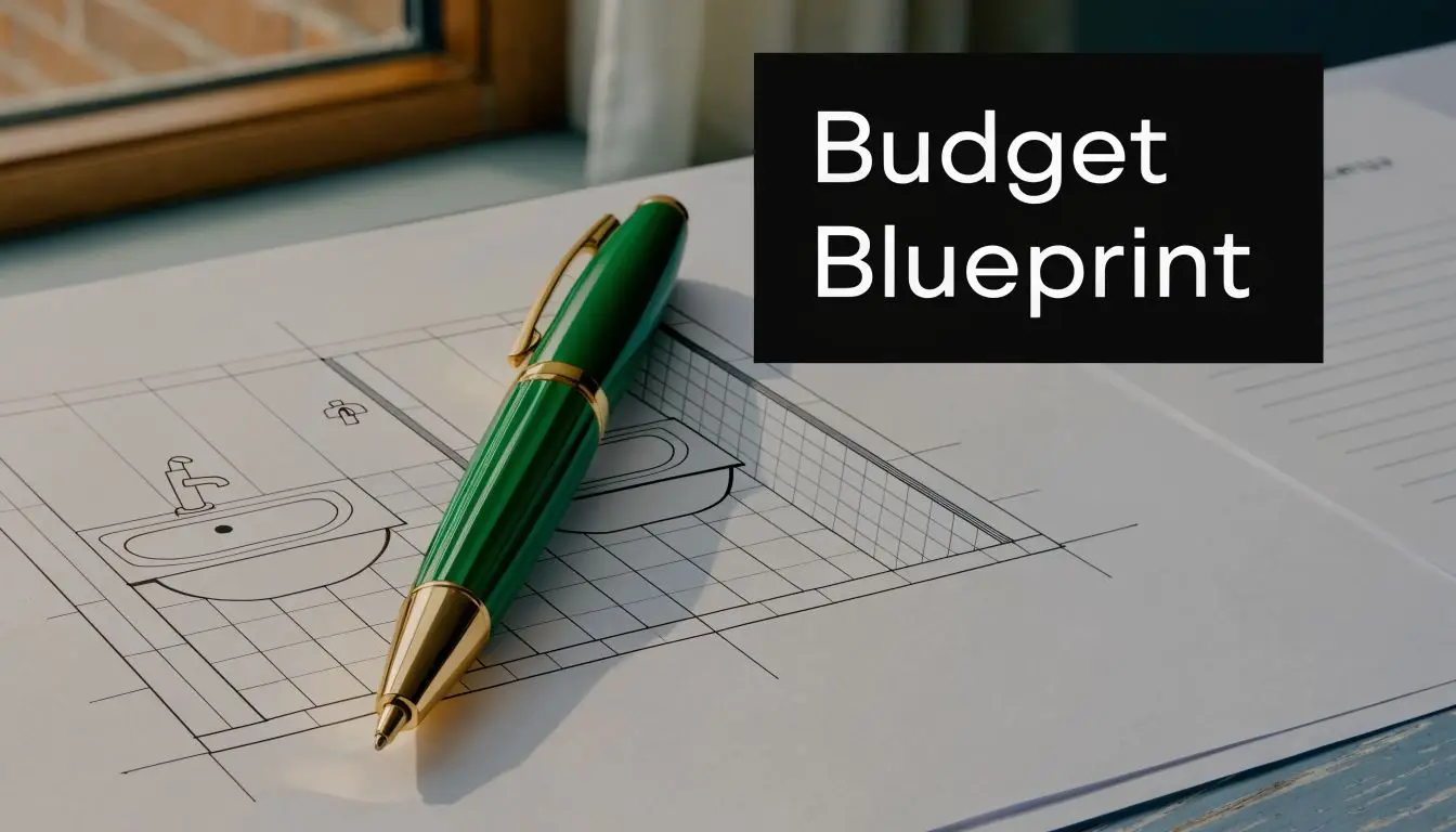
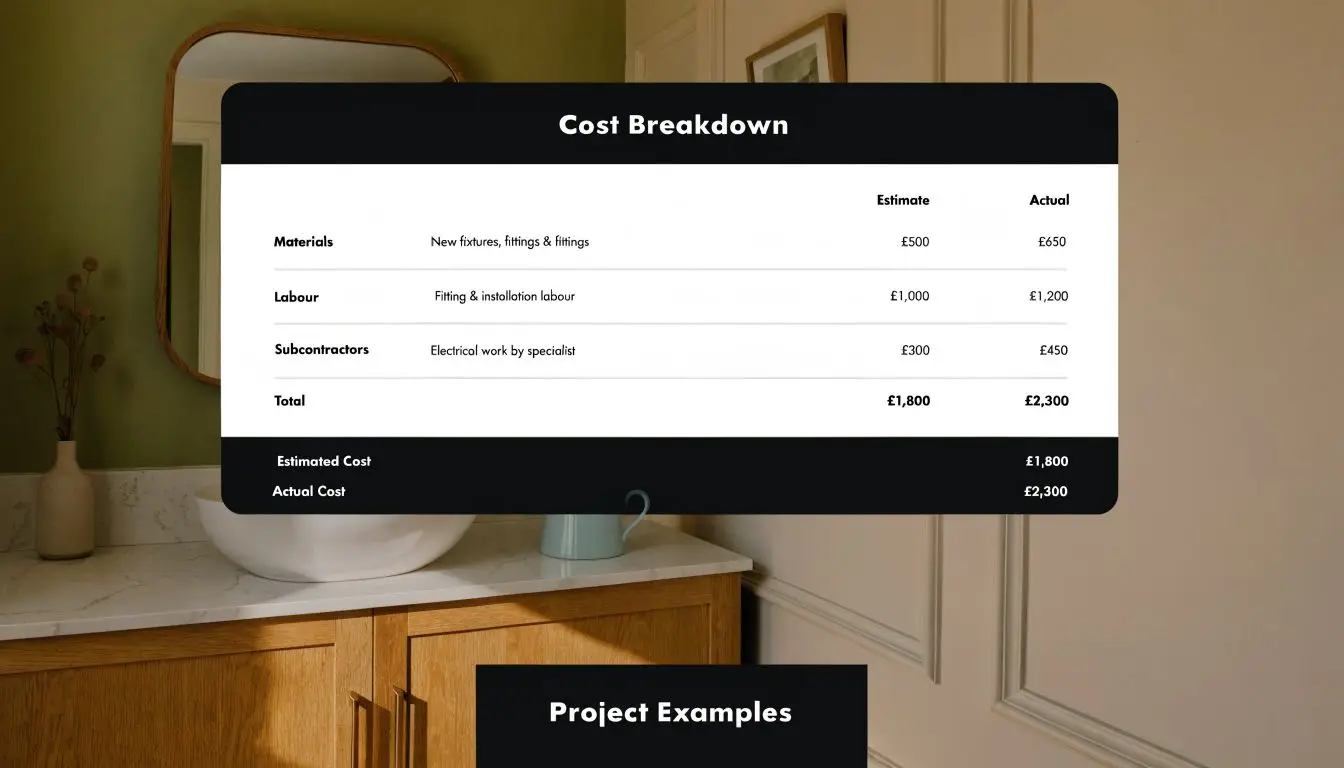
The Anatomy of a Bathroom Renovation Budget
The best way to read a bathroom quote is to stop thinking of it as one number and start reading it like a build sequence. Every line item represents a trade, a material package, or a compliance step that has to happen in the right order.

If you want to sense-check your project early, a bathroom renovation cost calculator for Melbourne projects can help frame the budget before you start requesting formal quotes.
What sits inside a real renovation budget
When homeowners ask where the money goes, this is usually what they're paying for:
Demolition and removal
Old tiles, fittings, sheeting, shower screens, vanity units and waste all have to come out safely and be removed from site.Carpentry and preparation
Walls and floors often need straightening, backing, repairs or adjustment before new materials can go in properly.Plumbing rough-in and fit-off
This covers the service work behind the walls and the final installation of fixtures.Electrical and ventilation
Lighting, power points, exhaust systems and any upgrades to the room's functionality sit here.Waterproofing
This is one of the most important stages in any Australian bathroom. If it's rushed or skipped, the nice-looking finishes above it won't matter for long.Tiling and tile preparation
This includes substrate preparation, tile laying, grout work, trims and finishing detail.Joinery and vanity work
Off-the-shelf vanities cost less. Custom cabinetry usually gives a better fit and storage result but pushes the budget up.Fixtures and accessories
Toilet, tapware, shower fittings, mirror, basin, bath, rails and hardware all add up.Project coordination
Good sequencing matters. Delays between trades cost time, and rushed handovers often cost quality.
Why bathrooms feel expensive even when they're small
Australian guidance puts a standard bathroom at about A$25,000 to A$35,000, and a key reason is that a bathroom is a high-trade-density space. Waterproofing, plumbing, electrical work, tiling and fit-off overlap tightly, and labour represents a major share of the total. It also notes that moving fixtures or altering plumbing layout materially increases spend because re-routing services, extra demolition and re-tiling are involved.
That aligns with what happens on site. A bathroom doesn't give trades much room to work, so every stage needs more precision. There's little tolerance for mistakes and no spare space to hide poor preparation.
What a homeowner should scan for in a quote
A quote should show enough detail that you can tell whether the builder has allowed for the full job or only the visible parts.
Look for these points:
| Budget area | What you want to see |
|---|---|
| Demolition | Clear allowance for strip-out and waste removal |
| Waterproofing | Explicit inclusion, not assumed or buried |
| Plumbing | Whether fixtures stay in place or move |
| Electrical | Lights, fan, power points and connection work |
| Tiling | What surfaces are tiled and what finish is assumed |
| Fixtures | Allowance level or nominated products |
| Joinery | Custom, semi-custom or standard supply |
| Management | Who coordinates the trades and defects process |
If a quote looks low, check what's missing before you assume you've found value.
The cheapest quote often becomes the most expensive once variations begin. In bathroom renovations, omitted work doesn't disappear. It comes back later as a problem, a delay or a cost increase.
Key Factors That Drive Your Renovation Cost Up or Down
The total doesn't move randomly. A handful of decisions do most of the heavy lifting.
Some choices keep a project controlled and efficient. Others trigger a chain reaction across multiple trades. That's why two bathrooms with a similar footprint can finish far apart in final cost.
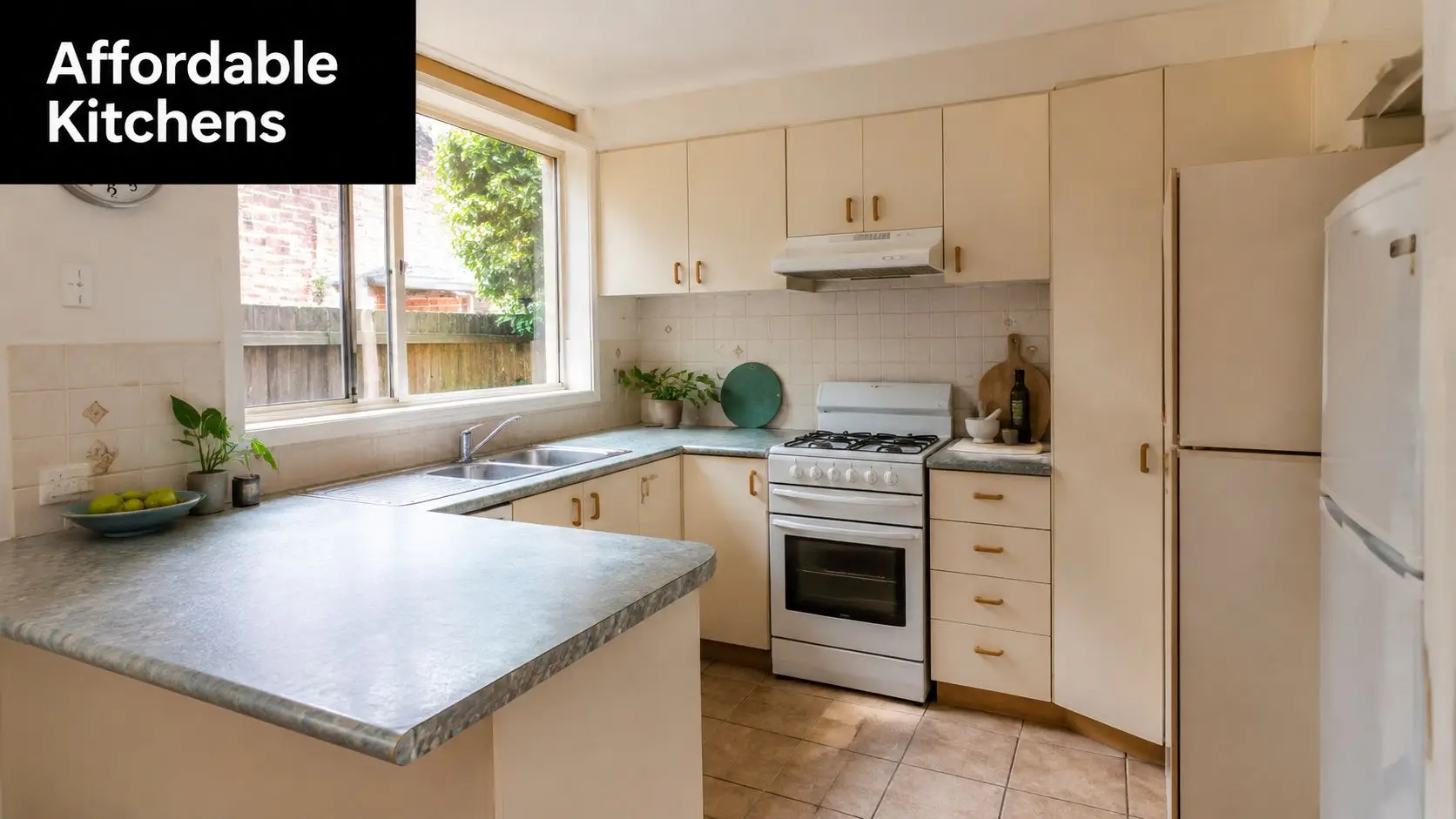
Keep the plumbing where it is if you can
The single biggest budget lever in many bathroom renovations is the layout. If the toilet, shower and vanity stay where they are, the project is usually cleaner, faster and easier to coordinate. Once you start moving them, the builder often has to open more of the room, reroute services and repair a wider area.
That's particularly relevant in Victoria because the labour side of the job often outweighs the savings you think you're making on fixtures.
Finish level changes the feel and the spend
There's nothing wrong with wanting a better-looking bathroom. In fact, many modern bathrooms get their impact from a few well-chosen upgrades rather than an all-out luxury spec.
Cost usually rises when you choose:
- Larger or more complex tiles that demand more precise setting out
- Custom vanities instead of standard units
- Feature tapware and fittings with a higher finish level
- Frameless glazing or statement baths that become focal points
- Detailed niches, trims and lighting that increase installation time
The mistake is assuming every visible upgrade adds equal value. It doesn't. In many homes, better storage, better lighting and a cleaner shower layout improve daily use more than an expensive feature finish.
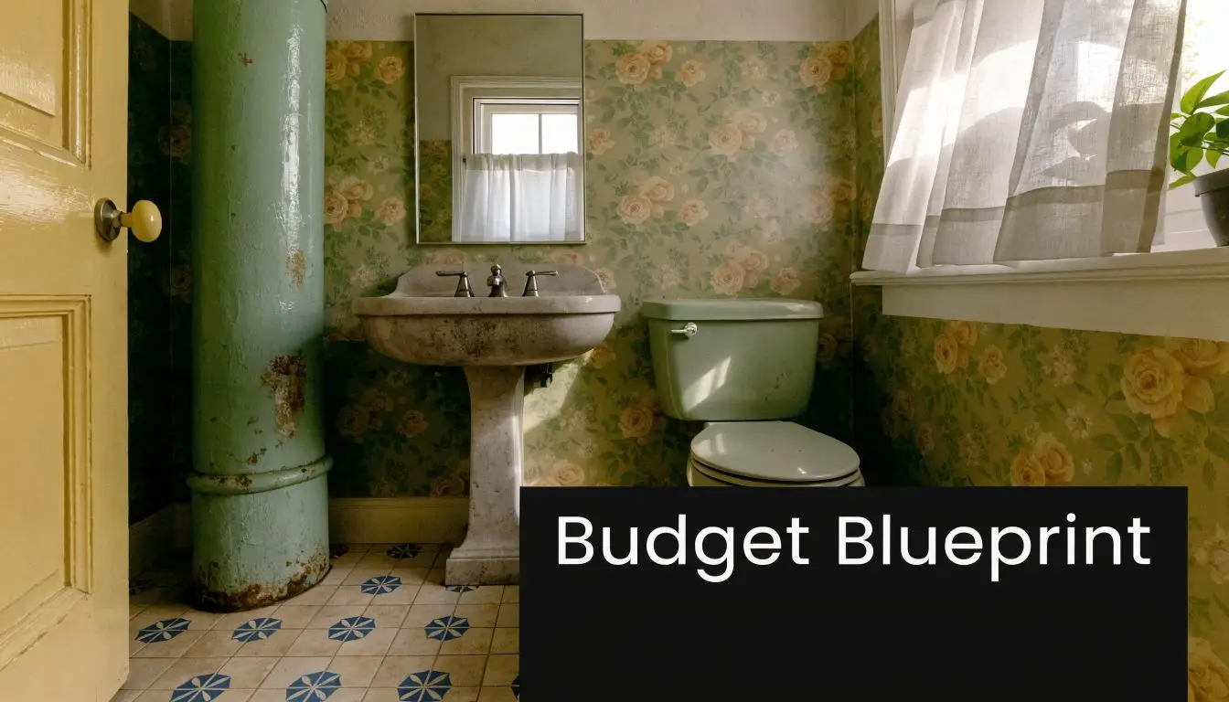
Older homes create more uncertainty
Highett and surrounding Melbourne suburbs have a broad mix of housing stock. Older bathrooms often hide the kinds of issues that don't show up in the first mood board.
These commonly include:
- Moisture damage behind tiles or around the shower base
- Out-of-square walls or floors that need correction
- Previous patch-up work that has to be redone properly
- Ventilation problems that contributed to mould or paint failure
- Service access issues that slow down trade work
A bathroom renovation gets expensive fastest when the original room looked cosmetic, but the structure behind it wasn't.
Customisation versus restraint
Designer bathrooms are built on detail. Recessed storage, floating joinery, feature strips, special lighting and carefully layered materials can look excellent. But every custom move asks for more time, more coordination and often more risk control.
That doesn't mean you should avoid custom work. It means you should decide where it matters.
A restrained design usually spends money well in three places:
- Waterproofing and preparation
- A practical layout
- Durable finishes you won't regret in two years
The rest should support those priorities, not crowd them out.
Sample Budgets for Modern and Designer Bathroom Renovations
Examples help because they turn broad cost bands into real decisions. These aren't claims about a specific past project. They're realistic planning scenarios based on the cost ranges already discussed and the sort of choices Melbourne homeowners commonly make.
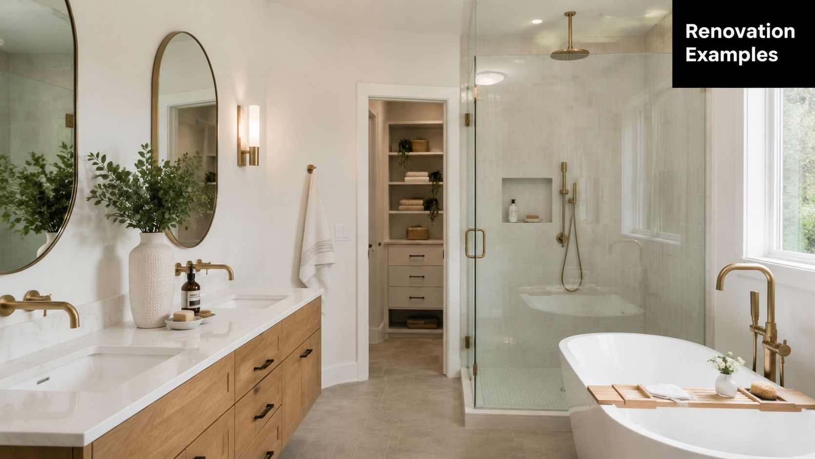
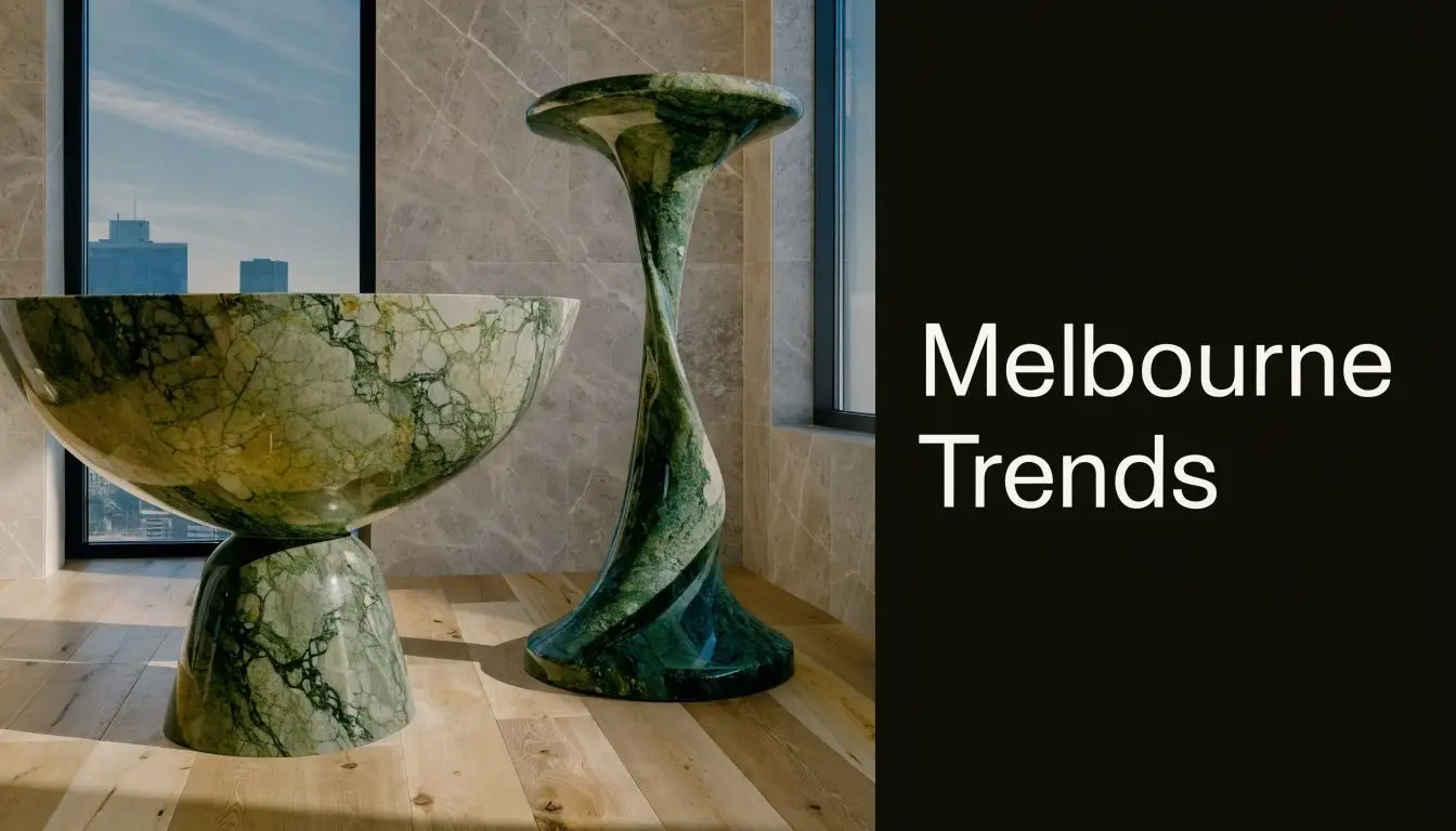
If you're exploring higher-end inspiration, it helps to look at designer bathrooms in Melbourne with a practical eye. The question isn't just what looks good. It's which features justify their cost in your home.
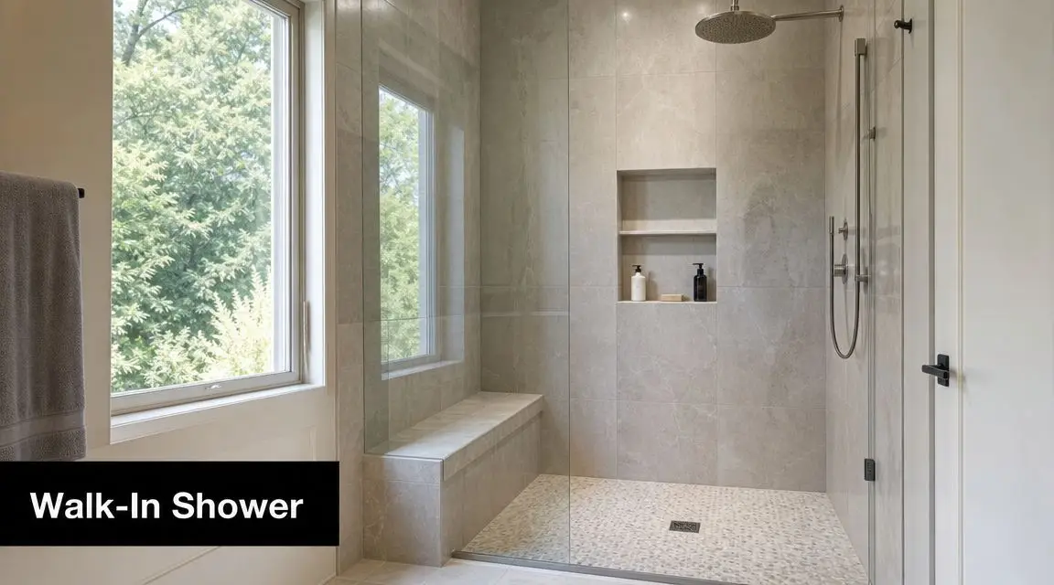
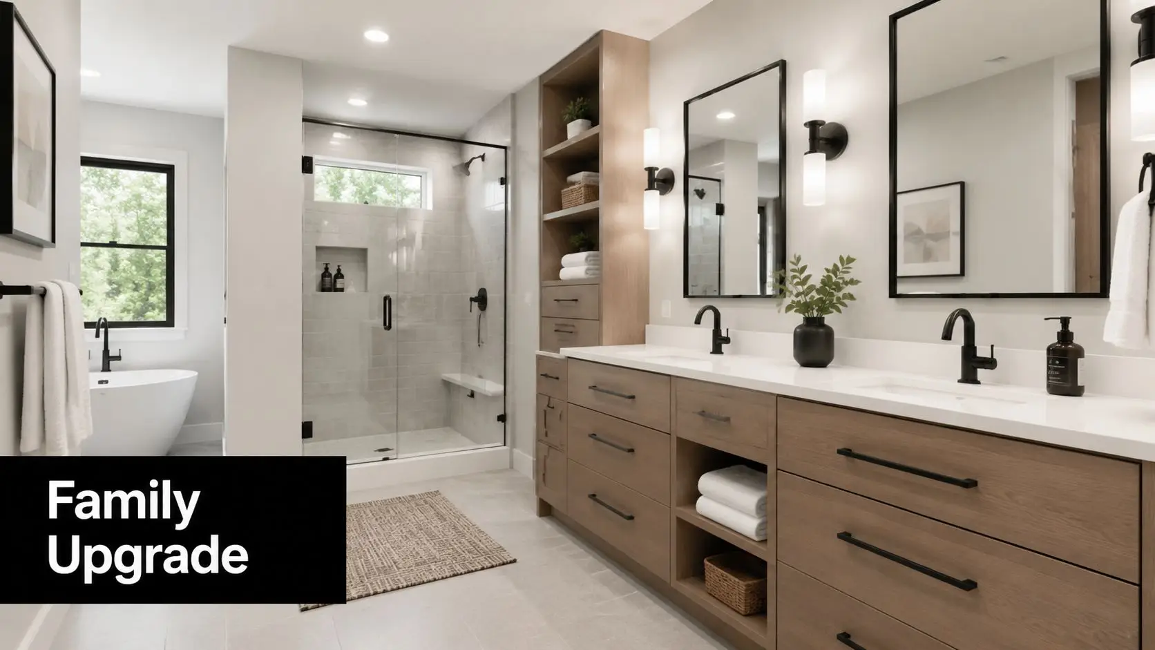
The A$28,000 modern family bathroom
This is the kind of renovation many households should aim for first. The room is dated, the shower is tired, storage is poor, but the basic layout works. The smartest move is to keep the plumbing footprint largely intact and spend the money on a full rebuild with durable finishes.
The brief for a modern family bathroom usually looks like this:
- A walk-in shower with simple, easy-to-clean detailing
- A practical vanity with better drawer storage
- Full waterproofing and fresh tiling
- Updated lighting and ventilation
- A more current look without drifting into overdesigned territory
The result feels completely new because the visible surfaces change, but the cost stays within a controlled range because the hidden services don't need major relocation.
A budget at this level usually leans on smart restraint:
| Area | Likely focus |
|---|---|
| Layout | Mostly retained |
| Vanity | Functional, clean-lined, not heavily customised |
| Tiles | Durable and contemporary rather than highly specialised |
| Shower | Better screen, fittings and drainage detail |
| Lighting | Improved task and general lighting |
| Finish style | Fresh, simple, low-maintenance |
This is often the best-value category for families. It gives you the reliability of a full renovation and enough design improvement to feel modern without paying premium-room prices.
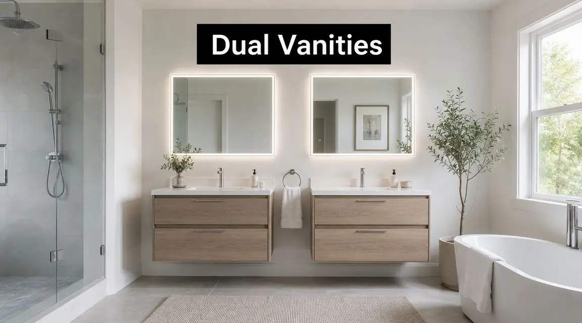
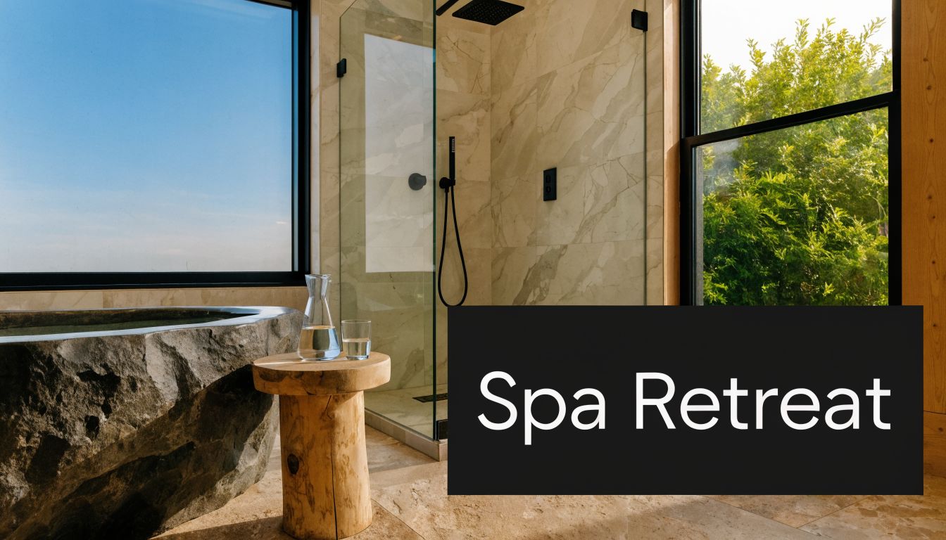
The A$55,000 designer ensuite
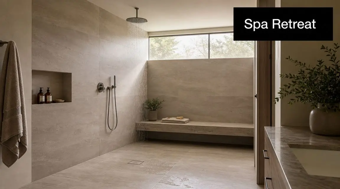
At the upper end, the job changes character. This isn't just about replacing what's there. It's about creating a room around experience, visual impact and custom detail.
A premium ensuite might include:
- A freestanding bath
- A larger frameless shower
- Custom vanity joinery
- Higher-end tile selection
- Layered lighting
- More sculptural fittings
- A reworked layout for better flow
That's how a project pushes beyond the standard premium range and into a more bespoke build outcome. The price rises not because one item is outrageously expensive, but because many choices each add complexity.
Premium bathrooms cost more because almost every element asks more from the trades. More set-out. More finishing detail. More coordination.
The homeowner who gets good value here is the one who wants a genuine upgrade in daily use and design quality, not just a room full of expensive products.
Which example is right for you
If you're weighing new bathroom ideas, ask yourself three things:
- Do I want a better bathroom, or a different bathroom?
- Can I keep the layout and still solve the room's problems?
- Will custom features improve how we use the space, or only how it photographs?
Those questions usually separate a strong mid-range renovation from a premium project that's worth its cost.
How to Save Money and Get Accurate Quotes in Melbourne
Saving money on a bathroom renovation doesn't mean chasing the lowest number. It means protecting the parts of the build that matter and trimming the parts that don't.
That starts with understanding where Victoria-specific costs often get missed. Australian guidance notes that many cost articles skip over local labour and compliance detail, even though licensed trades, plumbing relocation and waterproofing compliance are major cost drivers in Australian homes. It also highlights the value of asking what costs are usually missed in a first quote.
Where to save without creating future problems
There are smart ways to cut cost, and there are false economies.
Smart savings usually include:
Keep the existing layout
If the room functions reasonably well, this is often the best budget decision available.Use simpler tile formats
A clean porcelain tile can look sharp and reduce labour pressure compared with more intricate layouts.Choose one feature, not five
A statement mirror, vanity or wall tile can carry the design without forcing every finish into premium territory.Prioritise storage and lighting
These usually improve the room more than decorative extras.Be careful sourcing your own fixtures
It can work, but only if dimensions, lead times and compatibility are confirmed before site work begins.
For homeowners wanting a tighter plan, these budget bathroom renovation ideas for Melbourne homes are useful when the goal is controlled spending rather than stripped-back quality.
What usually goes wrong with cheap quotes
The low quote often wins because it feels simple. Then the problems start.
A quote may look attractive because it leaves out one or more of the following:
- Detailed demolition allowances
- Adequate waterproofing scope
- Realistic tile preparation
- Ventilation upgrades
- Waste removal
- Clear fixture allowances
- Project management responsibility
- Variation rules if hidden issues appear
That's where homeowners get caught. The quote wasn't wrong in arithmetic. It was incomplete in scope.
Why builder oversight matters
For full bathroom renovations, coordination matters as much as craftsmanship. A tiler can tile. A plumber can plumb. But a successful bathroom renovation depends on sequencing, accountability and one party taking responsibility for the whole room.
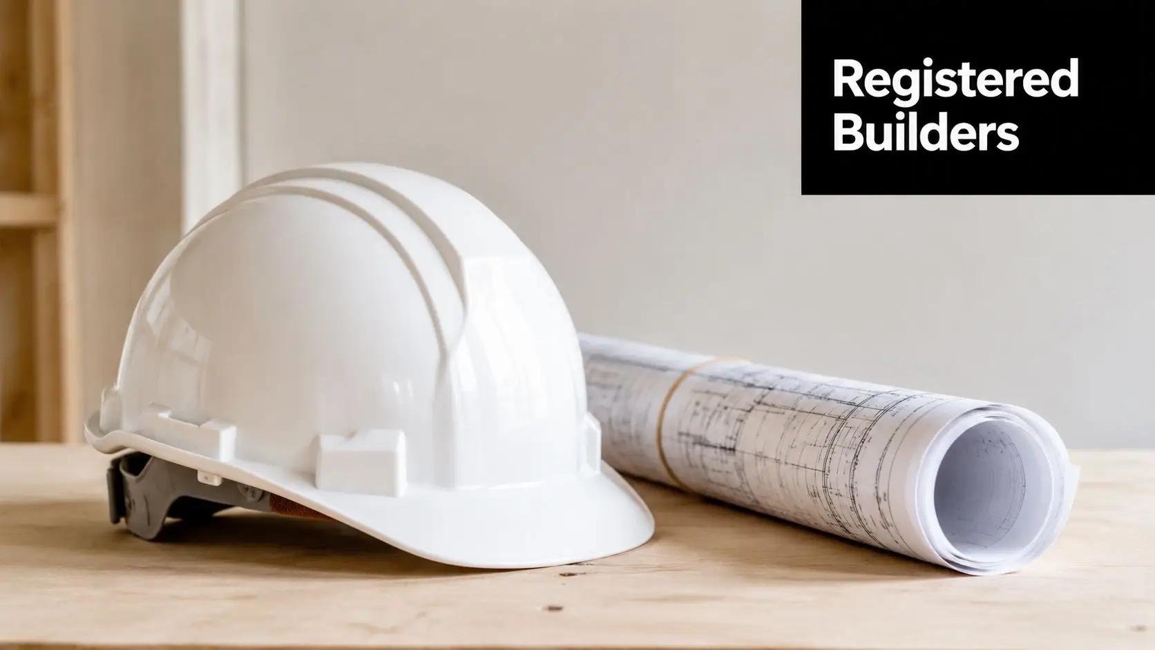
That's why many homeowners feel safer with a registered builder unlimited managing the project rather than a loose collection of individual trades. The issue isn't just convenience. It's clarity around scope, timing, defects and who owns the final result.
A good quote should clearly state:
| Quote item | Why it matters |
|---|---|
| Scope of works | Shows exactly what is and isn't included |
| Product assumptions | Prevents disputes about fixture level |
| Compliance items | Confirms the job accounts for critical wet-area work |
| Timeline | Helps you plan access and disruption |
| Variation process | Reduces surprises if hidden issues appear |
| Warranty detail | Clarifies post-completion support |
Don't judge a bathroom quote by the bottom line first. Judge it by how well it predicts the real job.
That's the difference between a quote that sells a project and a quote that prepares you for one.
ROI, Resale Value, and Your Renovation Questions Answered
A bathroom renovation is partly a comfort decision and partly an asset decision. In suburbs like Highett, buyers and renters notice bathrooms quickly because they use them every day and because defects in wet areas can signal broader maintenance issues.
A well-executed renovation usually does two things at once. It improves how the home lives now, and it protects the property from looking tired against competing listings. That doesn't mean every upgrade needs to be luxurious. It means the room should feel clean, functional, durable and coherent with the rest of the home.
Where value usually comes from
The bathrooms that hold value best tend to get the basics right:
- A layout that works
- Storage that suits daily use
- Reliable waterproofing and ventilation
- Finishes that feel current but not trendy for trend's sake
- Workmanship that looks neat in every corner and junction
Modern bathrooms usually perform well in the market because they appeal broadly. Designer bathrooms can also add strong appeal, but only when the spend matches the home and the suburb.
Common renovation questions
Do I need a council permit for a bathroom renovation in Victoria
Sometimes yes, sometimes no. It depends on the scope of work and whether structural changes or other approval-triggering work are involved. This is something you should confirm before build decisions are locked in.
How disruptive is a bathroom renovation
More disruptive than many people expect, because the room is out of service while multiple trades move through in sequence. The practical issue isn't only noise. It's access, dust control, scheduling and whether your household has another usable bathroom.
What's the difference between waterproofing and tiling
They are not the same thing. Waterproofing is the protective system behind the finished surface. Tiling sits over prepared substrates and waterproofed areas. Good tiles do not replace proper waterproofing.
Is a cosmetic update enough
Sometimes. If the bathroom is structurally sound, the layout works and there are no underlying moisture or compliance concerns, a cosmetic update may be sensible. If the room has deeper issues, surface improvements often just delay the proper renovation.
A good bathroom should still look good years later, not just on handover day.
If you're planning a bathroom renovation in Highett or greater Melbourne and want a quote that reflects the actual work involved, not just the showroom items, SitePro Bathrooms can help you map out a clear scope, realistic budget and finish level that suits your home.