
8 Compact Bathroom Design Ideas for Modern Homes
Maximise Your Space: Transform Your Small Bathroom
You step into a bathroom that should work harder than it does. The vanity pushes into the walkway, the shower screen chops up the room, and every surface feels busy before the day has even started. That is a common problem in compact ensuites and apartment bathrooms, especially in older Victorian homes where the original layout was never designed for modern storage, lighting, or larger fittings.
Good compact bathroom design starts with the plan, not the product list. The best results come from getting the room proportions under control, protecting circulation space, and reducing visual weight so the bathroom feels calm and easy to use. In practice, that means making early decisions about fixture sizes, wall depths, tile scale, and where storage can be built in instead of added on later.
Registered builders and bathroom designers look at these rooms differently. We measure what people can stand in, reach, open, and clean. A vanity that looks fine on a showroom floor can make a 1.8 metre wide bathroom feel tight once clearances, door swings, and shower glass are accounted for. A tile choice that looks sharp in a sample board can make a small room feel chopped up if grout lines are too busy.
3D design visualisations help avoid those mistakes before demolition starts.
They let you test layouts, sightlines, fixture placement, and material combinations while changes are still cheap and simple. That is one of the clearest ways to de-risk a renovation in a small bathroom, where a 50mm adjustment can be the difference between a room that feels resolved and one that always feels compromised.
The ideas in this guide focus on buildable improvements with real impact. Expect specific measurements, material considerations, and layout decisions that help compact bathrooms look clean, work properly, and hold up well over time.
1. Wall-Mounted Vanities and Floating Fixtures
A compact bathroom can feel tight before anyone steps into the shower. The usual culprit is visual weight at floor level. Wall-mounted vanities fix that fast by exposing more floor, extending the sightline from the doorway, and giving the room a cleaner profile.
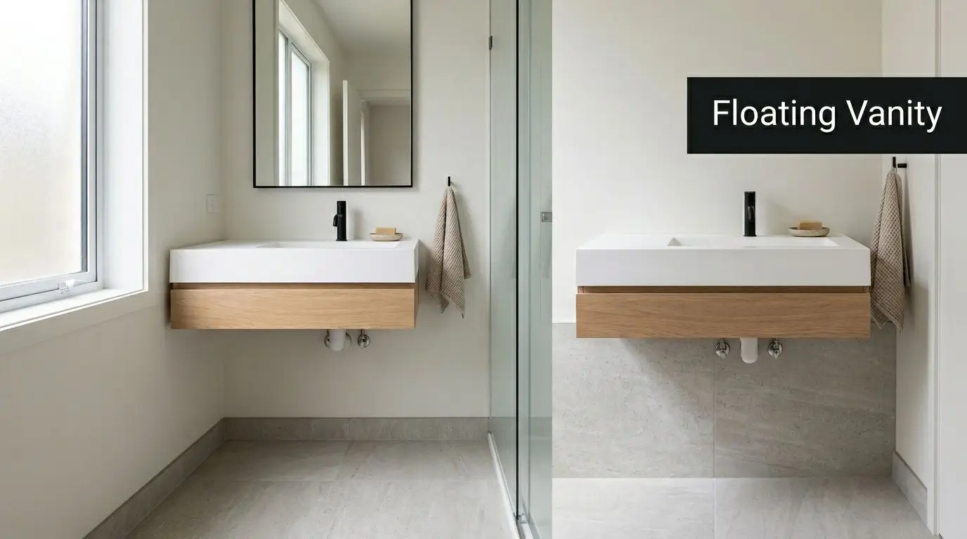
In smaller ensuites, an 800mm vanity is often the safe starting point, but the right size depends on door swing, shower screen position, and how much standing room is left in front. I usually test that in a 3D model before any joinery is ordered. On paper, a wider unit can look manageable. In the room, a 50mm overrun can make drawers, circulation, and cleaning feel clumsy every day.
Mounting height matters too. Most wall-hung vanities land around 800 to 850mm high, but that range should be set by the users, not copied from a display suite. Families with young kids, older owners, and ageing-in-place renovations often need a different height to keep the basin comfortable and the storage usable.
What has to happen behind the wall
A floating vanity needs structure behind it. That means checking the framing, adding noggings or reinforcement where required, and setting plumbing points early so wastes, traps, and water lines stay hidden inside the cabinet.
Choose the vanity after the wall build-up is understood.
That trade-off gets missed all the time. A slim wall-hung unit looks great in a showroom, but if the wall can't take the load without major rework, the money may be better spent on a shallower cabinet, a custom carcass, or a different layout. The same planning step also helps coordinate tile set-out and floor lines, especially if you're pairing the vanity with large format bathroom tiles for a cleaner, more open finish.
A few practical rules make these fixtures work harder in small rooms:
- Fix into solid structure: Use proper framing support and rated fixings. Plasterboard anchors are not enough.
- Keep the cabinet depth under control: In tight bathrooms, a shallower vanity often improves movement more than a wider vanity improves storage.
- Use durable finishes: Matte and satin joinery generally show fewer fingerprints and water marks than high gloss.
- Leave a realistic cleaning gap: Too low and the underside becomes awkward to mop. Too high and the vanity can feel visually disconnected.
A wall-hung toilet can create the same lighter effect if the wall depth, cistern space, and plumbing layout allow for it. Registered builders earn their keep here. They can tell you early whether the wall should be rebuilt, packed out, or left alone, which is exactly the kind of decision that keeps a compact bathroom looking resolved instead of overworked.
2. Large Format Tiles and Minimal Grout Lines
A compact bathroom starts to feel bigger once the eye can travel across the room without stopping at every joint. Large format tiles help because they create broader, quieter surfaces. Less grout also means less visual clutter and less cleaning in a room that already works hard.
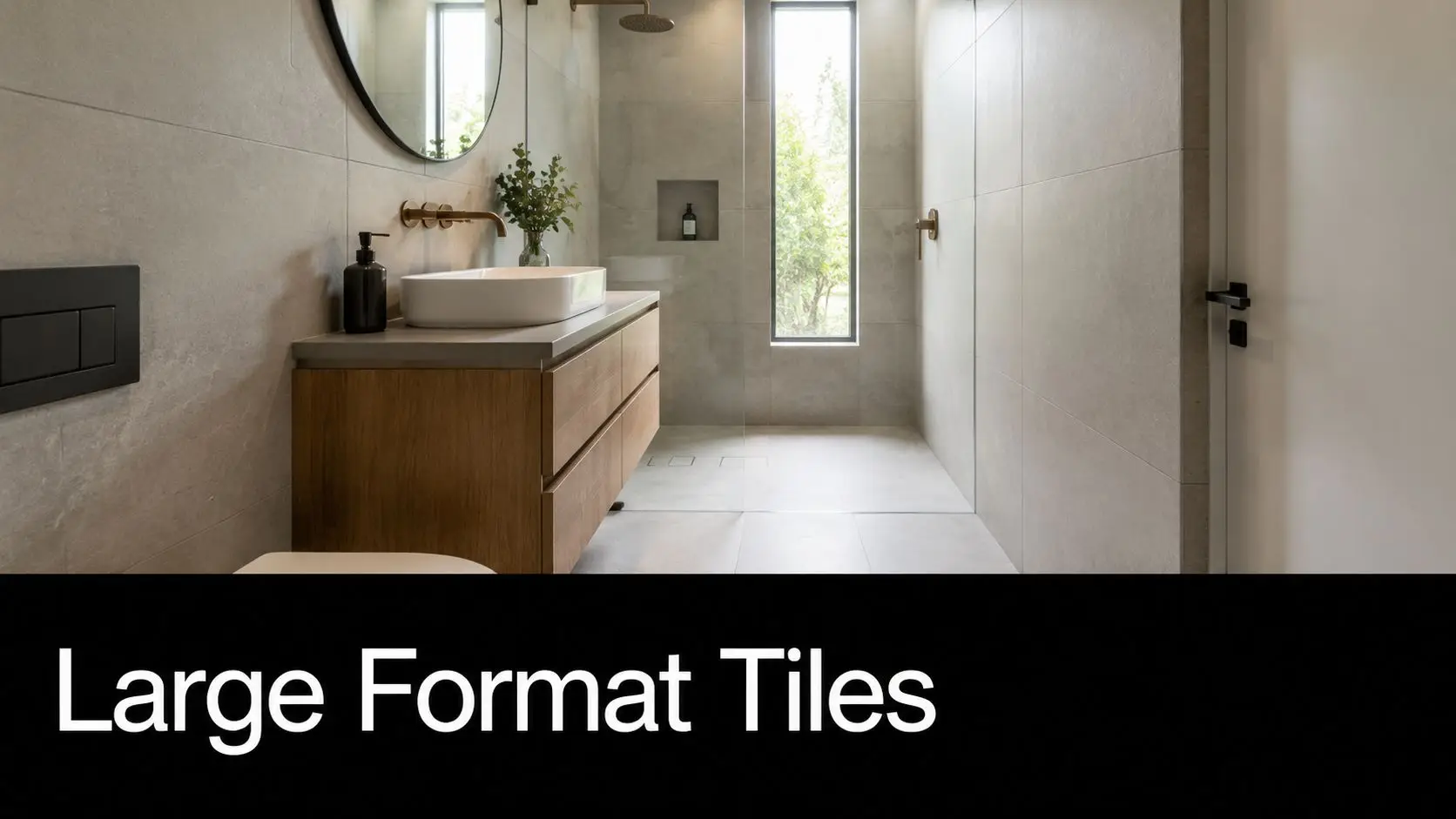
In a tight ensuite, I usually get the best result from 1200 x 600mm or 600 x 600mm tiles, depending on how many doorways, niches, and corners the room has. Bigger is not always better. A tile that is too large for the wall can force awkward cuts around tapware, windows, or toilet pan set-outs, and that can make the room feel more contrived, not more spacious.
Orientation matters as much as size. Run rectangular tiles horizontally and a narrow room often reads wider. Stack them vertically and the ceiling can feel taller. The right choice depends on what the room is lacking, width, height, or both.
Large format finishes also ask more of the build. If the substrate is out of plane, the defects show immediately. Falls on the bathroom floor still need to work, especially near the shower entry, so the tile selection has to suit the waterproofing method, waste location, and drain detail. That is one reason we model tile set-outs in 3D before demolition starts. It lets clients see where joints land at the niche, vanity end, and shower screen, which avoids expensive last-minute compromises.
A few site rules make a big difference:
- Straighten walls and floors first: Large tiles highlight dips and humps that smaller tiles can hide.
- Set the layout before waterproofing is locked in: Drain position, niche width, and screen placement all affect the final cuts.
- Use grout close to the tile colour: Tight tonal contrast keeps the surface reading as one field.
- Limit feature tiles to one small area, if any: In compact rooms, too many patterns break up the space fast.
I also prefer carrying one main tile across the floor and at least one major wall plane. That restraint is what makes the room feel resolved. If you are planning an open shower zone or want the floor finish to continue cleanly through the wet area, these wet room bathroom ideas show how that approach works in practice.
For a closer look at material options, these large format bathroom tiles show why scale, finish, and grout selection have such a big effect in small bathrooms.
3. Compact Corner Shower Solutions and Walk-In Designs
A tight ensuite usually fails at the shower first. The enclosure sits in the wrong spot, the door swing steals circulation space, and the room feels smaller than the floor plan suggests. In compact bathrooms, shifting the shower into a corner or opening it up as a walk-in often gives back enough usable space to change how the whole room works.
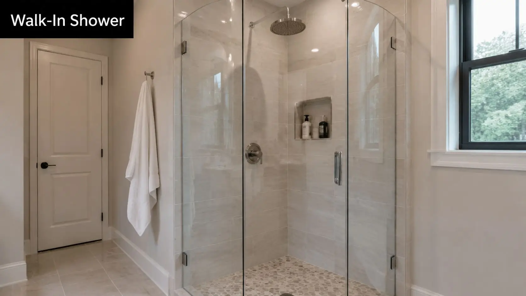
I see this constantly in ensuites around 1.5 x 2 metres. A pivot door shower cuts into the path to the vanity or toilet and breaks the room into awkward pockets. A frameless corner layout or a properly planned walk-in keeps the centre clearer, improves sightlines, and makes the bathroom read as one volume instead of three cramped zones.
The trade-off is technical, not cosmetic. Walk-in showers only work when water is controlled properly. That means accurate falls to waste, a shower rose position that contains spray, and screen placement that protects the dry path through the room. Get those wrong and the bathroom never feels settled, no matter how refined the finishes are.
For compact walk-in showers, I usually set a niche around 1200mm high so daily products sit within easy reach and off the floor. Glass also needs judgement. Thicker frameless panels can feel premium, but in very small rooms the hardware, panel width, and cleaning access matter just as much as the glass specification. Sometimes a minimal fixed screen gives a better result than a full enclosure with extra channels and door furniture.
Curbless or low-threshold entries are also worth considering if you want the room to age well. They improve access and can make the footprint feel wider, but they need tighter floor planning because the whole wet area has to work harder. Here, 3D bathroom design visualisations earn their keep. We use them to test screen length, entry position, drain location, and clearances before demolition starts, which helps avoid expensive mid-build changes.
If you are comparing layouts, these bathroom design ideas for small spaces show how corner showers and open entries can be planned without wasting usable floor area. If you are weighing full wet-area planning, these wet room bathroom ideas show how that approach can work in a tighter footprint.
4. Recessed Storage and Hidden Shelving Systems
Open a compact bathroom after a busy morning and the problem shows up fast. Bottles line the vanity, spare toiletries drift onto the window ledge, and the room starts to feel smaller than it is. Recessed storage fixes that by using the cavity inside the wall, not the circulation space you need to move through the room.
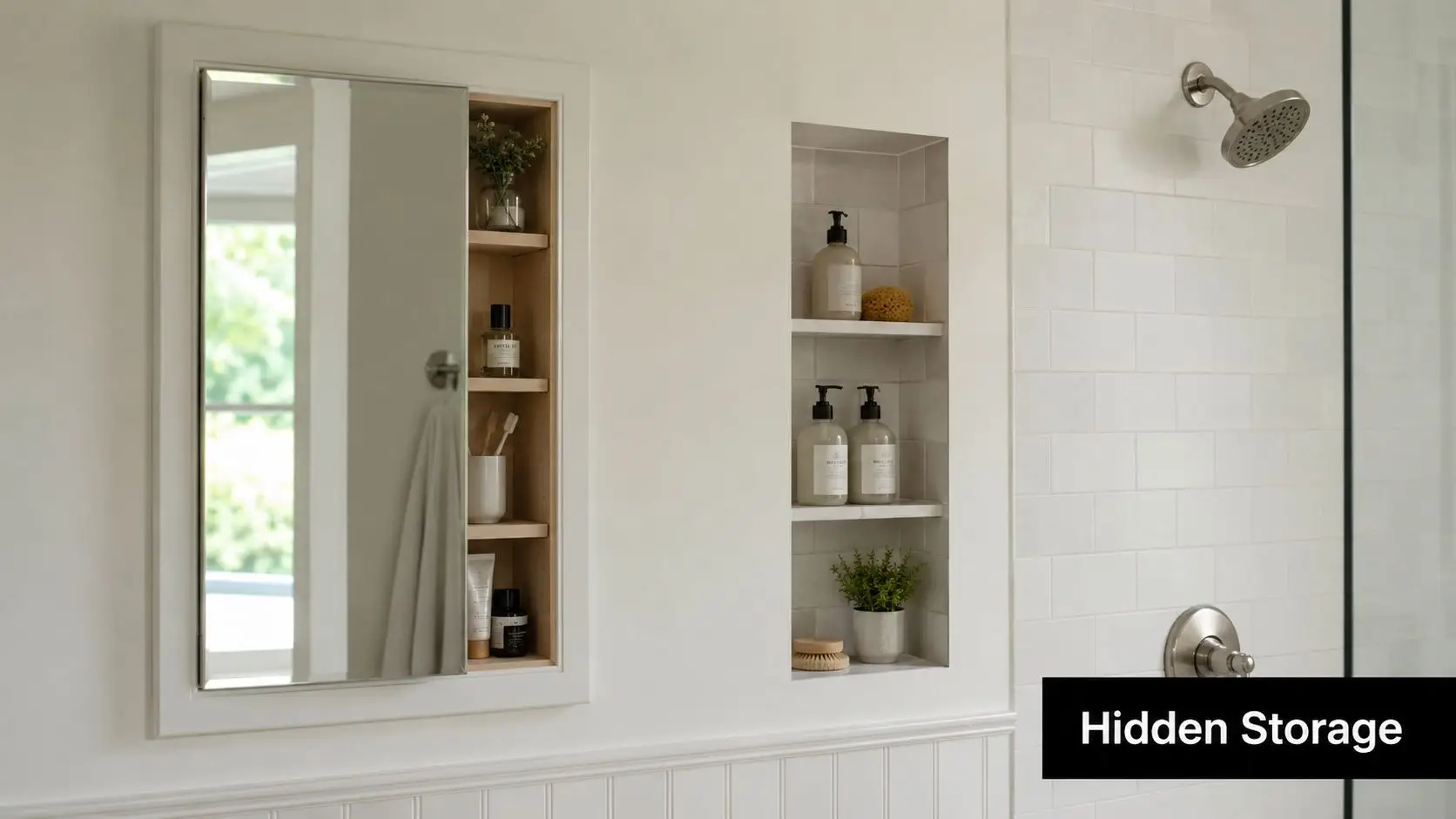
A recessed mirrored cabinet above the vanity is one of the smartest upgrades in a small bathroom. You get everyday storage at eye level, the mirror stays flush with the wall plane, and the room avoids the visual bulk of a surface-mounted unit. In the shower, a properly sized niche keeps bottles off the floor and out of corners where grime builds up.
The catch is that recesses need to be designed early. Stud positions, pipe runs, membrane detailing, and tile set-out all affect what is possible. In many homes, an internal wall will only give you enough depth for a shallow cabinet unless the framing is adjusted. That trade-off needs to be resolved on the plan, not after sheeting starts.
I usually aim for one well-proportioned recess instead of several small ones. It looks calmer, it is easier to waterproof, and it gives you storage that people use. Shower niches also work better when their width is set to suit the tile module, because you avoid awkward cuts and the finished wall reads clean and intentional.
A few details make the difference:
- Set the recess to the wall build-up. Standard framing, sheeting, adhesive, and tile thickness all affect final depth.
- Line niches up with grout joints where possible. The result looks built with the room, not dropped in later.
- Keep wet-area waterproofing continuous. Corners, shelf junctions, and niche bases need careful membrane treatment and falls.
- Size storage for real products. Tall pump bottles, razors, and spare rolls need more than a decorative slot.
3D bathroom design visualisations help here because they let you test niche height, cabinet depth, and mirror proportions before demolition starts. We use them to check whether a recessed cabinet will clear plumbing, whether a niche will clash with a feature tile band, and whether the storage is large enough to reduce bench clutter. That early coordination avoids expensive site changes and usually produces a cleaner result.
For more layout-led examples, these small bathroom design ideas with hidden storage solutions show how recesses can keep the room calm, practical, and easy to maintain.
5. Vertical Space Optimisation with Tall Storage and High Ceilings
You feel the limitation in a compact bathroom at shoulder height first. Benchtops crowd quickly, towel storage gets pushed into another room, and a standard vanity ends up doing jobs it was never sized to handle. The fix is usually above eye level.
Wall height gives you storage volume without tightening circulation. In period homes with taller ceilings, that opportunity is even bigger, but the same principle works in newer builds. A well-proportioned tall cabinet, linen tower, or overhead joinery bank can carry spare towels, cleaning products, and backups while keeping the floor line open.
The key is restraint.
Tall storage improves a small bathroom when the joinery is narrow enough to stay out of the way and detailed well enough to read as part of the architecture. In tight rooms, I usually keep full-height cabinetry slimmer than clients first ask for, because extra depth often creates a bulky corner, pinches movement, and makes the room feel top-heavy. Stopping the cabinet just short of the ceiling also helps. It leaves a clean shadow line and avoids that wedged-in look.
A practical arrangement is a full-height tower beside a wall-hung vanity, with everyday items stored between waist and eye level and bulk items higher up. That layout works because it splits storage by frequency of use. The vanity handles daily traffic. The tall unit handles overflow. You get better function without resorting to an oversized basin cabinet that dominates the room.
Measurements matter here. Cabinet depth should be set against door swing, vanity projection, and the clear path to the shower or toilet. In renovation work, we also check wall plumb early because older rooms are rarely straight, and tall panels make irregularities obvious fast. This is one of those areas where 3D bathroom design visualisations earn their keep. They let you test cabinet height, depth, and sightlines before joinery is ordered, which is far cheaper than trimming a design on site after waterproofing and tiling are complete.
A few details make tall storage work properly:
- Fix cabinets back to solid framing. Full-height units carry more load than they appear to, especially once shelves are filled.
- Use adjustable shelving. Toiletries, towels, paper goods, and cleaning products all need different heights over time.
- Keep daily-use items lower. Upper shelves suit spares and seasonal items, not products you reach for every morning.
- Choose door swings carefully. In compact rooms, a poorly hinged tall door can clash with mirrors, lights, or the entry door.
- Match the joinery finish to the room. Light timber tones, whites, and soft matt finishes usually keep vertical storage from feeling heavy.
High ceilings can also be reinforced visually, not just physically. Running tile, mirror, or joinery lines upward makes the room read taller, provided the composition stays simple. Too many horizontal breaks cut the wall up and reduce that effect.
Done well, vertical storage solves a real problem. It gets clutter off the vanity, keeps the room easier to clean, and makes a compact bathroom feel resolved rather than overworked.
6. Strategic Lighting Design and Mirror Placement for Space Expansion
Bad lighting shrinks a bathroom. It exaggerates shadows, flattens finishes, and makes mirrors less useful. Good lighting does the opposite. It opens the room up, improves grooming, and gives compact bathrooms a more expensive feel.
In practice, a single ceiling light in the middle of the room rarely cuts it. It creates shadows at the vanity and leaves corners dull. Better results come from layering. Recessed downlights handle general light, task lighting supports the mirror, and concealed or backlit elements soften the room at night.
Mirrors should work with light, not just fill a wall
Full-height mirrors are one of the easiest ways to stretch a room visually. In a compact ensuite, taking a mirror higher than standard eye level can make the ceiling feel taller, especially when the joinery below stays light and simple. If there's natural light, place the mirror so it catches and redistributes it rather than reflecting a blank wall.
Warm-white LEDs usually suit residential bathrooms best because they feel calmer than harsher light. Side lighting at the vanity is also more flattering than relying only on overhead fittings. That matters every morning, not just in photographs.
Australia's older population is also a practical reason to get this right. The ABS projects that the share of Australians aged 65 and over will rise from 16% in 2021 to 22% by 2046, and the National Housing and Homelessness Agreement 2022 to 2027 highlights the need for accessible, age-friendly housing, including bathrooms. Good mirror lighting and better visibility support that future-proofing without changing the look of the room.
- Use separate switching: Mirror lights should be able to run without the full ceiling scheme.
- Add dimming where possible: The bathroom needs different light levels at 6am and 10pm.
- Coordinate ventilation with mirrors: Good extraction reduces condensation and keeps the mirror usable.
A backlit mirror over a floating vanity is one of those combinations that almost always works in modern bathrooms. It adds function, softens the wall, and reinforces the sense that the vanity is floating instead of sitting in a dark corner.
7. Neutral Colour Palettes and Strategic Contrast Design
A compact bathroom usually feels smaller before the fittings even go in. The problem often starts with colour selection. If every surface changes tone, finish, or pattern, the room breaks into pieces and the walls seem closer than they are.
For small bathrooms, I usually keep the main palette tight. Warm white, soft greige, pale stone, and light grey all hold up because they reflect light well and let the room read as one volume. That approach also gives more freedom with fixtures and joinery. You can update tapware or handles later without rebuilding the whole scheme around a bold wall tile.
The trade-off is that a neutral bathroom can look flat if the materials are too similar. Good compact bathroom design avoids that by changing texture and depth rather than jumping between heavy colours. Matte wall tiles, a lightly grained timber vanity, brushed metal tapware, or a niche lined in a slightly deeper tone will add definition without shrinking the room.
Controlled contrast works better than strong contrast.
In practice, that usually means limiting the room to one main neutral, one supporting tone, and one darker or warmer finish. A floating vanity in oak-look joinery against pale porcelain is a reliable combination. So is a soft white wall tile with a stone-look floor and brushed nickel fittings. If clients want black tapware, I usually contain the contrast and keep the surrounding surfaces quiet so the fittings read as accents instead of visual clutter.
This part is easier to get right in a 3D bathroom design than from a few loose samples on a bench. On screen, you can test how a darker vanity, niche tile, or grout colour changes the visual weight of the room before anything is ordered. That helps avoid one of the common renovation mistakes in compact spaces. Individually nice finishes that fight each other once they are installed.
A few combinations regularly perform well in tight footprints:
- Warm white with pale greige: Soft, clean, and less clinical than plain white.
- Light stone-look tile with oak or walnut-look joinery: Adds warmth without making the room busy.
- Pale grey porcelain with brushed nickel or chrome: Simple, durable, and easy to keep consistent across fittings.
- Muted green or clay as a small accent: Best used inside a niche, on joinery, or in accessories rather than across full walls.
Samples still matter, but they need to be tested properly. Check them under the actual bathroom lighting, next to the vanity finish, and beside the floor tile. I also like to view them at different times of day because a compact bathroom with one small window can shift from cool to warm quickly, and the colour that looked balanced in the showroom can read completely differently on site.
8. Multifunctional Fixtures and Space-Saving Innovations
A compact bathroom usually fails in the gaps between fixtures. The toilet projects too far, the vanity drawers hit the doorway, the mirror needs a separate light, and a towel rail ends up on the only free wall. The fix is not cramming in smaller products at random. It is choosing fixtures that solve two problems at once and planning their clearances before rough-in starts.
The best multifunctional pieces save space without making maintenance harder. A mirrored shaving cabinet with integrated lighting can remove the need for wall sconces and recover storage at eye level. A wall-hung toilet with an in-wall cistern opens up the floor and makes cleaning easier, but it also needs enough wall depth and an access point for servicing. A vanity with internal organisers sounds minor, yet in a tight room it often removes the need for an extra shelf or tower unit.
I see the same trade-off on many small projects. Clients want the room to feel open, but they also need it to work every day. That usually points to fixtures with clean geometry, concealed storage, and fewer separate add-ons fixed to the walls.
A few options consistently earn their place:
- Mirrored cabinets with integrated lighting: combine task lighting, reflection, and storage in one unit.
- Wall-hung toilets with concealed cisterns: reduce visual bulk and free up floor area, provided the wall build-up can accommodate the frame.
- Vanities with drawer dividers and power access: keep benchtops clear and make daily use easier.
- Heated towel rails in the right location: dry towels faster and add a small amount of background warmth, though they should not be treated as the main heat source.
- Fold-down seats and support rails: improve accessibility without permanently consuming valuable circulation space.
Dimensions matter here. In a compact plan, even a small reduction in projection can improve how the room moves. A shorter projection toilet, a shallower vanity, or a recessed cabinet can be the difference between a layout that feels tight and one that feels resolved. These are the decisions worth testing in a 3D bathroom design before any plumbing is set. You can check door swings, standing room at the vanity, and whether a drawer front will clash with the toilet pan or shower glass.
Serviceability needs the same attention. Concealed cisterns, in-wall tap bodies, and integrated lighting all look tidy, but they must remain accessible for repair or replacement. If a product saves space on day one but creates invasive maintenance later, it is the wrong product for the job.
For compact bathrooms, I usually check three things before signing off on these fixtures:
- Wall depth and framing: enough room for in-wall systems without compromising structure or pushing the room out awkwardly.
- Clearances in use: doors, drawers, and bodies need space to move comfortably.
- Long-term maintenance: filters, valves, drivers, and cistern components should be reachable without opening finished walls.
Used properly, multifunctional fixtures do more than save room. They reduce visual noise, improve daily use, and make a small bathroom feel considered instead of crowded. In the best layouts, every fitting earns its footprint.
8-Point Compact Bathroom Design Comparison
| Solution | Implementation Complexity | Resource Requirements | Expected Outcomes | Ideal Use Cases | Key Advantages |
|---|---|---|---|---|---|
| Wall-Mounted Vanities and Floating Fixtures | Moderate–High, needs wall reinforcement and concealed services | Skilled carpenter/plumber, reinforced studs/brackets, hidden plumbing, higher material cost | Increased perceived floor space, easier cleaning, streamlined modern look | Small ensuites, modern apartments, renovations with load-bearing walls | Frees floor area, customizable height, minimalist aesthetic |
| Large Format Tiles and Minimal Grout Lines | High, precise substrate prep and expert tiling required | Experienced tiler, flat/level substrate, cutting tools, premium tiles | Continuous surfaces, fewer visual breaks, premium contemporary finish | Narrow bathrooms, showers, wet-room style renovations | Visual continuity, easier cleaning, durable finish |
| Compact Corner Shower Solutions and Walk-In Designs | Moderate–High, requires waterproofing, slope design and precise glazing | Waterproofing membranes, frameless glass, skilled tiler/glazier, good ventilation | Maximized usable floor area, open sightlines, accessible bathing | Small bathrooms, attic/sloped ceilings, accessibility-focused projects | Space-efficient layout, spa-like openness, improved access |
| Recessed Storage and Hidden Shelving Systems | Moderate, best planned during framing; retrofit more invasive | Carpentry, recessed cabinets/niches, waterproofing in wet areas, tile integration | Reduced visual clutter, retained storage without protrusion, cleaner lines | Tiled showers, compact ensuites, projects prioritizing minimalism | Keeps counters clear, mirrored options amplify space, seamless integration |
| Vertical Space Optimization with Tall Storage and High Ceilings | Moderate, requires secure anchoring and careful proportioning | Custom cabinetry, strong wall fixings, possible step-stool/ladders | Large storage capacity without floor impact, rooms feel taller | Victorian homes with high ceilings, narrow bathrooms needing storage | Maximizes vertical volume, organized storage, draws eye upward |
| Strategic Lighting Design and Mirror Placement for Space Expansion | Moderate, needs electrical planning and coordinated placement | Lighting fixtures, mirrors/backlighting, dimmers, professional electrician | Perceived larger, brighter space, improved task visibility, enhanced ambiance | Low-light bathrooms, hotel-style renovations, any compact bathroom | Non-structural spatial gain, energy-efficient LEDs, immediate visual effect |
| Neutral Colour Palettes and Strategic Contrast Design | Low, mainly finish and colour selection | Paint/tiles/finishes, possible colour consultation, quality materials | Brighter, cohesive appearance, reduced visual complexity, timeless look | Small bathrooms, rentals, budget-conscious updates | Cost-effective, broad appeal, enhances perceived spaciousness |
| Multifunctional Fixtures and Space-Saving Innovations | Low–Moderate, depends on chosen fixtures and integrations | Specialized fixtures (wall-hung toilets, integrated vanities), plumber/electrician | Fewer separate elements, increased functionality in small footprint | Tight renovations, compact apartments, accessibility retrofits | Saves floor space, reduces clutter, combines functions for efficiency |
Ready to Start Your Bathroom Renovation?
You feel the pressure of a compact bathroom the moment the door opens. Knees clip the vanity, storage spills onto the benchtop, and every fitting looks like it was chosen in isolation. Good renovations fix that at the planning stage, before a single tile comes off the wall.
Compact bathrooms work best when the room is designed as one coordinated system. Shift a vanity by 80 or 100mm and you may also need to adjust mirror width, wall light spacing, towel rail position, door clearance, and shower screen dimensions. On site, these small changes stack up fast. The cleanest results come from resolving them on paper first, then confirming them in a 3D model before construction starts.
That process also exposes the trade-offs early.
A floating vanity can open up the floor visually, but the wall needs the right framing and fixing points. Large format tiles reduce visual clutter, but they demand flatter substrates and a disciplined set-out or the room will look out of square. A walk-in shower can make a small bathroom feel calmer and more open, but only if the falls, drainage, waterproofing, and glass position are handled properly. In tight rooms, one weak decision tends to create three more.
3D design visualisations help remove that risk. They let clients compare a 750mm vanity against a 900mm option, test whether recessed shaving cabinets project too far into the room, and see if a full-height tile layout improves the proportions or makes the ceiling feel lower. It is much cheaper to correct joinery depth, niche placement, or circulation space on screen than after plumbing rough-in or waterproofing.
For homeowners in Highett and across greater Victoria, that level of planning also makes the build process easier to control. Selections are clearer, allowances are tighter, and trades are working to a layout that has already been resolved. That usually means fewer site changes, fewer delays, and a better finish at handover.
SitePro Bathrooms handles that chain of work end to end as registered builders unlimited. The team develops the layout, prepares detailed 3D designs, manages construction, and completes the finishing work as one coordinated package. That matters in compact bathrooms, where every millimetre has a job to do and good design only works if the build follows through.
If you want a small bathroom to feel measured, calm, and properly built, contact SitePro Bathrooms and start with a layout that is tested before demolition begins.